🔭 PROPHET: the good & the meh

Prophet, formerly known as fbprophet, is a time series prediction machine learning model that is praised for ease of use, functionality, and performance. I have seen it drastically outperform ARIMA and SARIMAX models, and so I decided to put it to the test with some challenging data. What I found was that while Prophet is highly effective with some kinds of time series data, it is not exactly a miracle model. In this article, I will take three different datasets and confront Prophet with them to exhibit what it can and cannot do well.
First, we will investigate how Prophet performs at predicting Apple stock prices. Second, we will look at how Prophet predicts ecommerce sales based on fairly limited data (I said "challenging", didn't I?). And lastly, we will see how Prophet works with extensive energy consumption data that exhibits a great deal of seasonal trends to predict future energy consumption levels.
| Evan Marie 🌎: EvanMarie.com | EvanMarie@Proton.me | Linked In | GitHub | Hugging Face | Jovian.ai | CodeWars | TikTok | Discord ⇨ ✨ EvanMarie ✨#6114 | |
|---|
| The Code | Interactive Jupyter | HTML Version | |
|---|
| | Top | Apple Stock Data | Initial Data Visualization | Prophet Model | Incoporating Holidays | Future Predictions | Ecommerce Data | Ecom Visualization | Ecom Prophet | Energy Consumption Data | Energy Visualization | Importance of Trends | Energy Prophet | Energy Forecasting | Energy Results | Energy Future Predictions | | ||
|---|---|---|
| ✺ Apple Stock: the Data ✺ |
Our first test for Prophet is one of the most challenging: stock price prediction. It is pretty widely understood that stock price prediction, as well as most other financial prediction, is highly chaotic, full of noise, and lacking in trends. That sounds tricky, right? Well, yes, it is, even for Prophet.
Let's take a look at our first dataset. This is the complete daily historical stock data for Apple from 1980 until yesterday, February 9, 2023. I used the Yahoo Finance API via yfinance to import the data, as shown below.
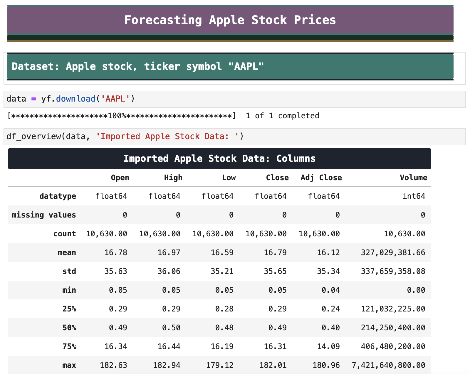
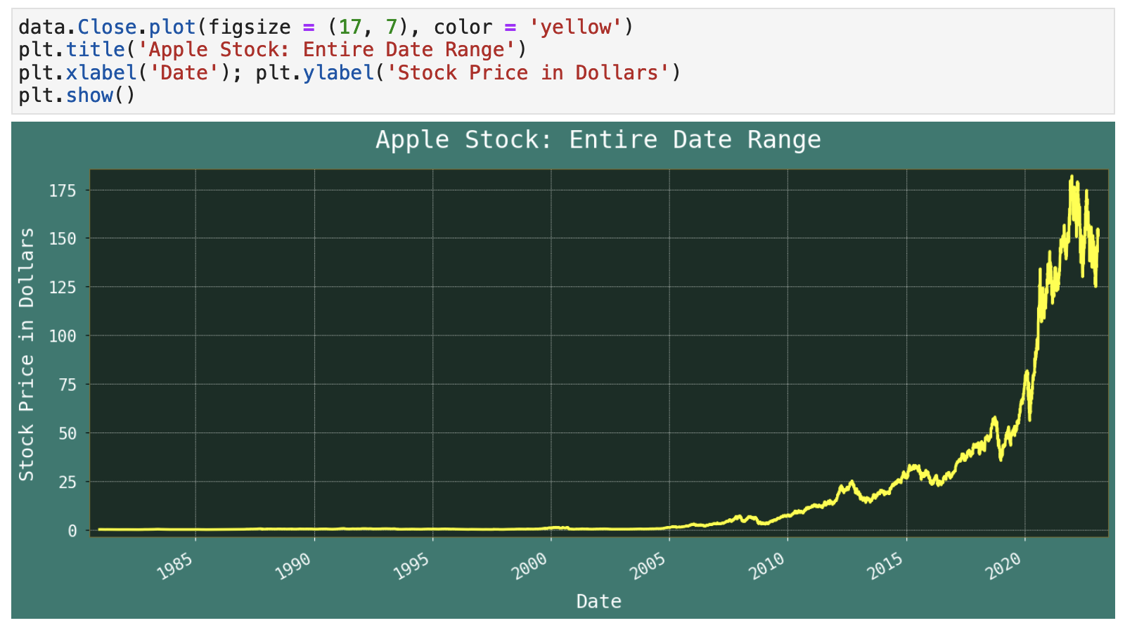
What better way to digest all this data than by a quick and easy plot! Here we can see the entire history of Apple stock. It is immediately clear how much the vast success of the iPhone has influenced Apple's financial standing. The first iPhone was officially announced and later released in 2007. We can see from the visualization below that there was an initial bit of increase in stock price at this point, but it clearly took about 3 years for the world to start to embrace the iPhone. Since that point, however we see a clear indication of the immense success of the device.
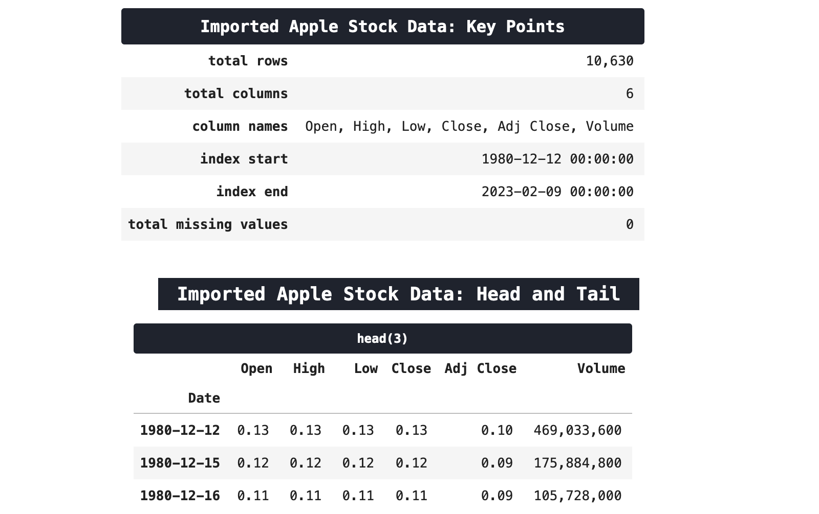
As you can see from the overview (below), there are over 10,000 records in the data, thus giving Prophet a fair amount of data to work with. But this is stock data, so it could also just look like a bunch of data we spilled all over the floor and swept into a pile, i.e. void of any discernible trends, messy, and unpredictable.
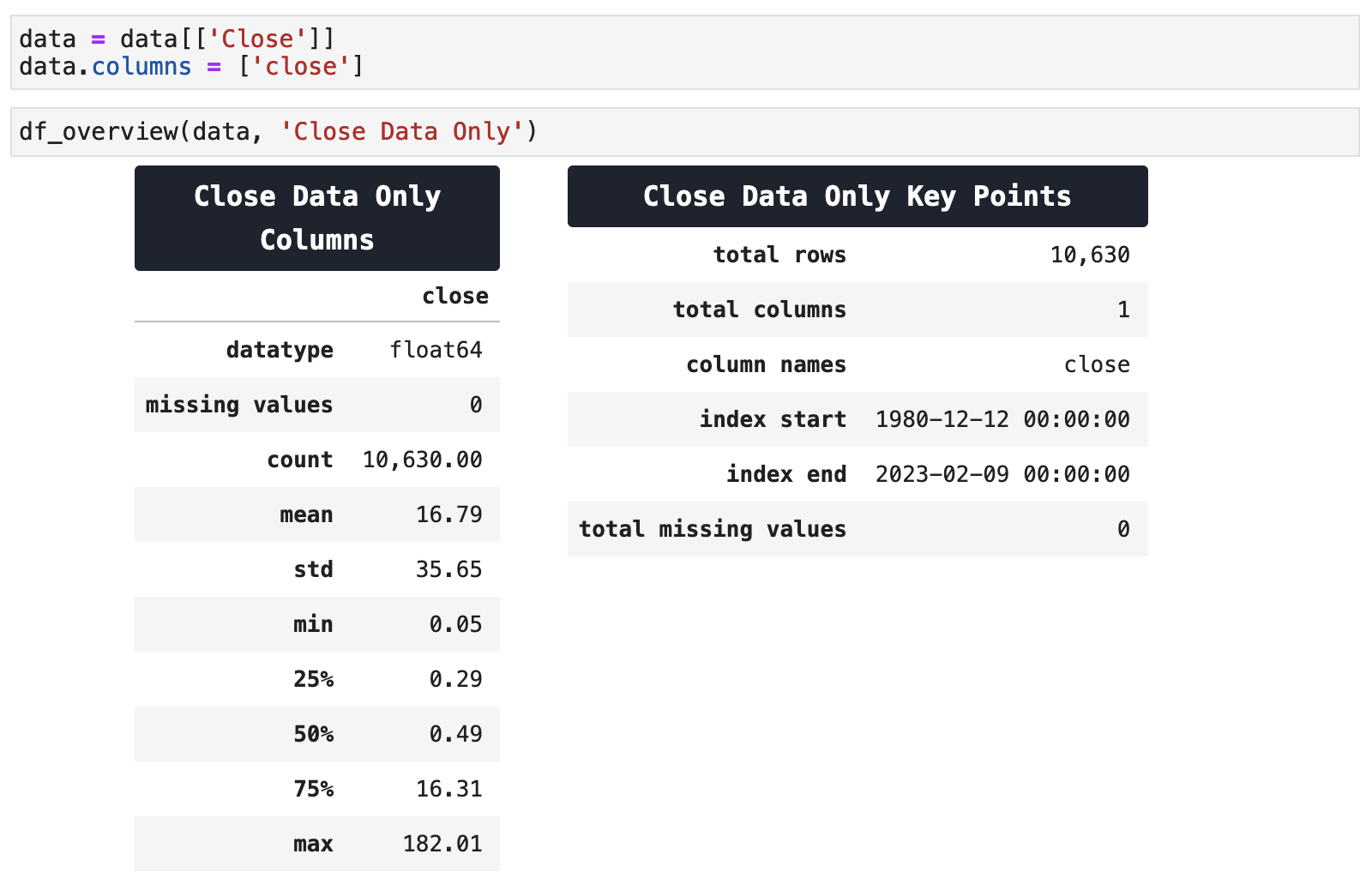
Because Prophet is univariate, meaning it only works with one variable or series of values and datetime data, we will use only the 'close' column from the Apple stock data. When working with other models, I do like to include the volume, as well as a host of other engineered datetime features, lags, and anything I can find that correlates in a meaningful way to my data. But Prophet is strictly accepting of a singular variable. So it shall be "close"!
| | Top | Apple Stock Data | Initial Data Visualization | Prophet Model | Incoporating Holidays | Future Predictions | Ecommerce Data | Ecom Visualization | Ecom Prophet | Energy Consumption Data | Energy Visualization | Importance of Trends | Energy Prophet | Energy Forecasting | Energy Results | Energy Future Predictions | | ||
|---|---|---|
| ✺ Apple Stock: Initial Data Visualization ✺ |
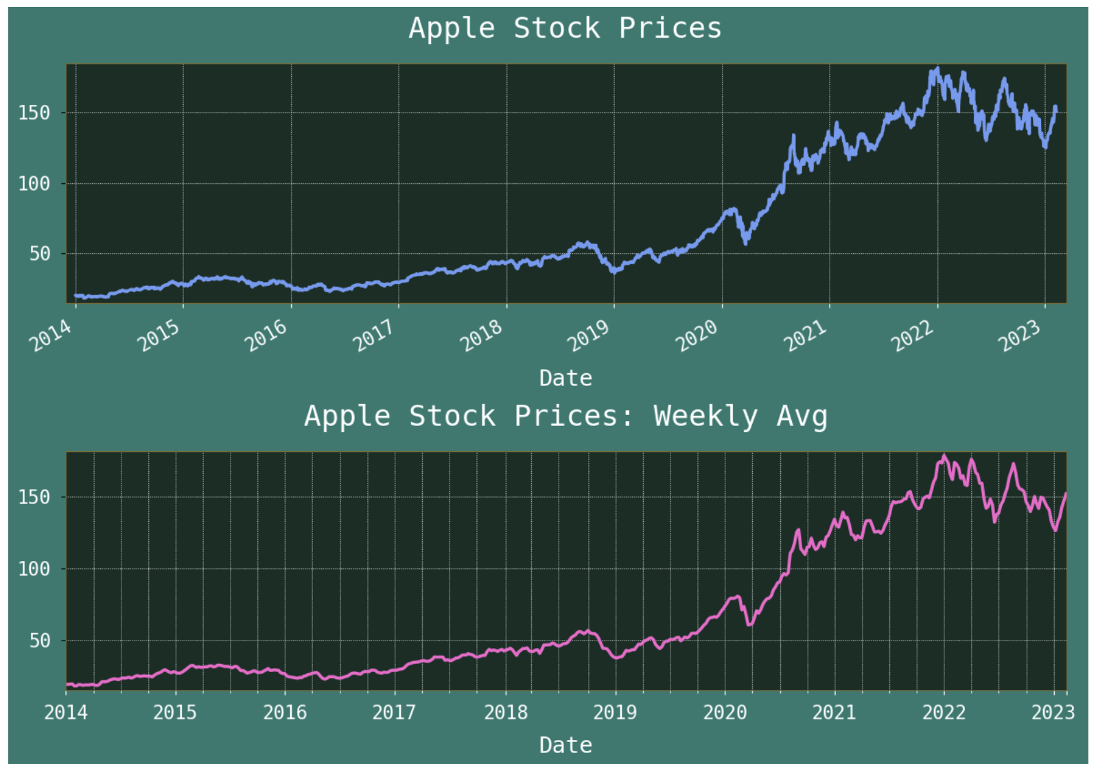
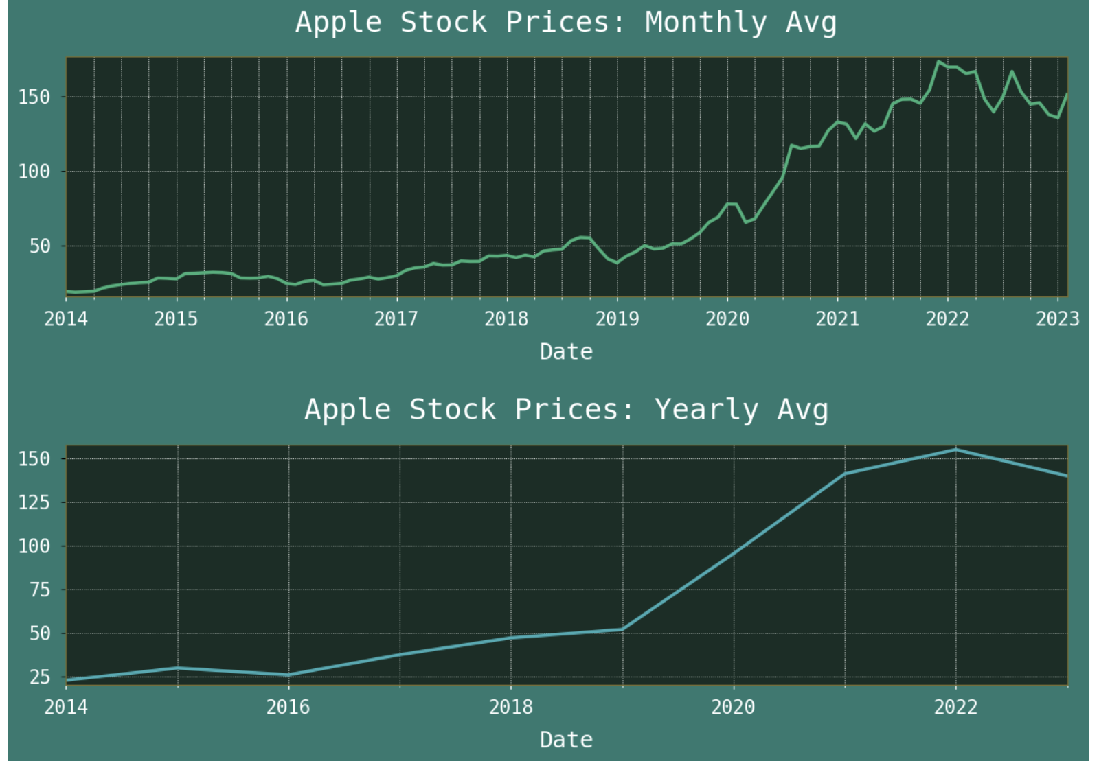
It is always a good idea to get as much of a comprehensive view of data before modeling as possible. Below are graphed representations of Apple stock prices, however, for the purpose of communicating more clearly, I removed all data before 2014 for visualization purposes. Until 2014, Apple stock stayed at a fairly low and consistent price, which does not really help us much with visualization. So we are zooming into the 2014-2023 range here and getting a look at how Apple has performed in its most meaningful years.
Here, I have graphed the stock prices by their daily close prices, and their average weekly, average monthly, and average yearly prices as well. This way, we can get multiple views of the trends of Apple stock and possibly comprehend the data more thoroughly. And honestly, this is data ASMR for me, so I am going to need you to go along with my love of visualization.
As we continue, keep in mind that when training the model, a very large amount of the training data will be from the period of time before 2014 (not visualized here), when the stock remained at a very low level, comparatively speaking and barely varied. We will soon see how that affects our stock price predictions as well as how much it surprisingly does not.
| | Top | Apple Stock Data | Initial Data Visualization | Prophet Model | Incoporating Holidays | Future Predictions | Ecommerce Data | Ecom Visualization | Ecom Prophet | Energy Consumption Data | Energy Visualization | Importance of Trends | Energy Prophet | Energy Forecasting | Energy Results | Energy Future Predictions | | ||
|---|---|---|
| ✺ Apple Stock: First Prophet Model ✺ |
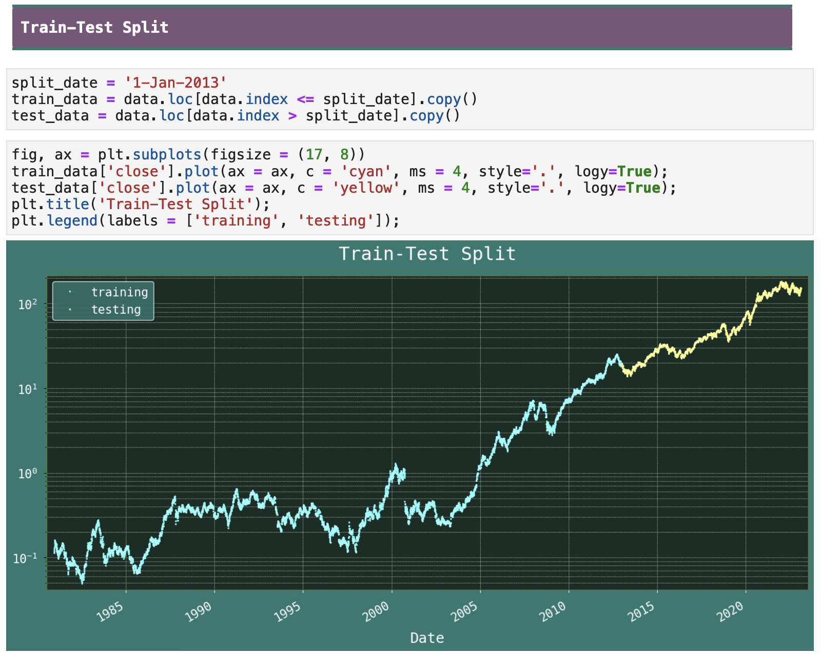
Now, we will build our first Prophet model. Before doing so, I am splitting our data at around 80%-20% for our training-testing portions. Notice that the split date therefore, as noted earlier, ends up making it such that the training data basically all comes from the period of time before Apple stock really took off and rose in price. The train-test split below is visualized with logy values for more meaningful comprehension. When comparing these to the visualizations above, keep this in mind, as it is a very important factor that differentiates them.
Next, it is important to prepare the data for Prophet. This is one of the aspects of the model that I find a bit 'meh', or tedious, merely because most time series data has a datetime index. And to use Prophet, the datetime must be input as a column specifically labeled "ds". The input variable data must be specifically labeled "y" as well. It is not that inconvenient, but it can complicate things when you prefer working with datetime data using a datetime index. It is important to always keep in mind which version of your data you are manipulating, the datetime index version or the Prophet-atized version. I personally find this somewhat inconvenient.

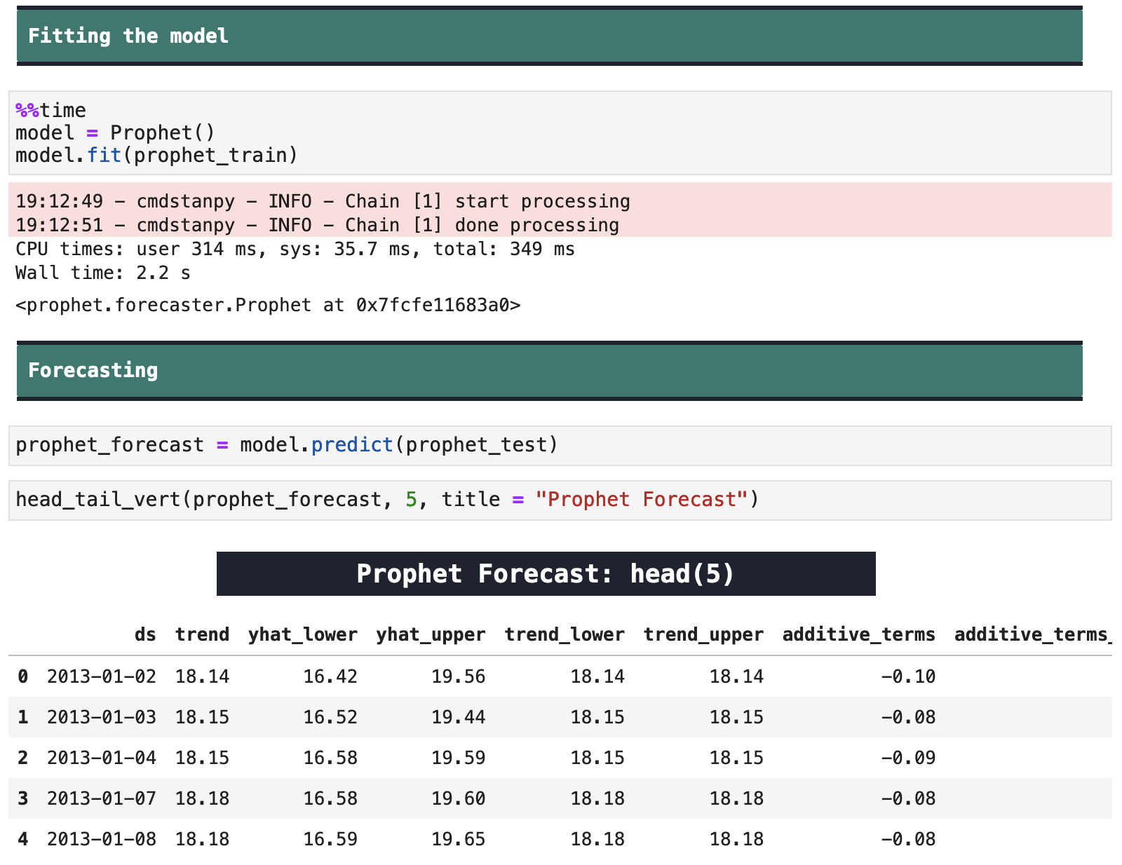
Next comes the fitting. Here I am using Prophet.fit() to fit to the training data, and Prophet.predict() to create the forecast data from the model. These are both fairly typical steps, and Prophet is surprisingly quick in its fitting and predicting.
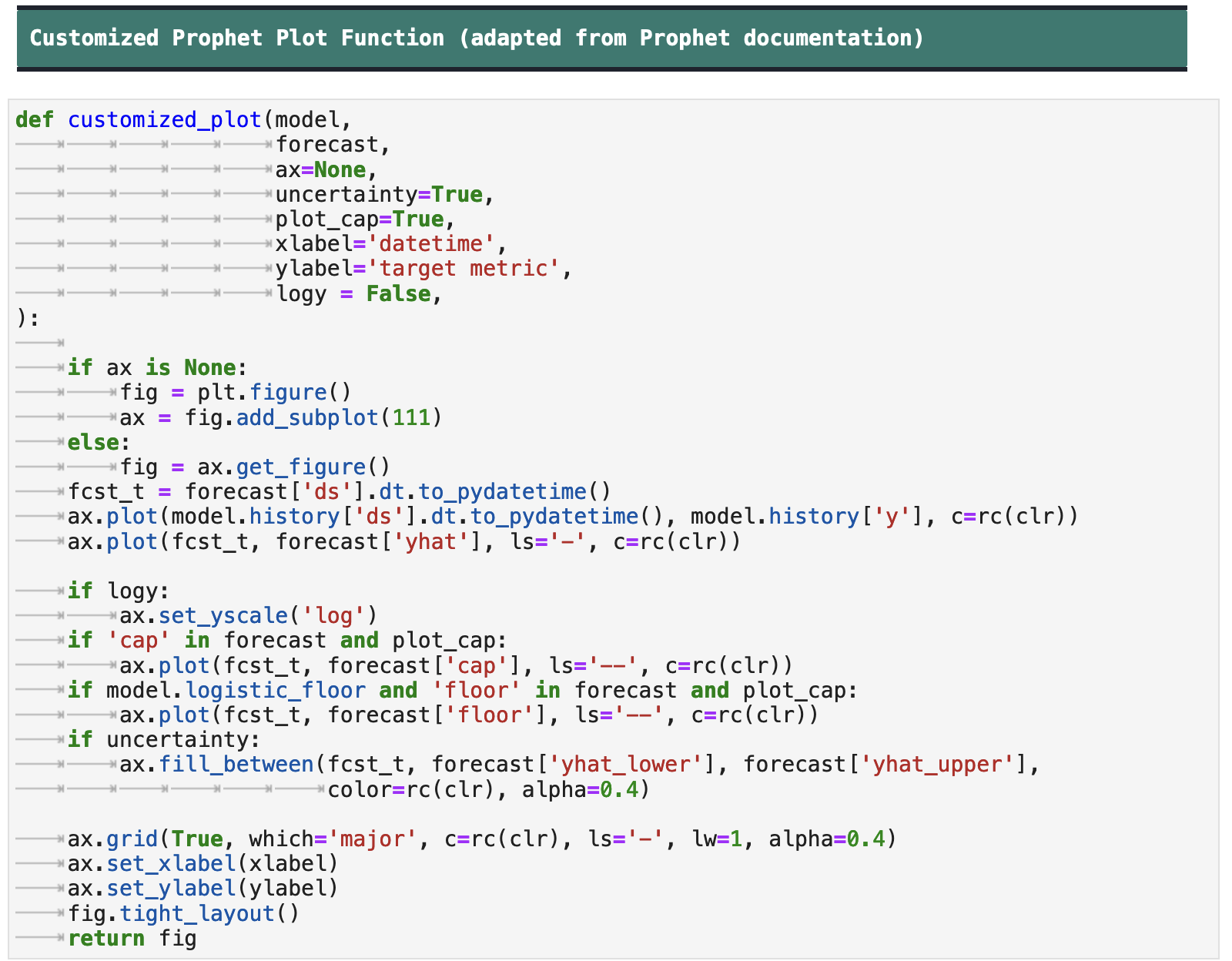
Another area where Prophet is a little aggravating in my opinion, is in its plotting functions. So I customized their Prophet.plot() function, as seen in the code below, so that I could have more control over the visualization. Using the original function, a user has absolutely no control over the output visualization and how it looks or behaves. In fact, it even overrides my Matplotlib stylesheet.
I am not a fan. I personally feel that they could take a morning to rewrite these functions to make them more customizable for users. But then again, I do not mind rewriting the code myself to do exactly what I want. And their dictatorship over their visualizations is probably just an attempt at branding. I don't think they realize how long it is going to take for them to get rid of the Facebook connection. And I do not think that forcing data scientists to visualize their data STRICTLY in blue, black, and white is going to help. It's just so...Facebook.
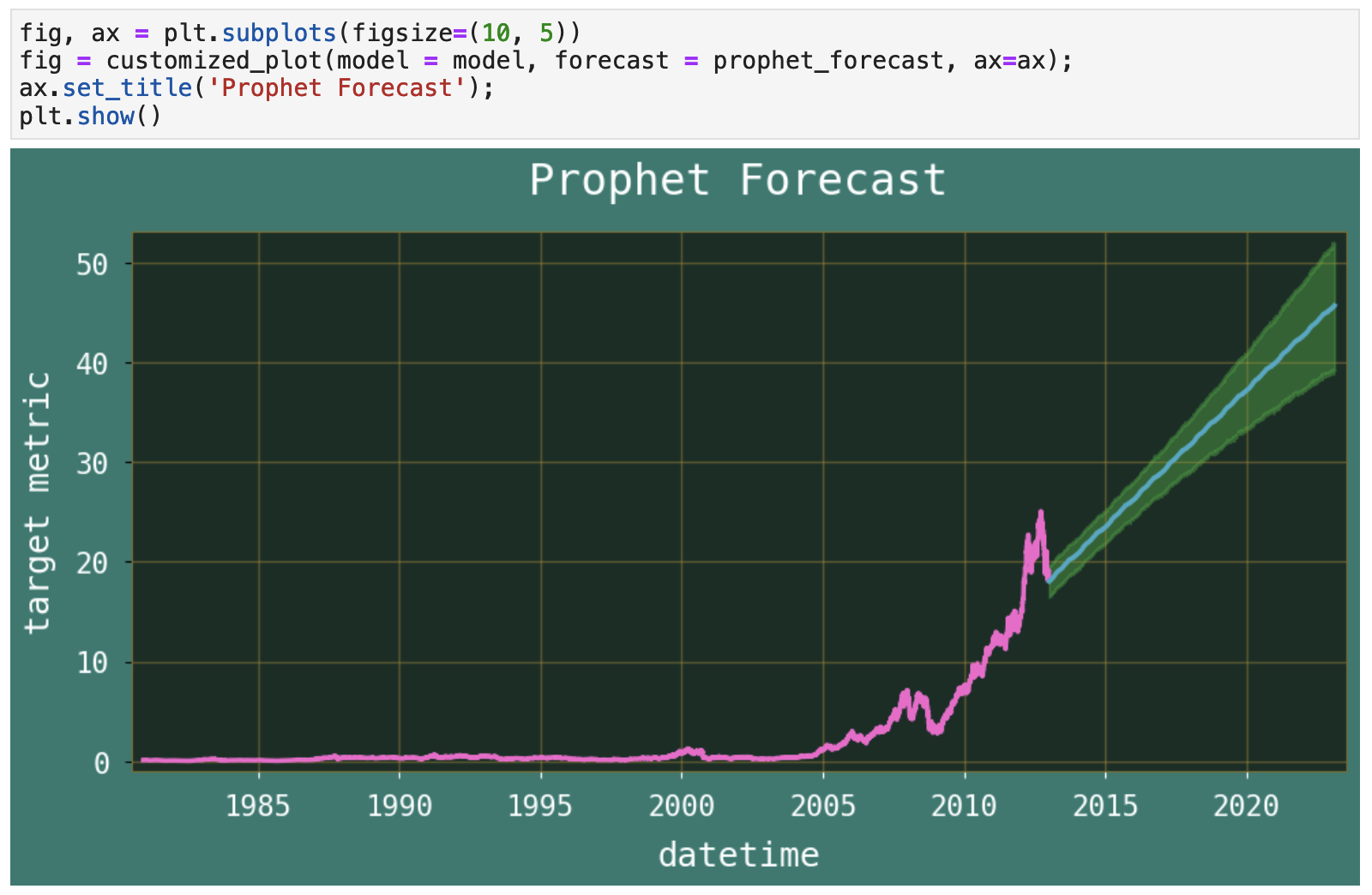
Now, we can get the forecast data from Prophet, complete with confidence interval visualization. Here is a quick overview of the significance of confidence intervals.
| In the plot below: confidence interval becomes wider the farther a prediction is into the future | ||
|---|---|---|
| (Source) Confidence Intervals are estimates that are calculated from sample data to determine ranges likely to contain the population parameter(mean, standard deviation)of interest. For example, if our population is (2,6), a confidence interval of the mean suggests that the population mean is likely between 2 and 6. And how confidently can we say this? Obviously 100%, right? Because we know all the values and we can calculate it very easily. But in real-life problems, this is not the case. It is not always feasible or possible to study the whole population. So what do we do? We take sample data. But can we rely on one sample? No, because different samples from the same data will produce different mean. So we take numerous random samples (from the same population) and calculate confidence intervals for each sample and a certain percentage of these ranges will contain the true population parameter. This certain percentage is called the confidence level. A 95% confidence level means that out of 100 random samples taken, I expect 95 of the confidence intervals to contain the true population parameter. |
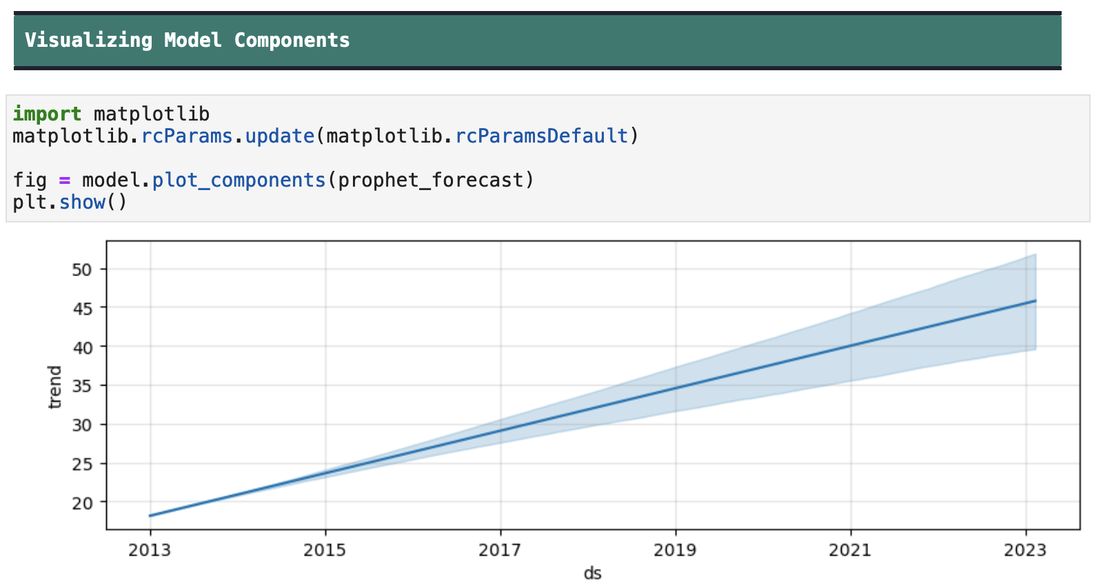
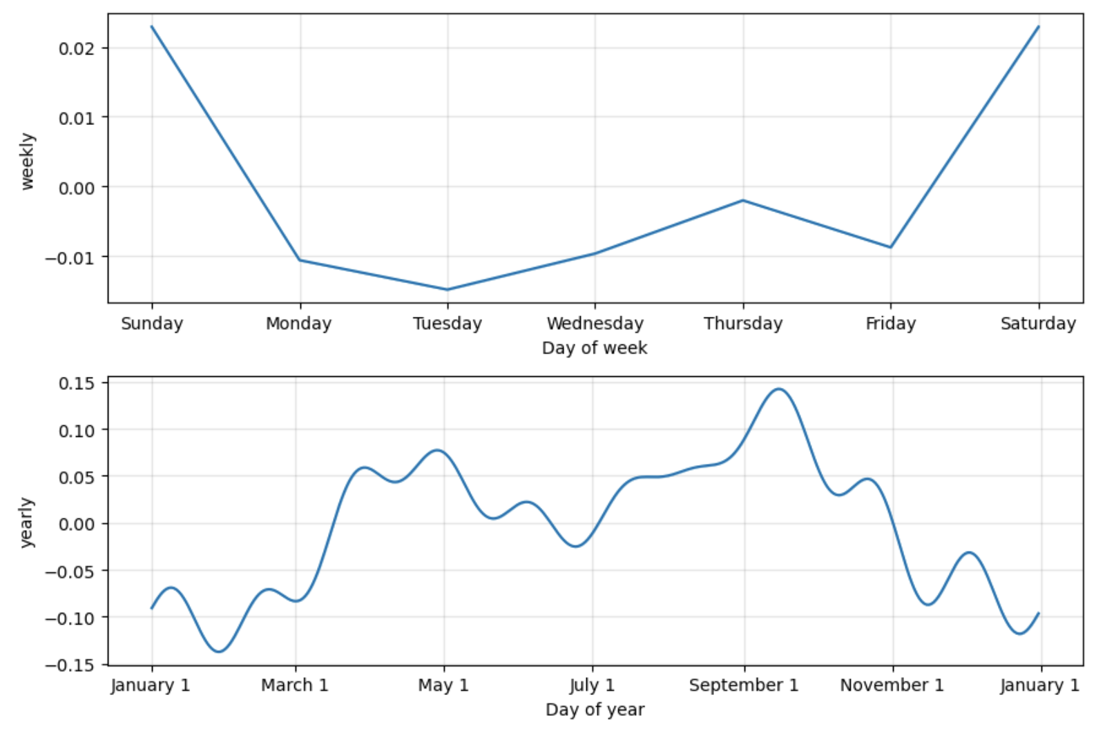
Next, we can visualize the components of the forecast. Here, I gave in to their visualization dictatorship and overrode my stylesheet myself to get acceptable looking visualizations.
First, we see the trend, which is basically just up. We also get a look at the data and how it trends on a weekly basis and a yearly basis.
But looking at our predictions versus the actual closing data (below), we can see that the trajectory our model found did not really follow the true trajectory of the Apple stock prices. And this makes sense. The light blue line at the beginning of the plot represents the data on which the model was trained, and from this we can easily see why Prophet might have found the trajectory it did.
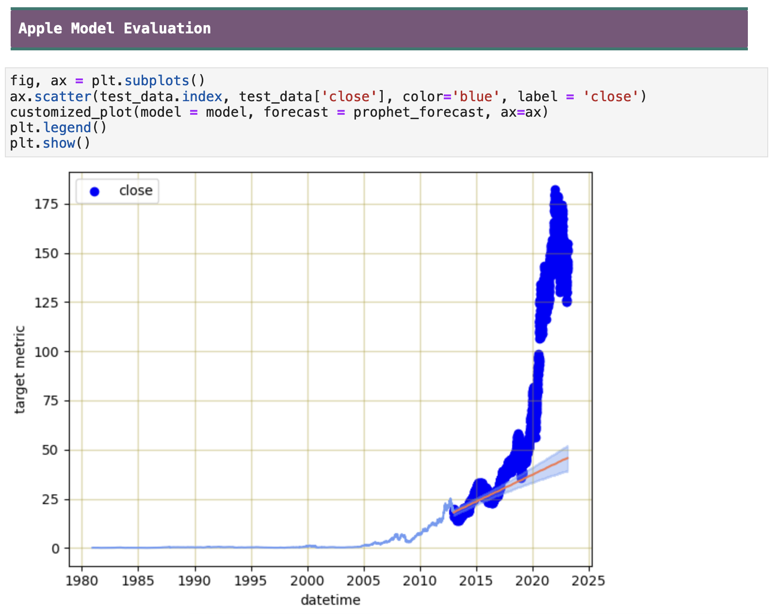
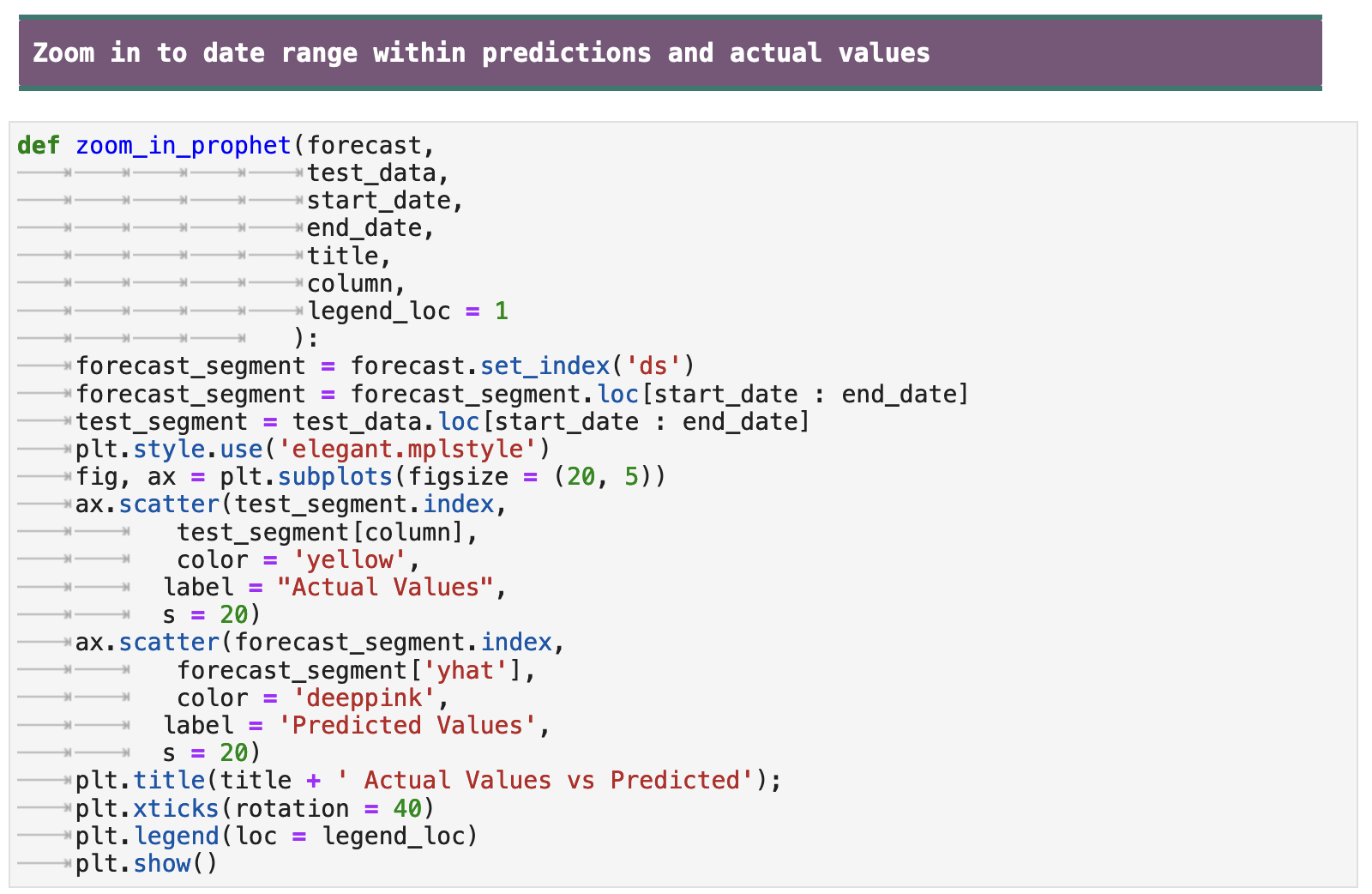
Let's zoom in a bit and take a closer look at how the model tracked the actual values with its predictions. The following function is one I wrote that will take a date range and return the predicted values and actual values visualized for that range only.
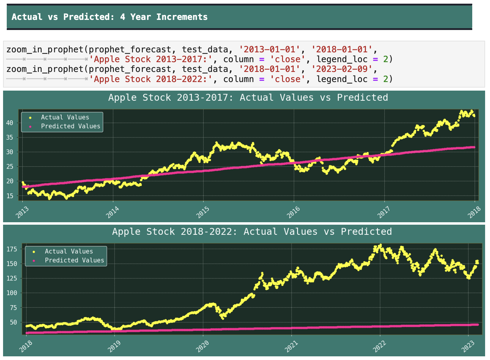
We can see how in the beginning, the model was able to track the trajectory to a reasonable degree, in years 2013-2017. But when it hits 2018 and going into the 2020s, it falls off a cliff in its abilities to accurately predict the stock prices.
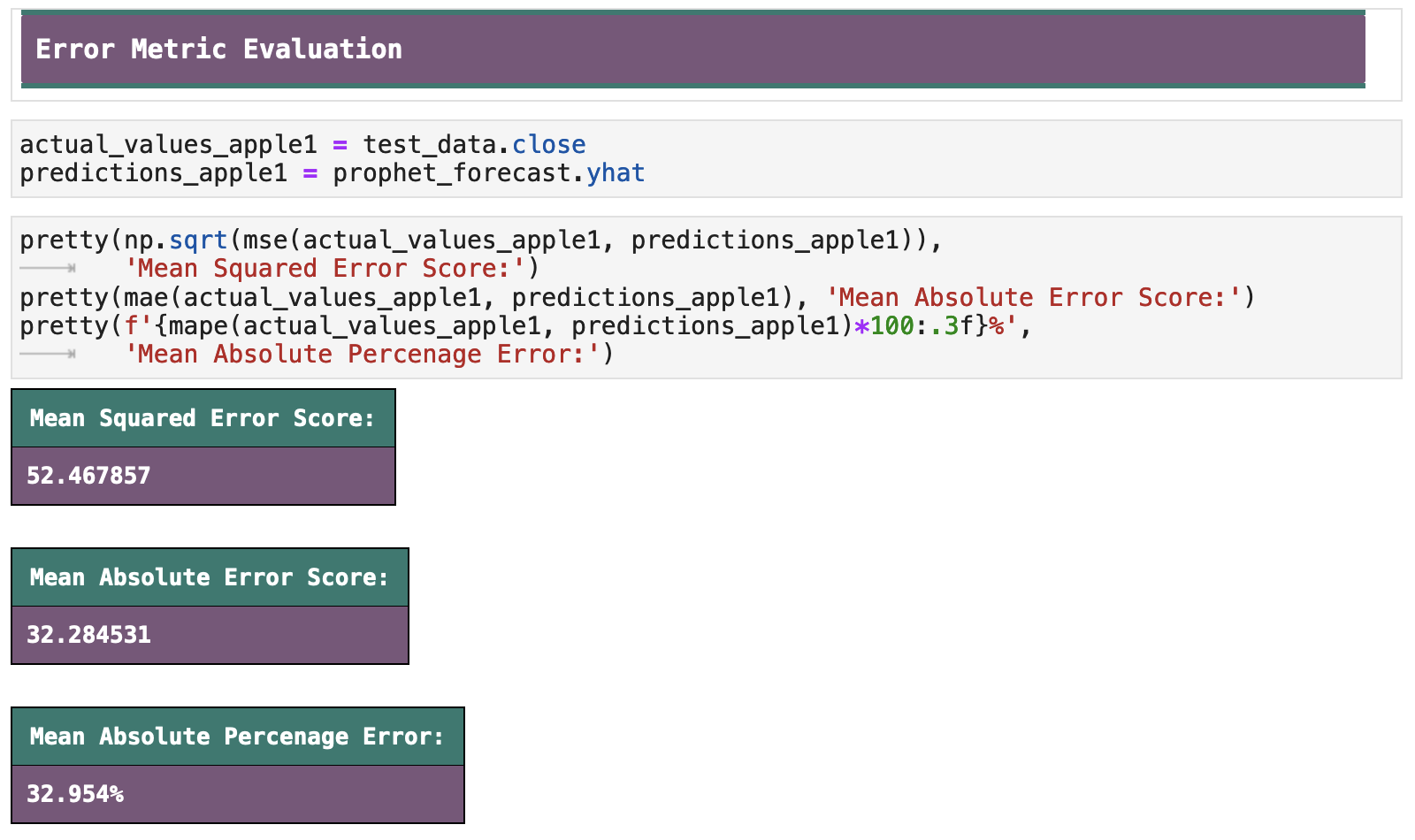
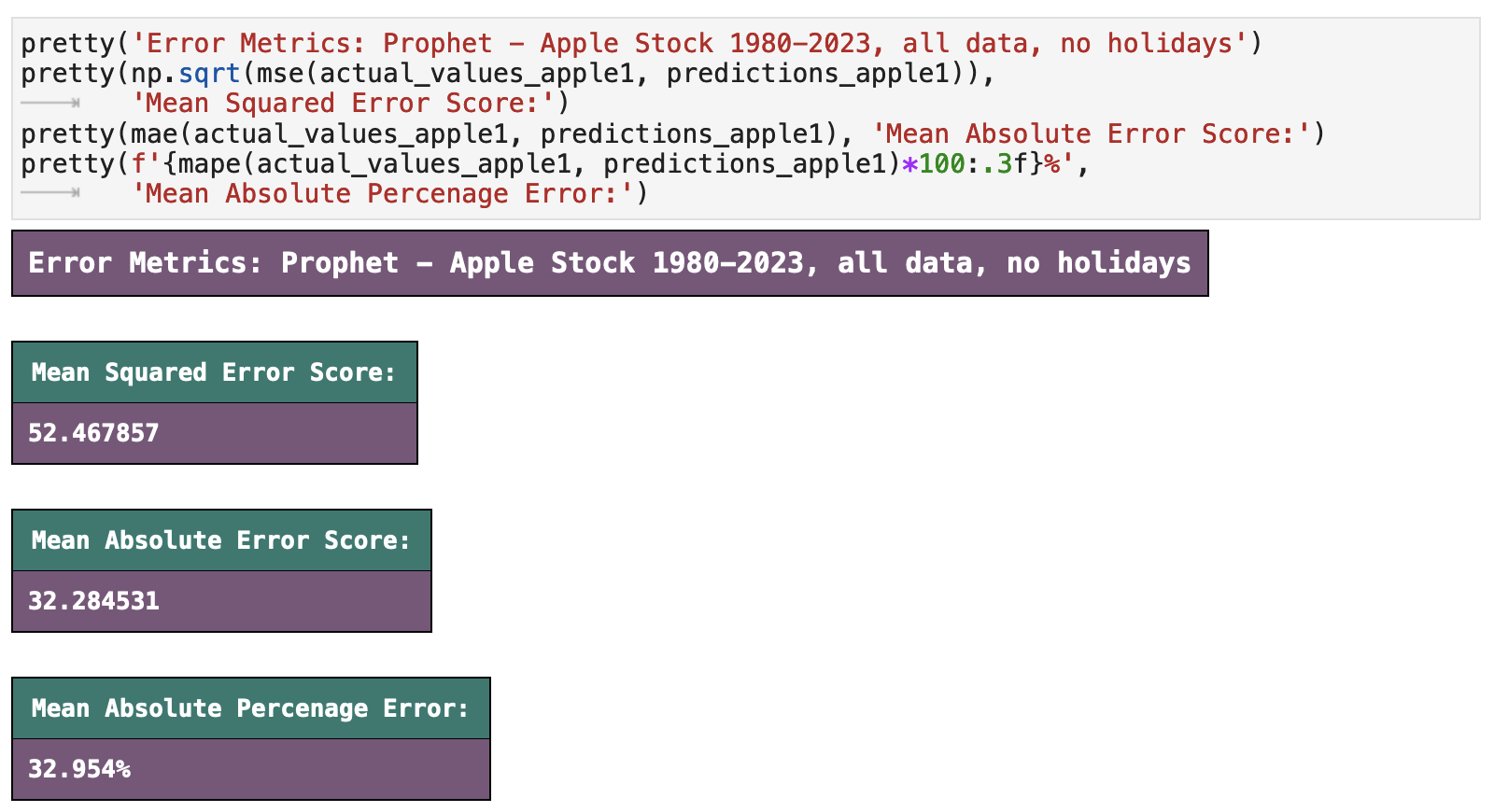
When we look at our error metrics for the model, the percentage error is somewhat disappointing, but then it is also to be expected, given the trajectory of Apple's stock during the years that comprised the training data versus the trajectory upon which the model had to predict. We get around a 33% error rate, which makes the model only 67% accurate. Perhaps there is something simple we could do to improve upon this. We will make an attempt in the next section!
| | Top | Apple Stock Data | Initial Data Visualization | Prophet Model | Incoporating Holidays | Future Predictions | Ecommerce Data | Ecom Visualization | Ecom Prophet | Energy Consumption Data | Energy Visualization | Importance of Trends | Energy Prophet | Energy Forecasting | Energy Results | Energy Future Predictions | | ||
|---|---|---|
| ✺ Apple Stock: Shortened Data, Holidays Included ✺ |
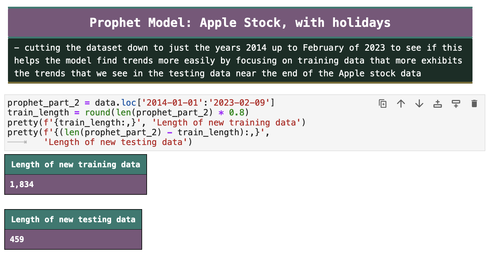
As mentioned previously, the first 34 years of Apple stock data stayed at a fairly low and consistent level and only started to considerably go up around 2014. So in the next section, we will look at how the model responds if we remove all data up to the year 2014. This will drastically reduce the amount of data we are working with. And while I could obtain more frequent data to make up for this cut, my goal was to show how the model would perform with the same data frequency while training on years that more accurately matched the trend of Apple's stock prices in the testing data.
As you can see below, we now only have 1,834 training records and 459 testing. Let's see how this affects our model.
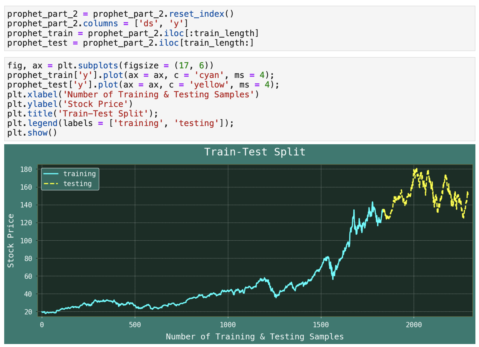
Let's again visualize our train-test split. We can now see that our training data takes into account a great deal of the upward trend in the Apple stock prices. And the testing data remains fairly high but still with some large fluctuations in price.
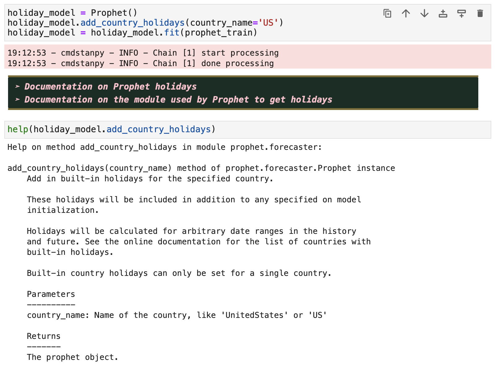
We will also make use of Prophet's add_country_holidays() function, which will account for the US holidays and possibly improve upon our predictions if the holidays have any meaningful affect on the trend of our data.
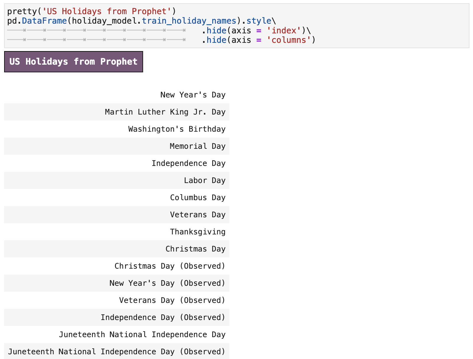
Below is a list of the holidays that Prophet will consider in its fitting process.
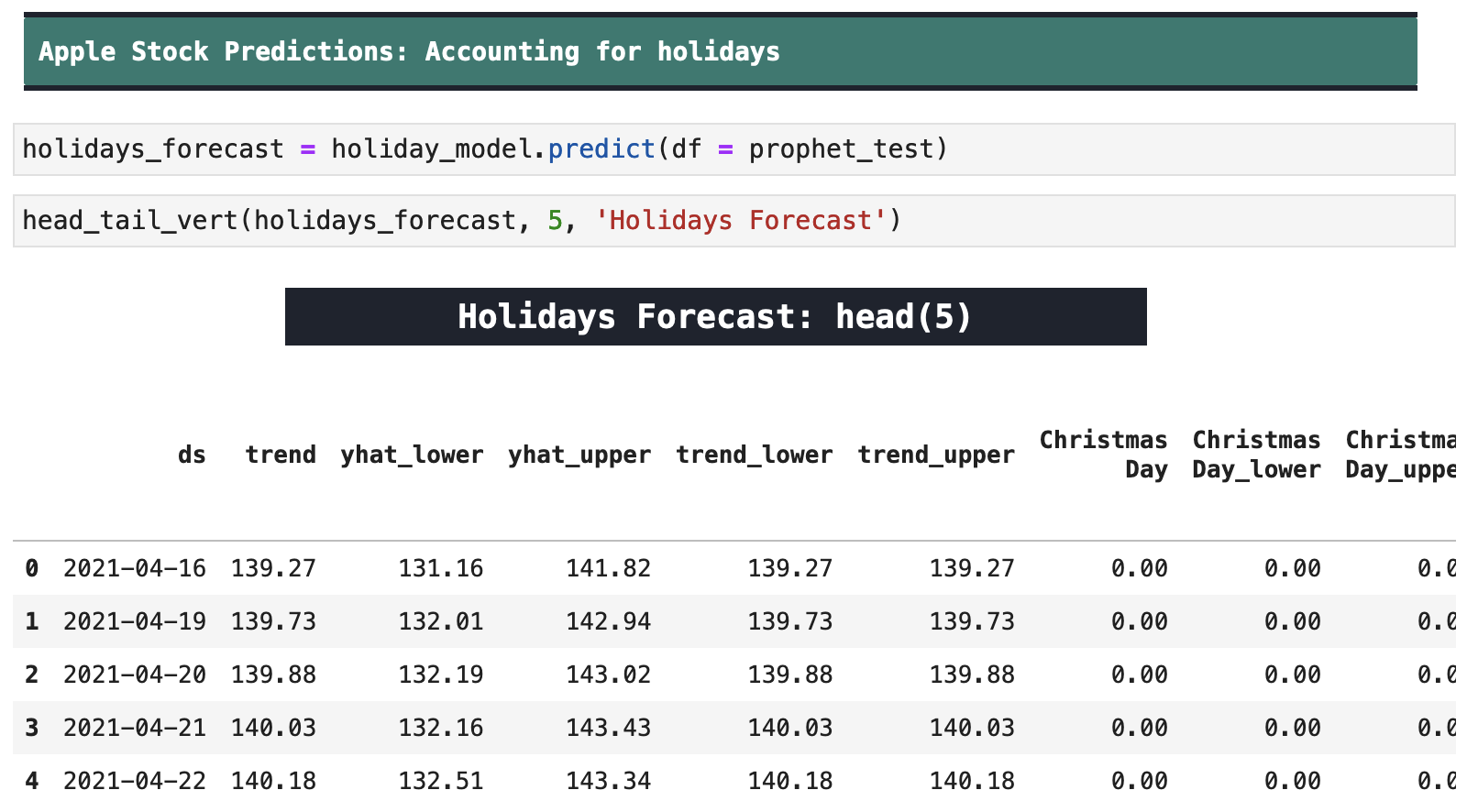
And this is the forecast data from our new model's predictions.
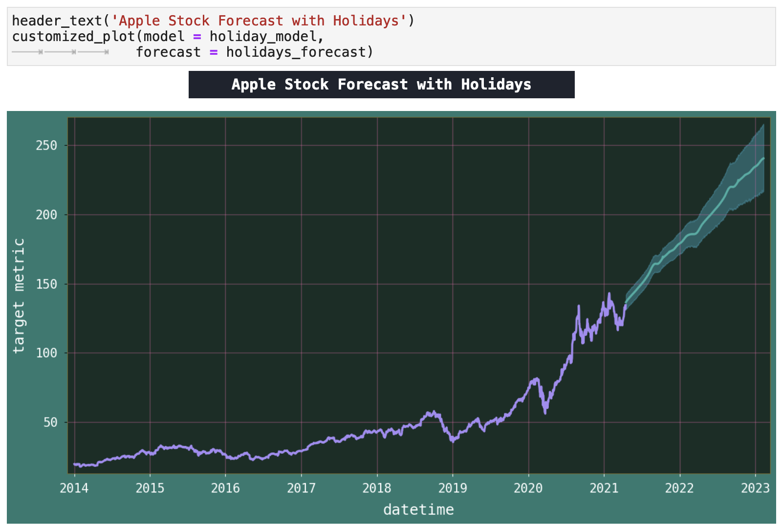
We see a similar plot to our previous one. Perhaps we will get more meaningful visualizations later when we zoom in to specific time periods of predictions versus actual values.
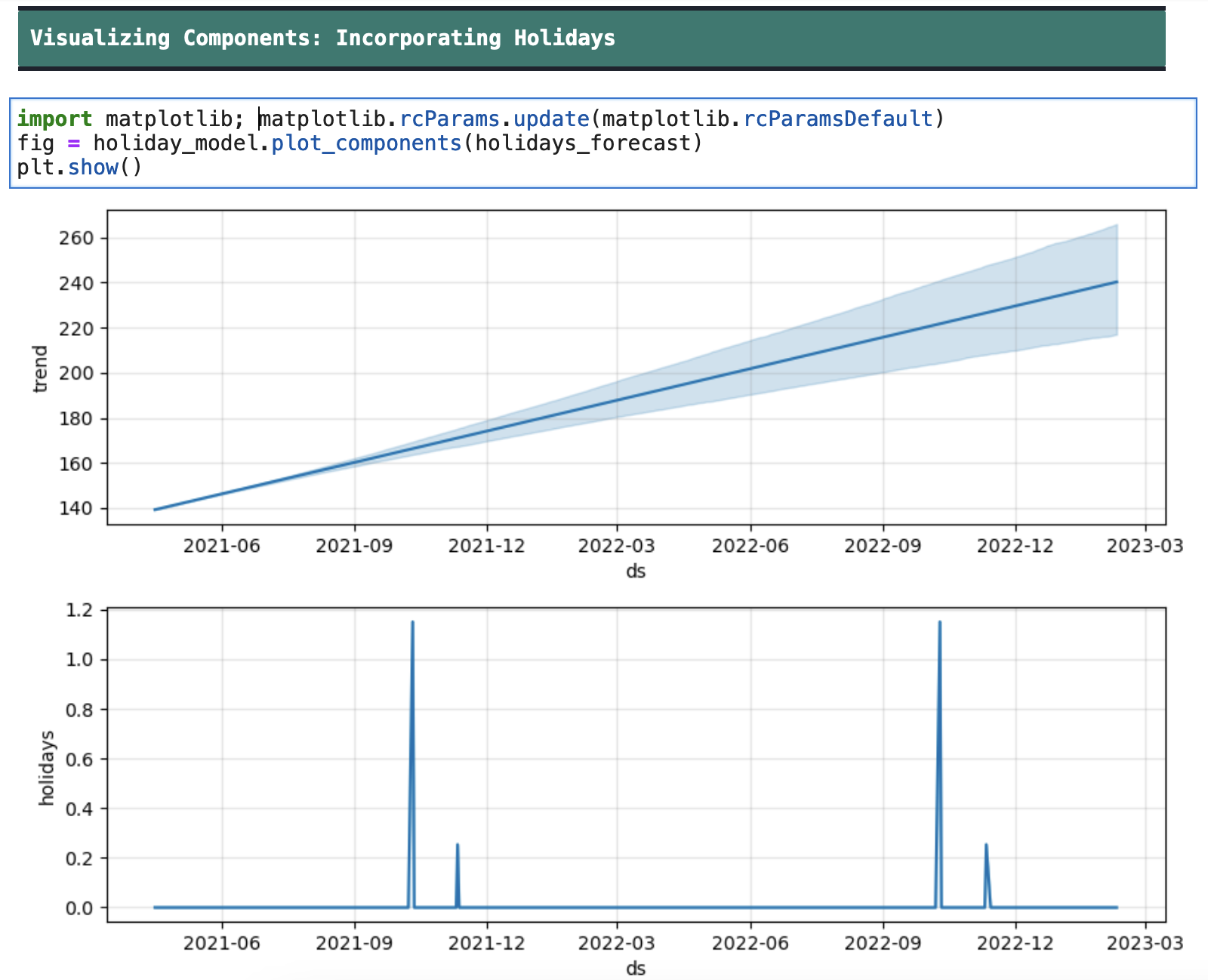
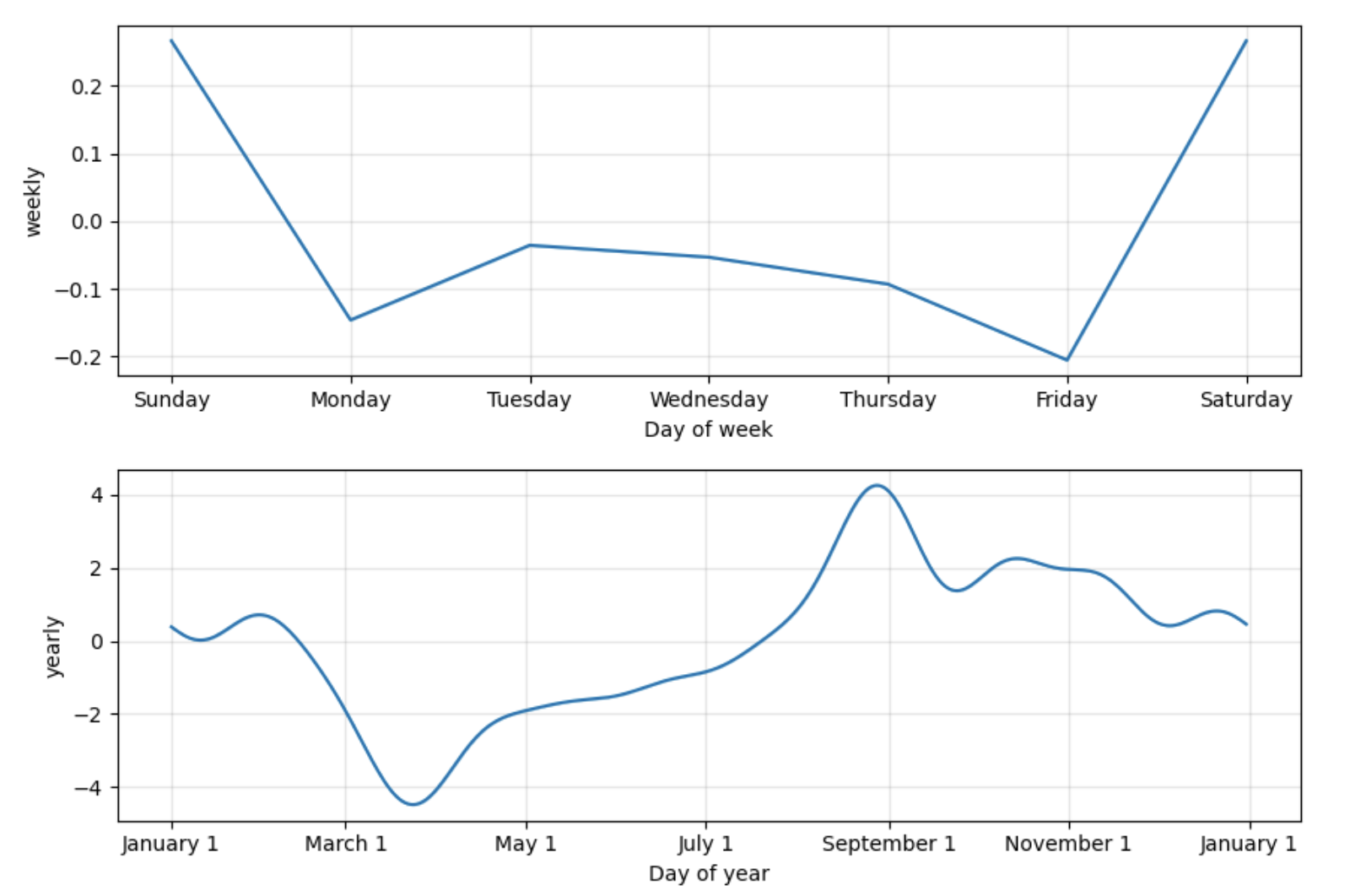
And here we see the components of the model trained on the shortened data with the holidays added. This too seems to match the previous component visualizations for trend, yearly, and weekly patterns, however in this case, we also get the holidays plot, which shows us the holidays' effects on the data.
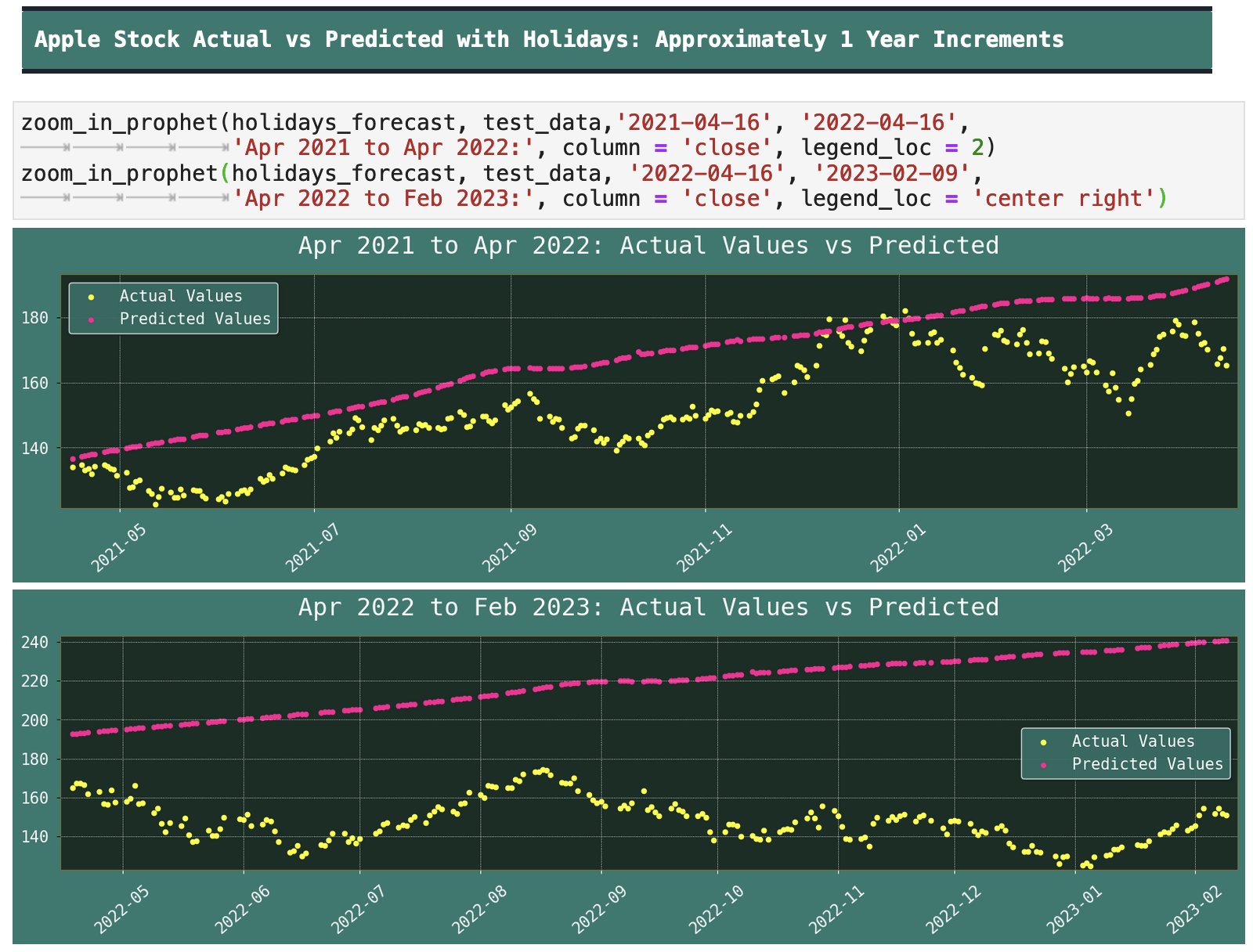
Below, we have zoomed-in visualizations of the actual values compared to the predicted values. Once again, we can see how in the first section of comparison, the model predicts with some accuracy the trajectory of the stock prices. But viewing the second plot, which has the most recent data and predictions, we can see that the model then follows the trajectory it had previously been on, but the stock prices do not. And since stock prices are chaotic by nature, a shift like this is not very surprising. But the model is making the most reasonable assumptions based on the information it has.
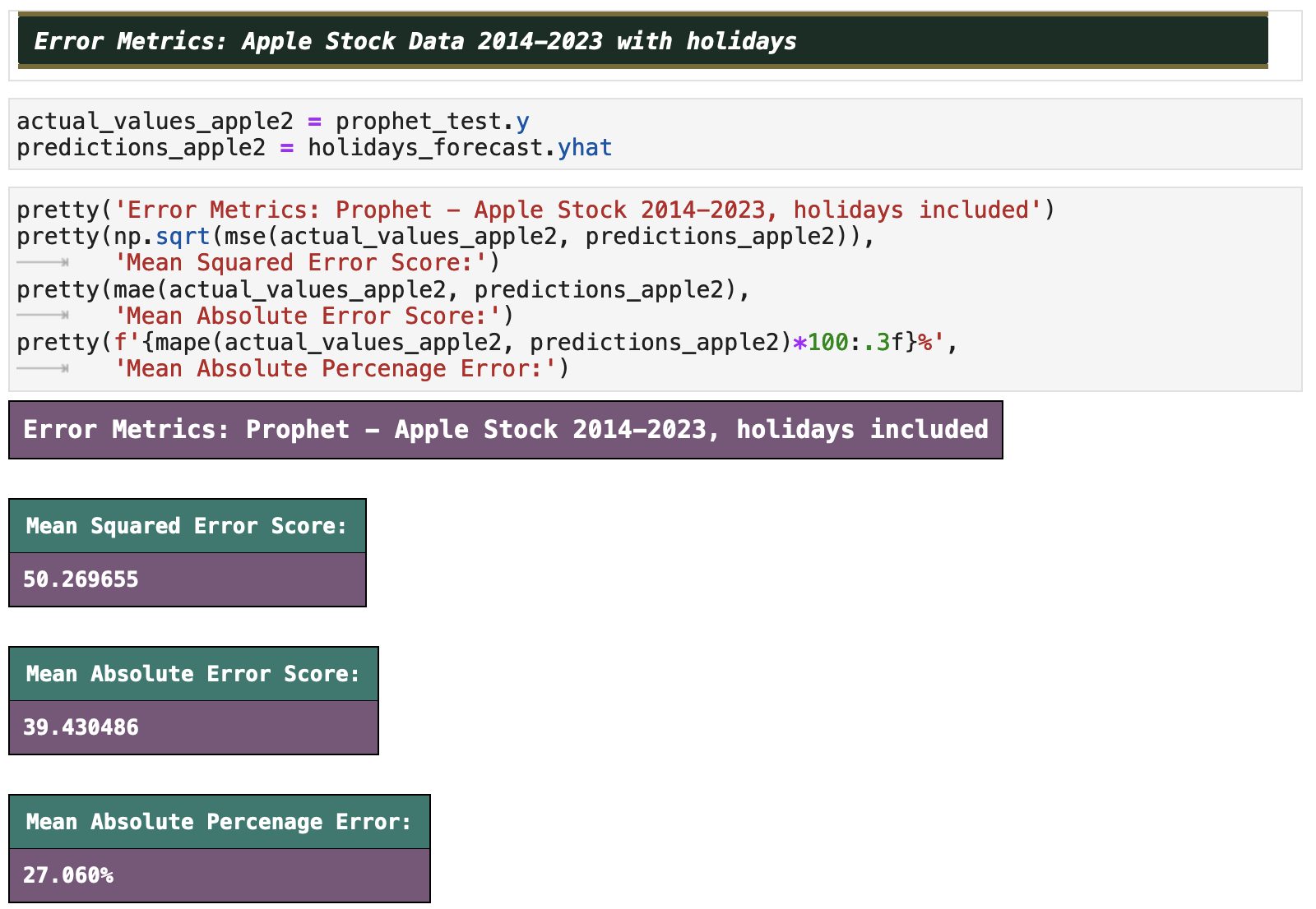
Let's now compare the error metrics of our model that received limited training data, only from the years 2014 to 2021. There is approximately 6% improvement on accuracy! And while that is not nothing, it is still not much. So it is reasonable to then conclude that Prophet might not be the best model for time series prediction when it comes to stock prices.
| | Top | Apple Stock Data | Initial Data Visualization | Prophet Model | Incoporating Holidays | Future Predictions | Ecommerce Data | Ecom Visualization | Ecom Prophet | Energy Consumption Data | Energy Visualization | Importance of Trends | Energy Prophet | Energy Forecasting | Energy Results | Energy Future Predictions | | ||
|---|---|---|
| ✺ Apple Stock: Future Predictions ✺ |
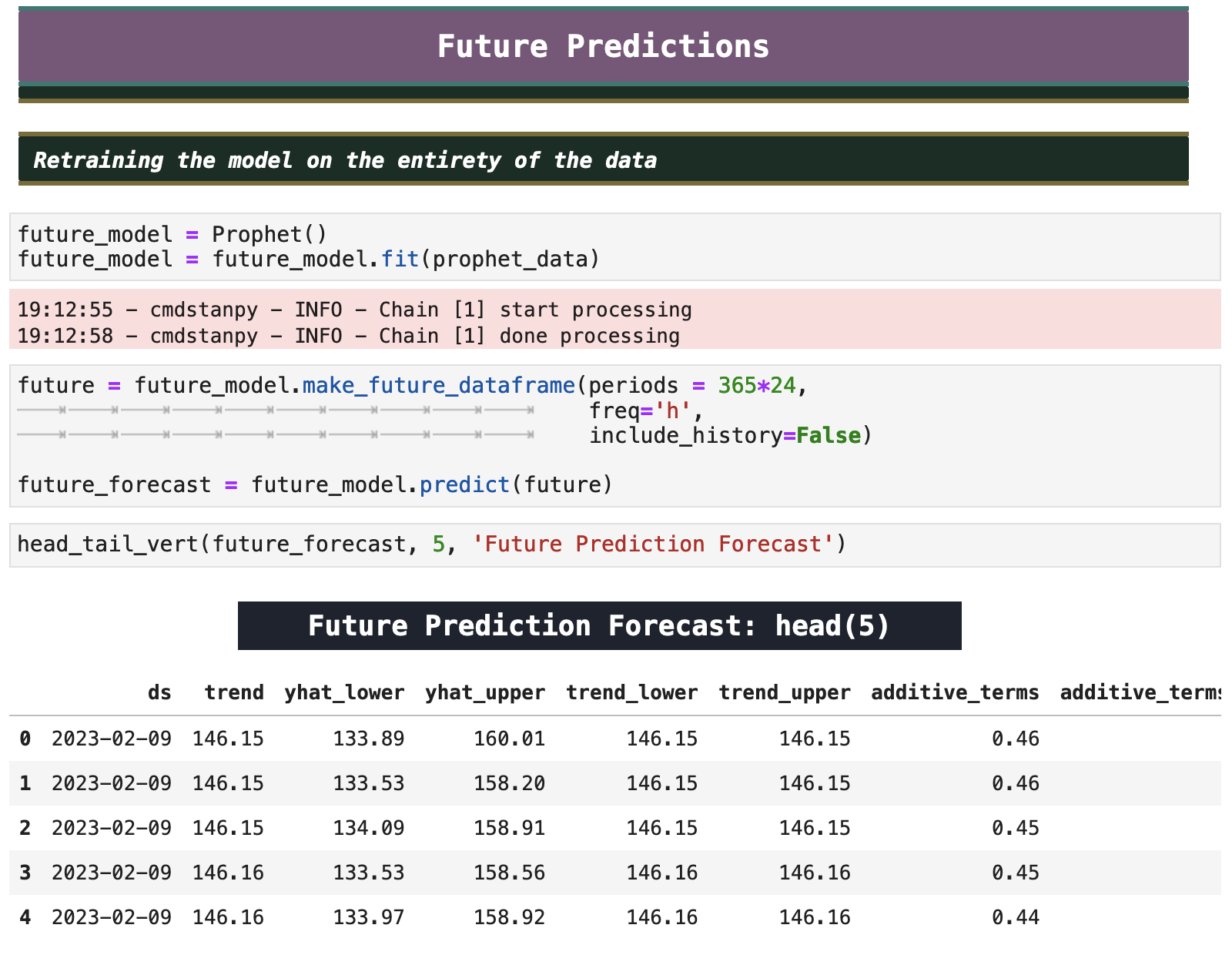
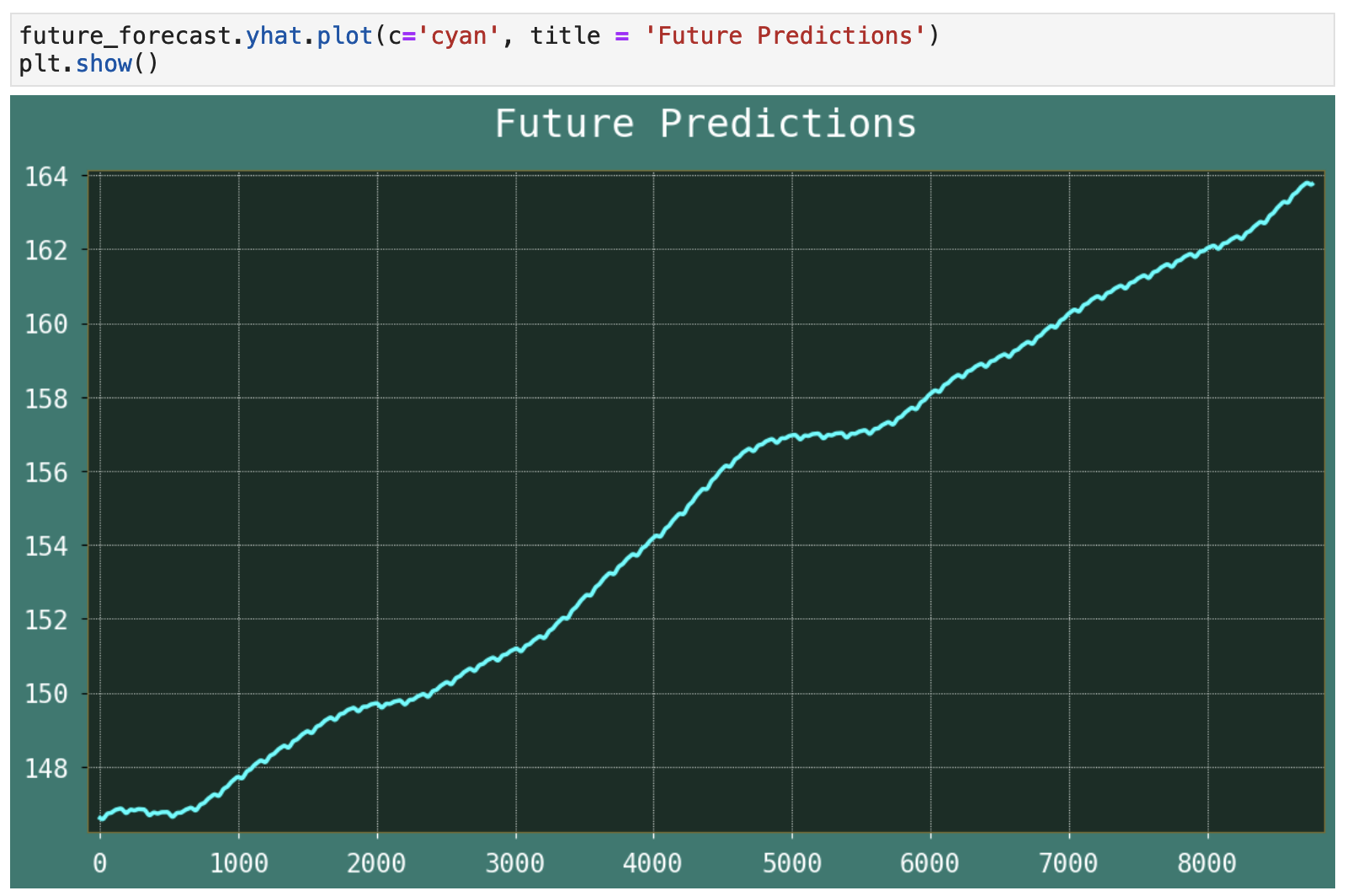
For the fun of it, let's see what Prophet thinks about the future of Apple stock. To get future predictions, we will retrain the model, this time on the entirety of the dataset acquired from Yahoo Finance, 1980-2023.
Making future predictions with Prophet is quite convenient in that we have the make_future_dataframe() function, to which we only need give the number, or periods of prediction we want returned. And I have passed hourly as our frequency.
As you can see from the visualization below, Prophet looks like it will probably be investing in Apple in the immediate future, as it predicts a strong upward trend. While I am not going to go running to Trade Station to invest immediately, I can definitely imagine this exact trend playing out. However, keeping in mind the volatility and chaotic nature of the stock market, it is almost just as likely that this trend might not play out.
| | Top | Apple Stock Data | Initial Data Visualization | Prophet Model | Incoporating Holidays | Future Predictions | Ecommerce Data | Ecom Visualization | Ecom Prophet | Energy Consumption Data | Energy Visualization | Importance of Trends | Energy Prophet | Energy Forecasting | Energy Results | Energy Future Predictions | | ||
|---|---|---|
| ✺ Ecommerce: the Data ✺ |
So if stock prices are not Prophet's forté, perhaps sales prediction is? And I can tell you from previous experience that Prophet is actually quite effective at this type of prediction. But then an above average child could predict sales if they understood the seasonal trends that affect the numbers. So let's make it a little more challenging for Prophet. We will use just a single year of data from an ecommerce dataset from the UK. That means no seasonal trends, which is what Prophet really does love. (Don't worry. We will get it plenty of trendy data later.)
The original data included every single item purchased in the course of a year. And as you can see below, this resulted in a dataframe of over 541,000 records. However, we will be consolidating this data.
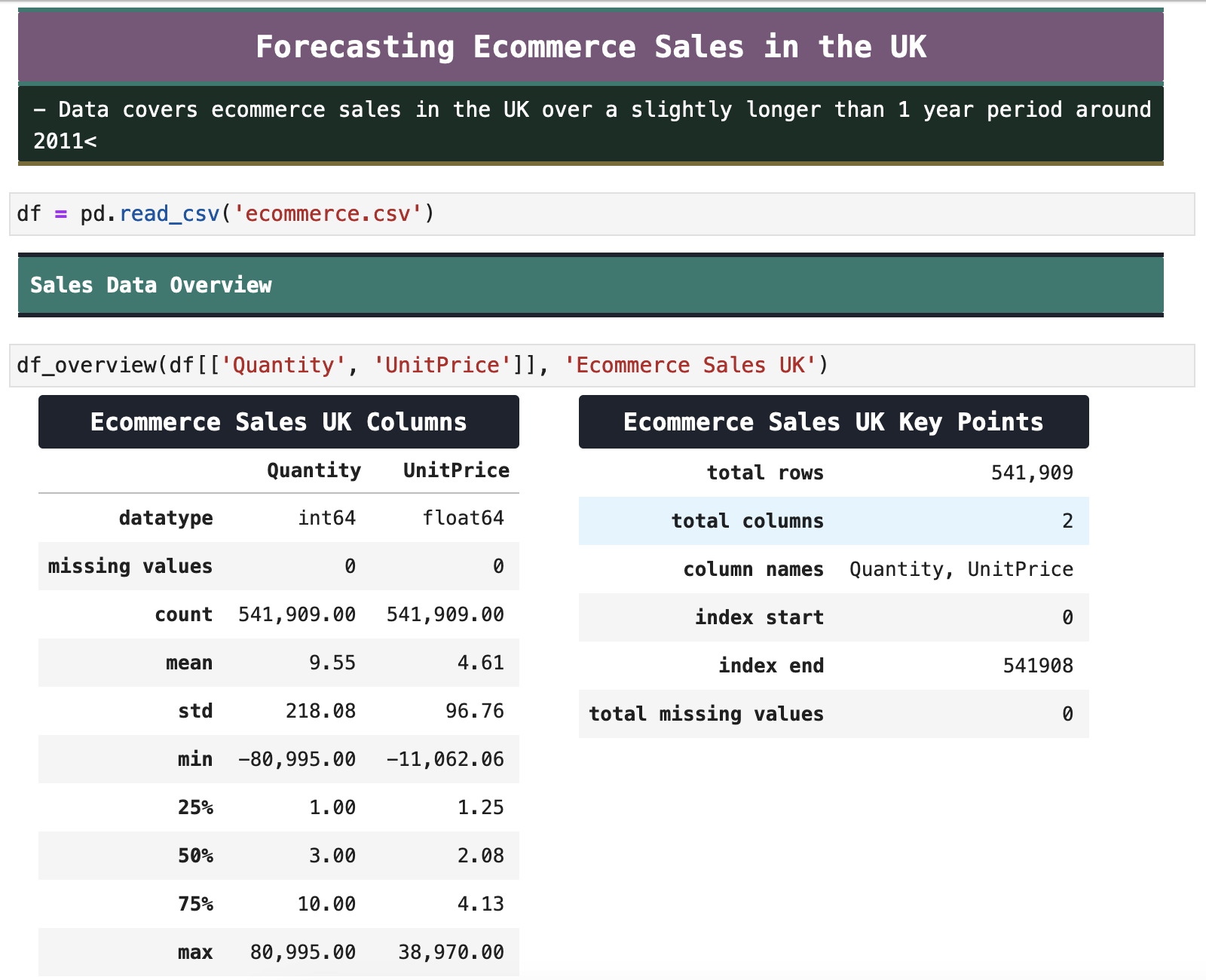
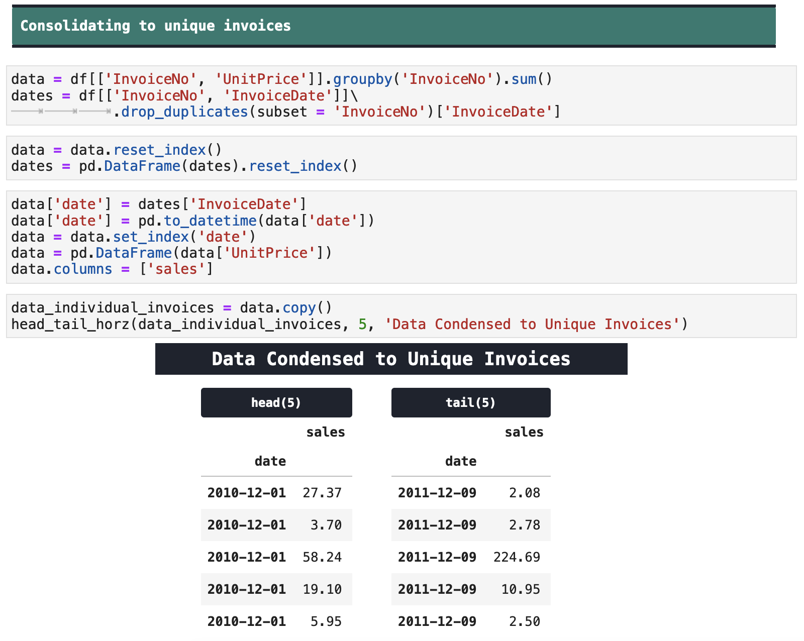
Instead of accounting for every item purchased, our data will be limited to unique invoices. So purchases by the same person at the same time will be combined as one purchase. The following code shows the process of this consolidation. It took a number of steps to get a dataframe that will be appropriate for Prophet, with just the invoice totals and the datetime data.
| | Top | Apple Stock Data | Initial Data Visualization | Prophet Model | Incoporating Holidays | Future Predictions | Ecommerce Data | Ecom Visualization | Ecom Prophet | Energy Consumption Data | Energy Visualization | Importance of Trends | Energy Prophet | Energy Forecasting | Energy Results | Energy Future Predictions | | ||
|---|---|---|
| ✺ Ecommerce: Initial Visualization ✺ |
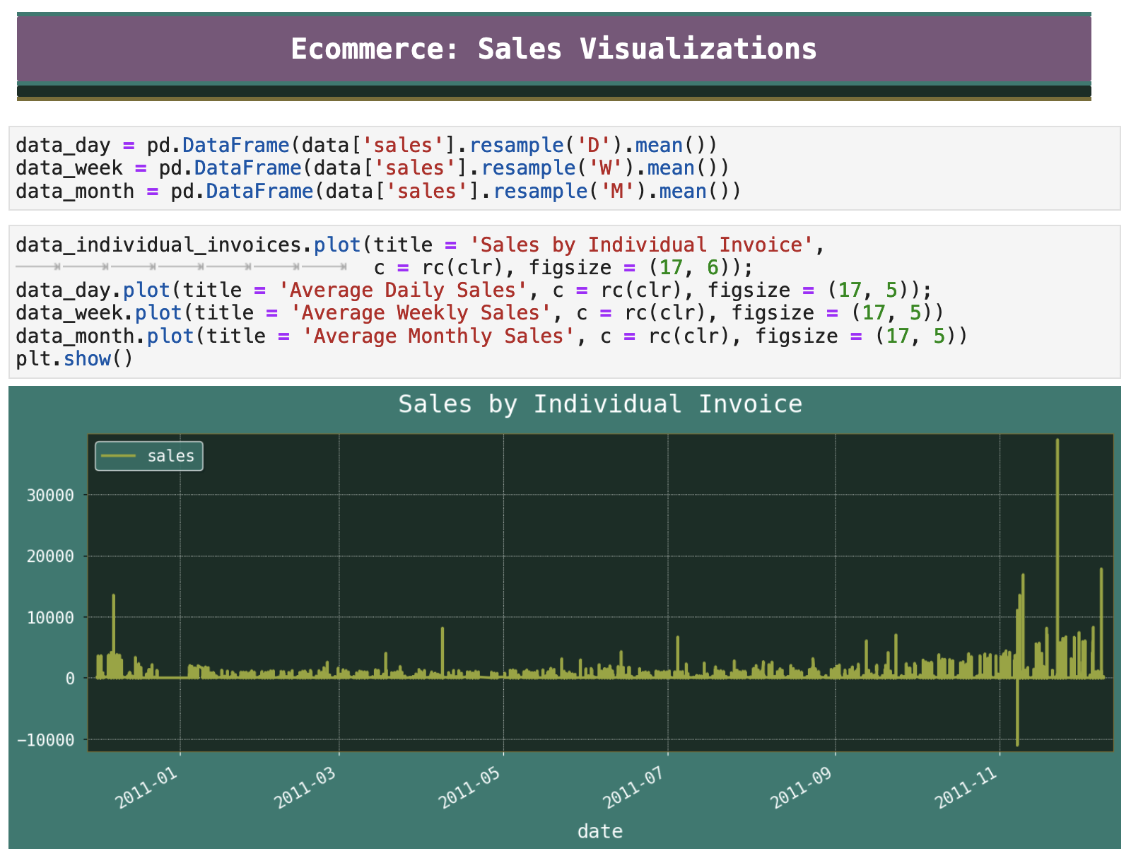
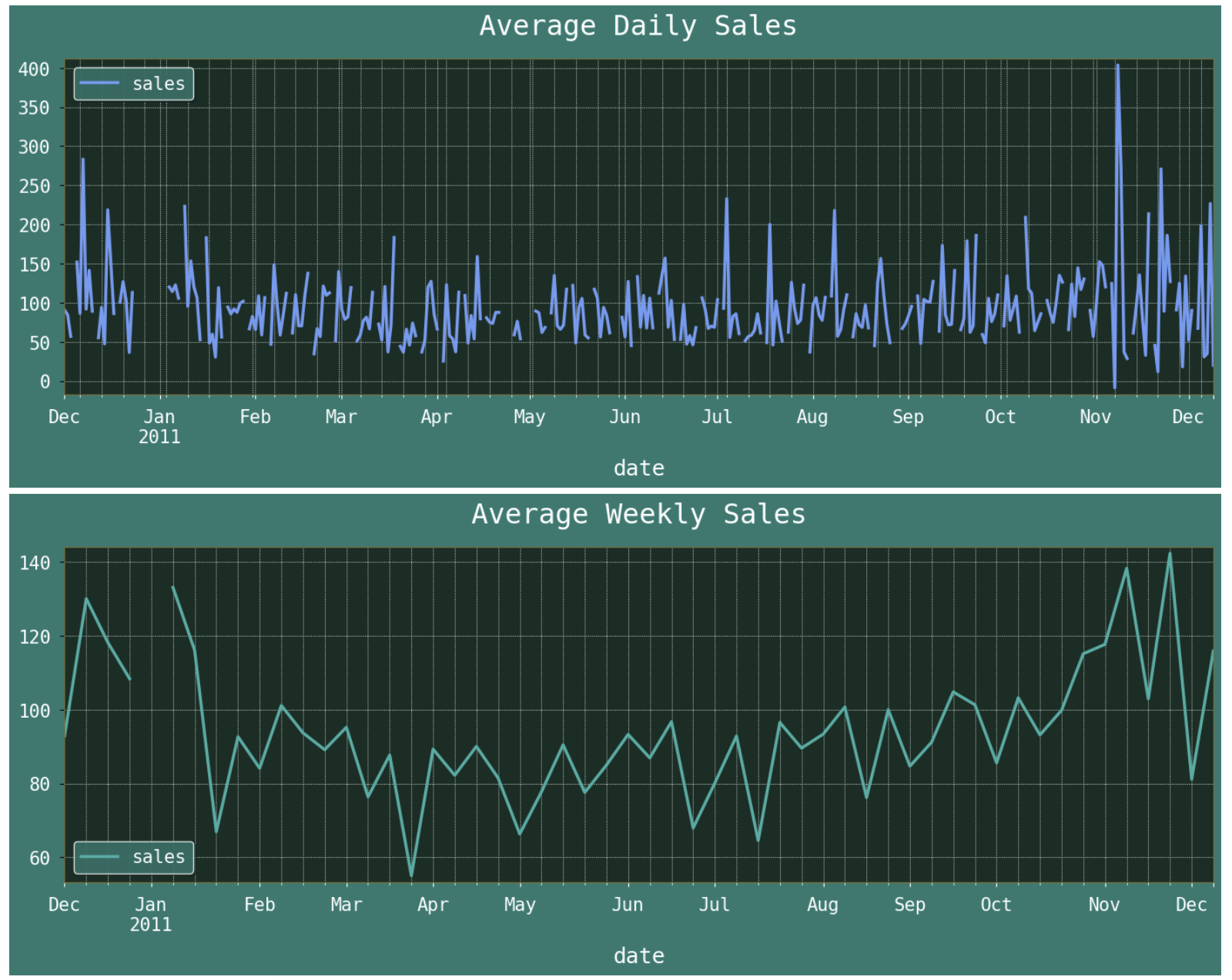
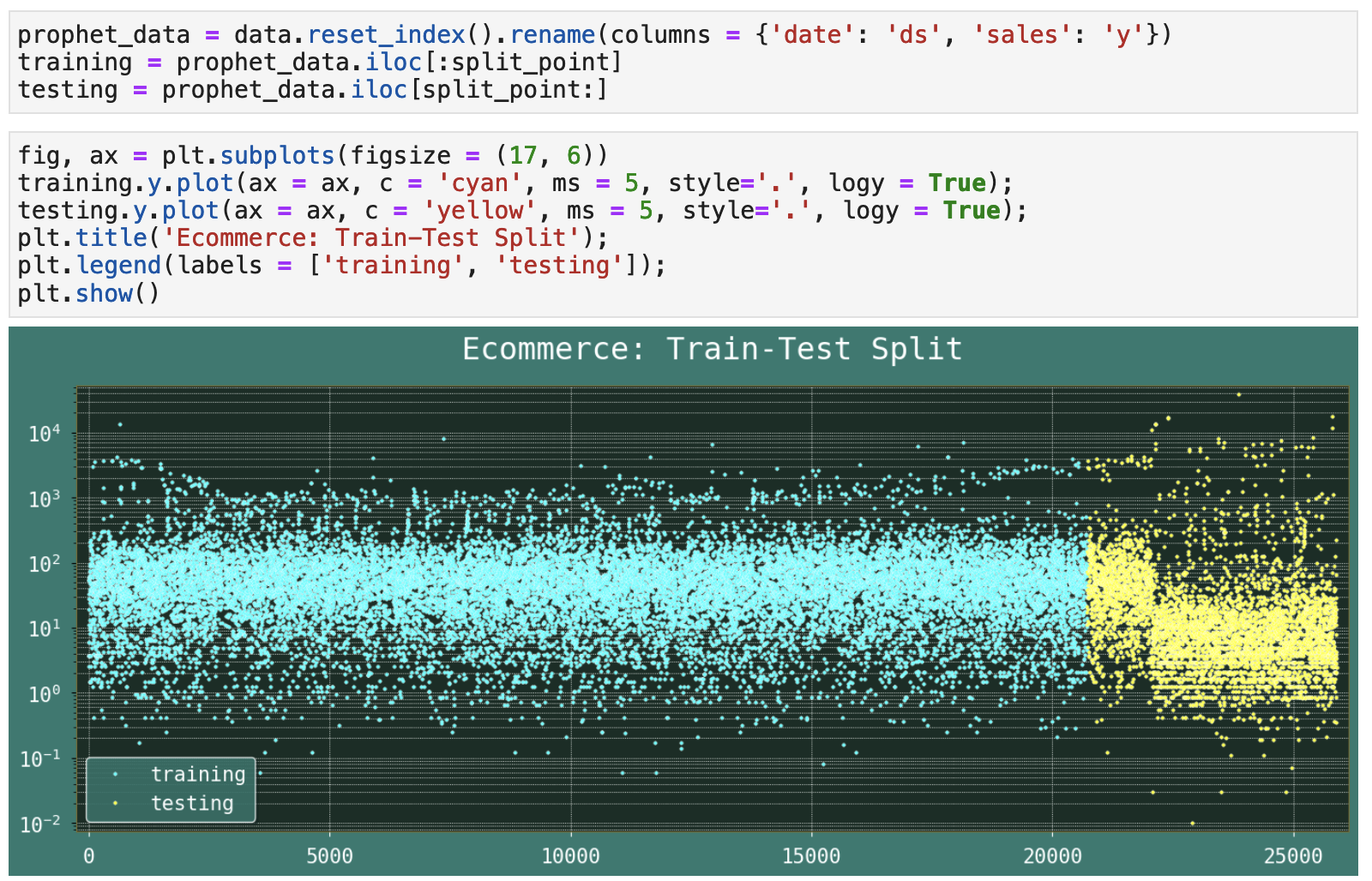
Now, let's visualize the data we are working with. We can see that, as expected, there is a dramatic increase in sales right before the Christmas holiday period, right around black Friday. But with just one year worth of data, the model does not get to know about this as being a trend. This data is all Prophet gets to see. And once again, the portion at the end of the dataset, which in time series data will always be the training or validation data, is drastically different from the majority of the data that comes before it.
Again, I have included plots of the individual records as well as the averaged daily, weekly, and monthly sales. Thus we can see with varying levels of specificity the trends we can expect the model to pick up on.

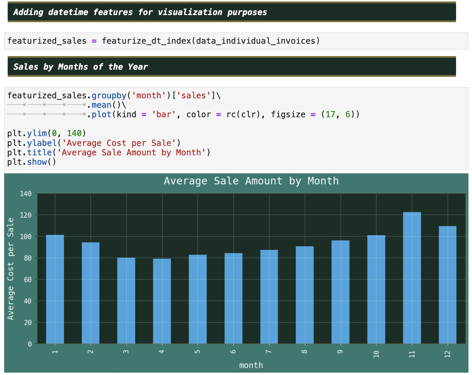
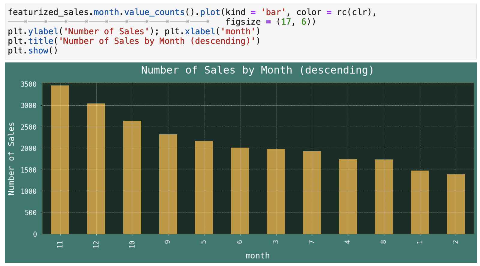
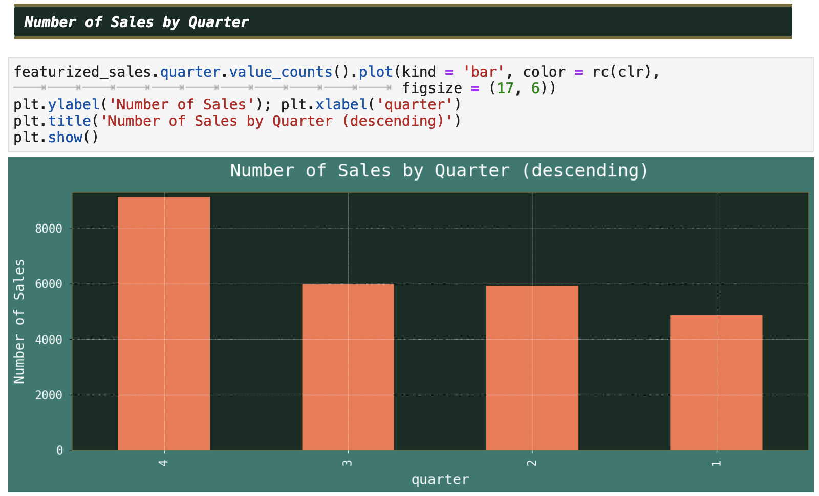
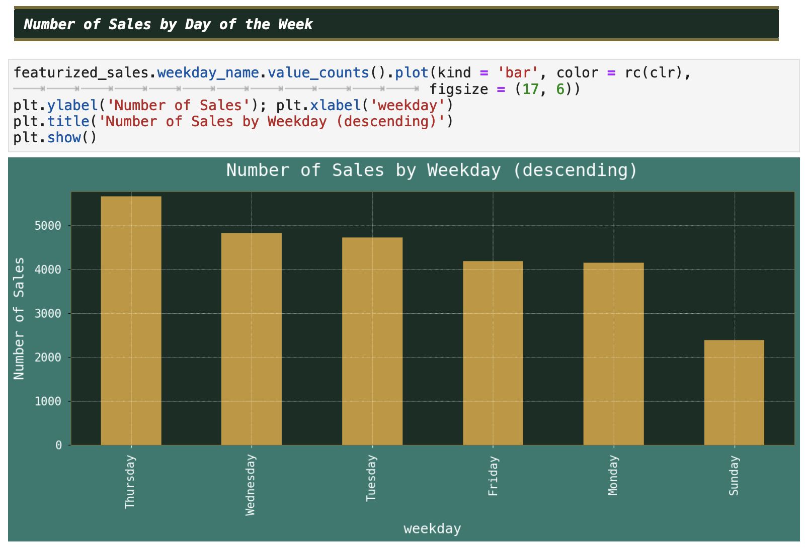
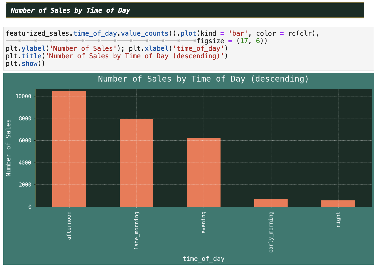
Taking this a bit further, and since we do get to enjoy some level of trends, as opposed to the previous, chaotic Apple stock price dataset, let's see some of these smaller time-frame trends in a bit more detail. Below, we can see the sales numbers by month, quarter, weekday, and time of day, now that I have featurized our data with some extracted datetime features.
| | Top | Apple Stock Data | Initial Data Visualization | Prophet Model | Incoporating Holidays | Future Predictions | Ecommerce Data | Ecom Visualization | Ecom Prophet | Energy Consumption Data | Energy Visualization | Importance of Trends | Energy Prophet | Energy Forecasting | Energy Results | Energy Future Predictions | | ||
|---|---|---|
| ✺ Ecommerce: Prophet Model ✺ |
Based on the visualization above, it seems like our data has some moderately glaring trends that our model should be able to pick up on. So it is time to split the data and try it out. One aspect to keep in mind: the purchase / sales amounts vary greatly, even though there are clear daily, weekly, and monthly trends. Let's see what Prophet thinks.
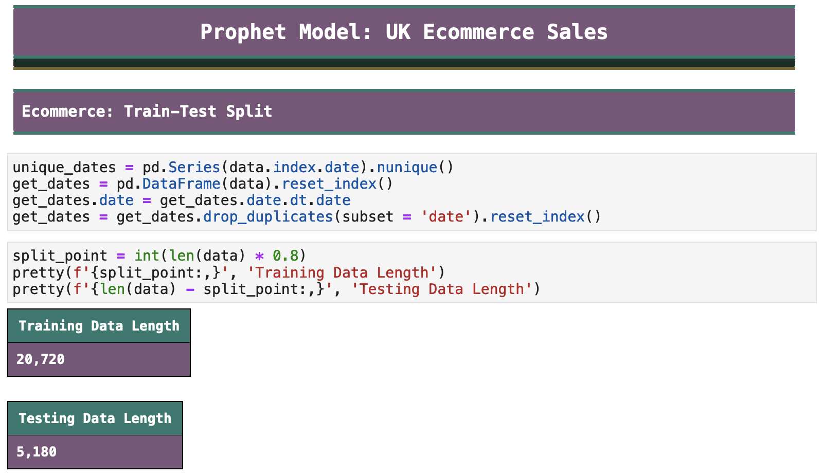
Our train-test split has left us with almost 21,000 records for training and just over 5,000 for testing. Now it is time to prepare our data for Prophet, and we can visualize our train-test split within our data. I have used log values on the y axis to rein in the high end and low end outliers.
Holidays will have a clear affect on our data, so we will once again use Prophet's add_country_holidays() function, this time passing GB as our country name, since the ecommerce data originates from the UK. Because our data only covers a single year, this may or may not have any effect on our model. Again, I am pushing Prophet to really show me what it is capable of. We shall see!
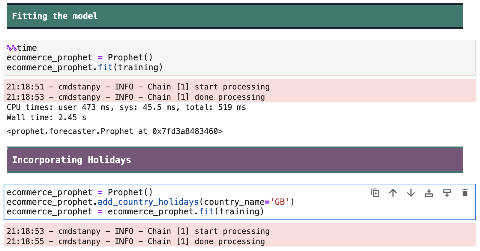
I must comment on the fact that I spent a fair amount of time trying to make sure this data was correct. As you can see below, the holidays that my model observes based on the GB parameter I passed to add_country_holidays() look indentical to US holidays. I investigated this further and made sure that GB was in fact the correct way to refer to the UK within Prophet. I am still a bit baffeled by this. Below are the links to the documentation both for Prophet's add_country_holidays() and for the module that Prophet incorporates within this function.
| ➣ Documentation on Prophet holidays ➣ Documentation on the module used by Prophet to get holidays |
|---|

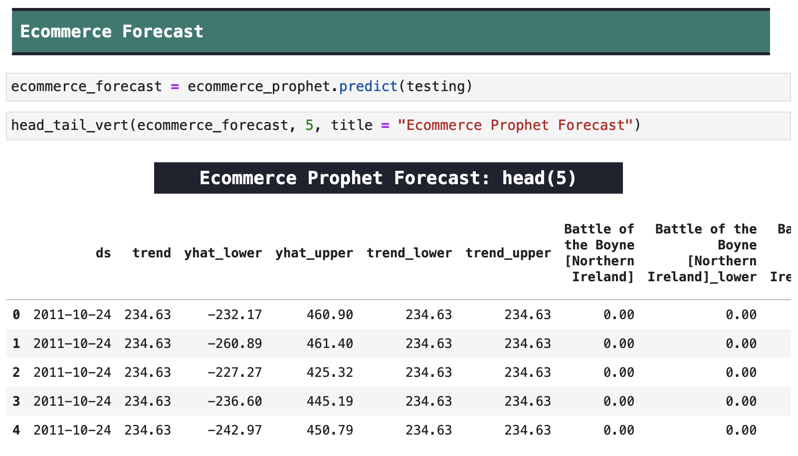
Here are the results of our predict method as well as Prophet's forecast plot. This will be more comprehensible once we break it down further below.

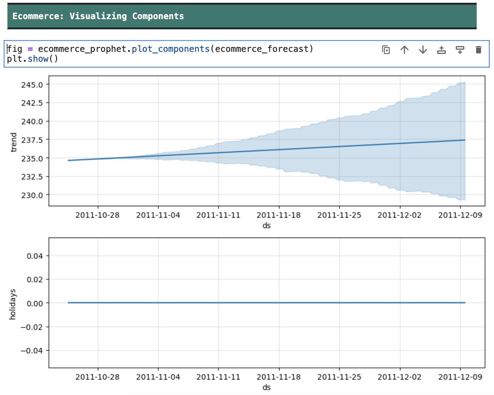
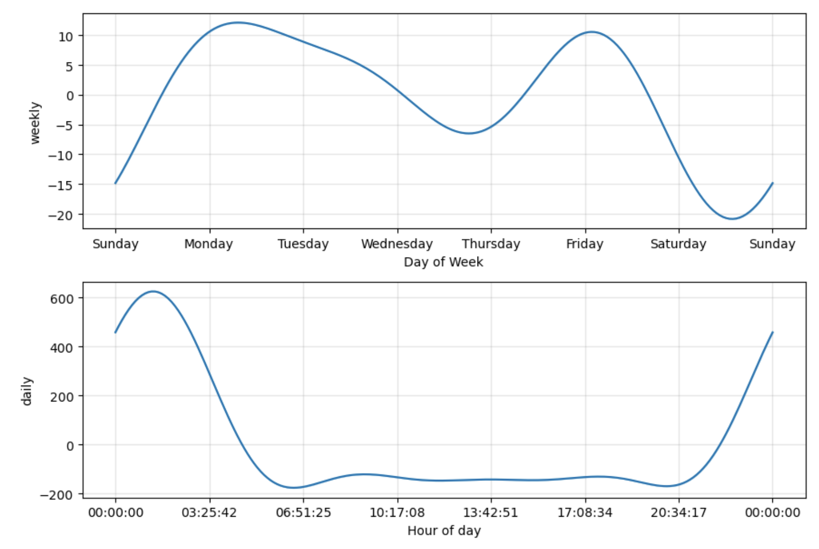
Here we can view our ecommerce Prophet model components. We again can see the trends in weeday and time of day purchasing.
The following is a slightly upgraded version of my previous function for zooming in to view the predictions versus actual values in more detail.
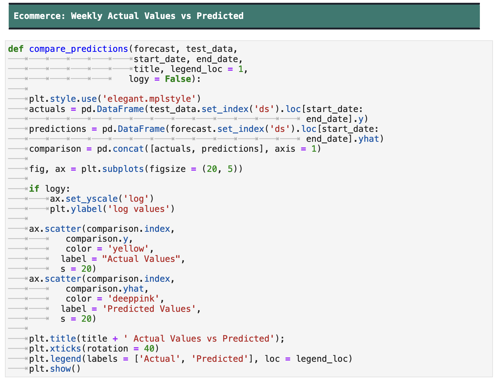
I plot out the values one week at a time below, using log values on the y axis due to the large spread of extreme values, i.e. invoices with much higher or much lower totals than the averages.
It is clear to see how the model becomes less accurate the farther out the predictions get. Also note that the dates for evaluation begin at the end of October, which is just before the holiday shopping starts to cause increases in sales in our data. Surprisingly, the model actually predicts even higher sales than the actual values during the time when the spending was at its highest, during the holidays.
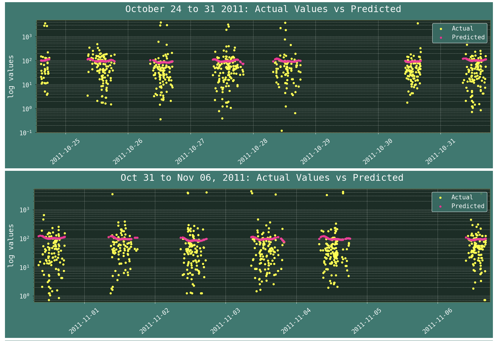
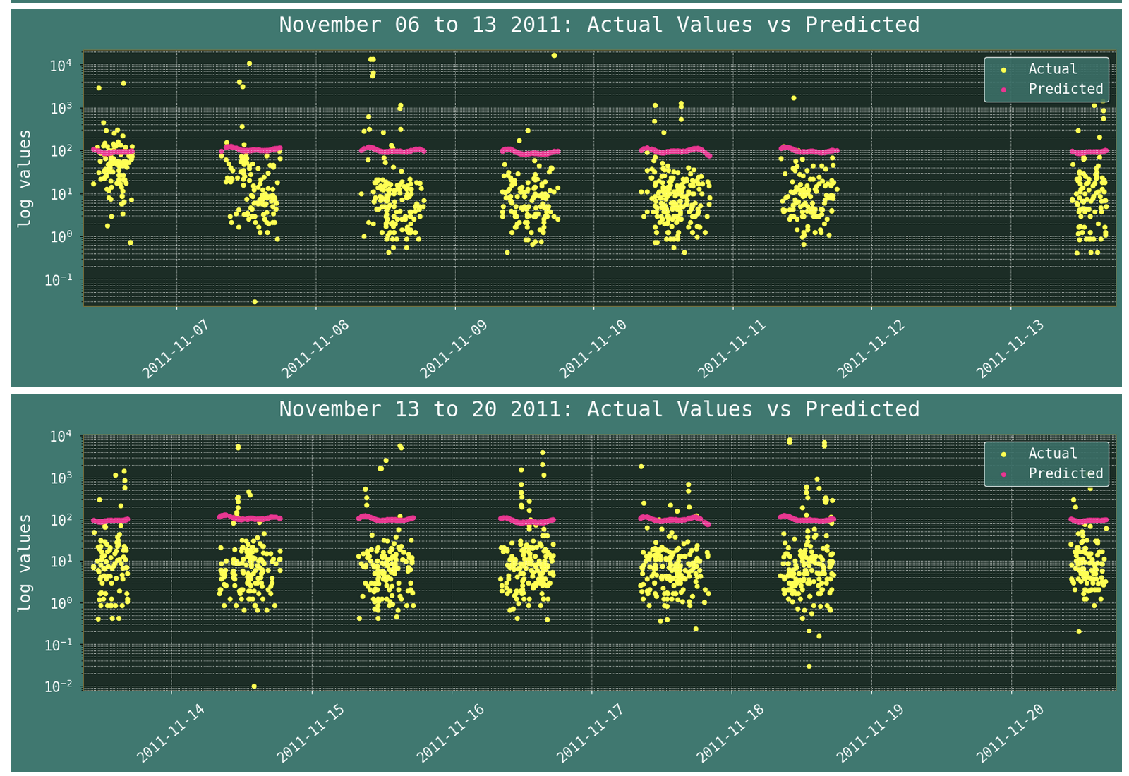
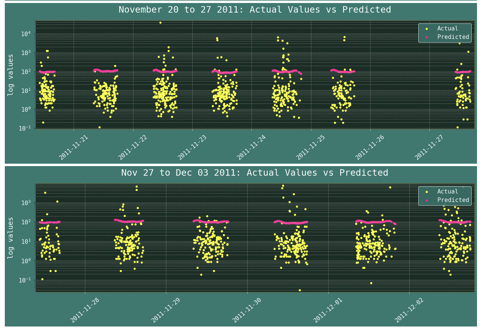
Looking at the error metrics, I realized that I might have thrown Prophet a little too much of a challenge. And if I had a great deal more data from the same dataset, I would love to investigate this further.
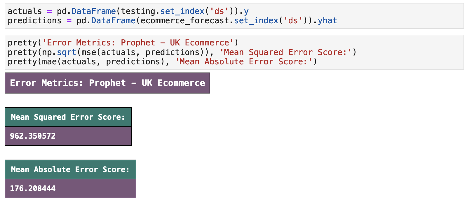
Because of the wild metrics returned above, I calculated the average accuracy of each prediction (below) and found that yes, I definitely gave Prophet a job that it was not really up for. Don't worry though. The next dataset is very Prophet friendly!

| | Top | Apple Stock Data | Initial Data Visualization | Prophet Model | Incoporating Holidays | Future Predictions | Ecommerce Data | Ecom Visualization | Ecom Prophet | Energy Consumption Data | Energy Visualization | Importance of Trends | Energy Prophet | Energy Forecasting | Energy Results | Energy Future Predictions | | ||
|---|---|---|
| ✺ Energy Consumption: the Data ✺ |
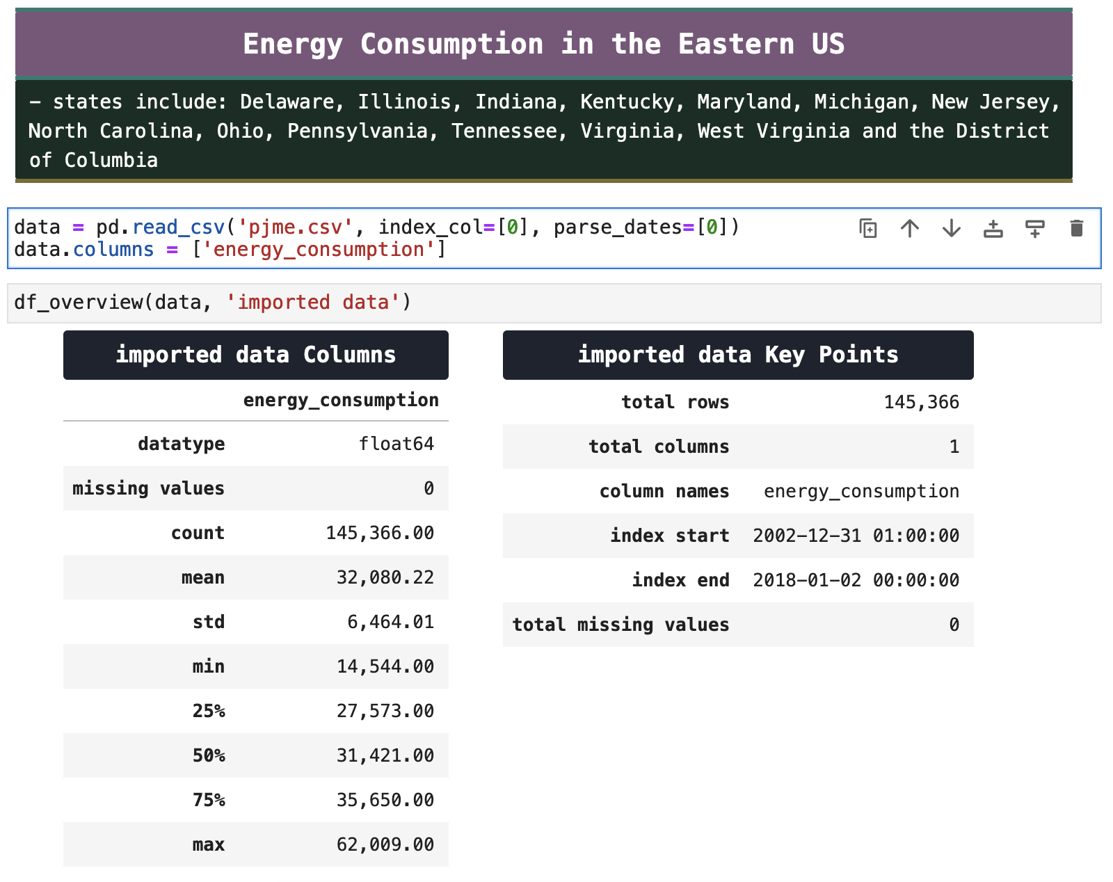
I could not leave you unsatisfied only witnessing Prophet's shortcomings, admittedly that I threw directly in its face. So I am incorporating this final dataset, giving Prophet a chance to shine. This is perfect for Prophet. It is a time series dataset full of trends, with over 145,000 records, and everything Prophet needs to make accurate predictions.
This data comes from PJM Energy, which provides energy for the states listed in the markdown cell below. It contains hourly energy consumption and covers the years 2002 through 2017, so there is plenty for Prophet to work with and find patterns and trends.
| | Top | Apple Stock Data | Initial Data Visualization | Prophet Model | Incoporating Holidays | Future Predictions | Ecommerce Data | Ecom Visualization | Ecom Prophet | Energy Consumption Data | Energy Visualization | Importance of Trends | Energy Prophet | Energy Forecasting | Energy Results | Energy Future Predictions | | ||
|---|---|---|
| ✺ Energy Consumption: Visualization ✺ |
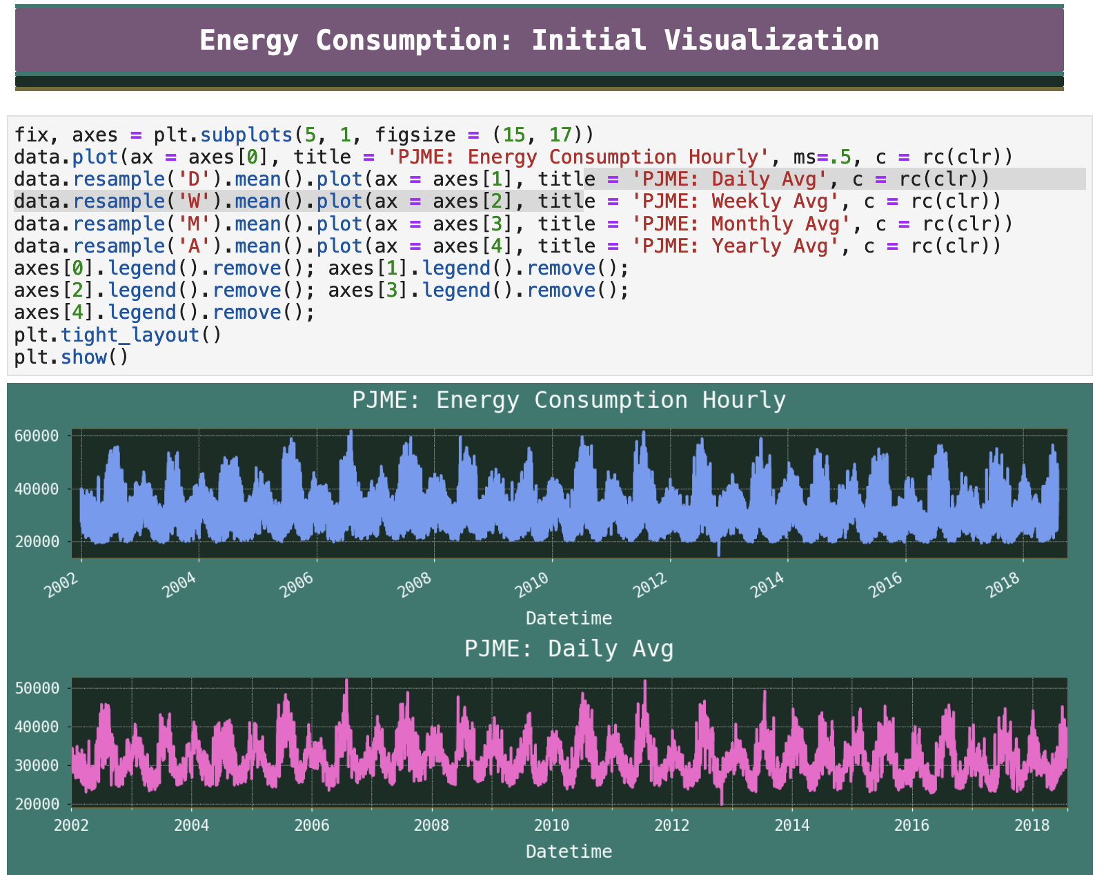
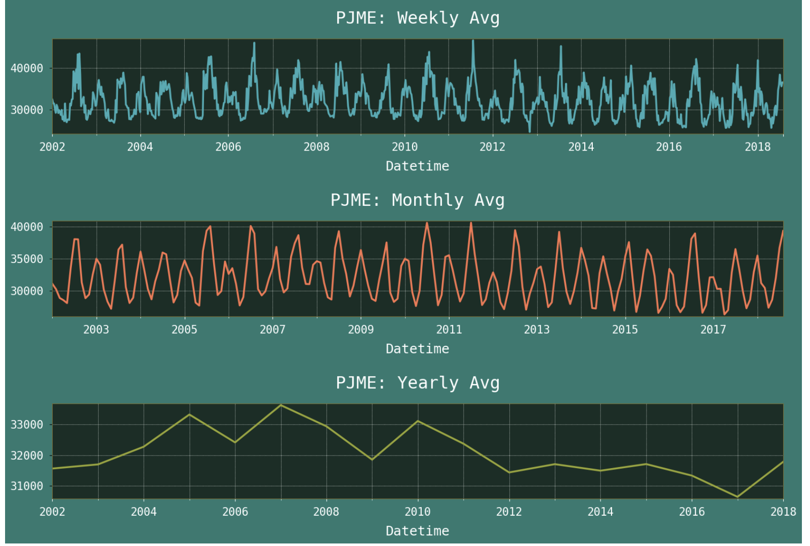
With just the first visualization, we can see BEAUTIFUL trends that Prophet will be ever so happy to feast on. Trends continue to be ever-present in the daily averages, weekly, and monthly averages, as is quite clear in the visualizations below.
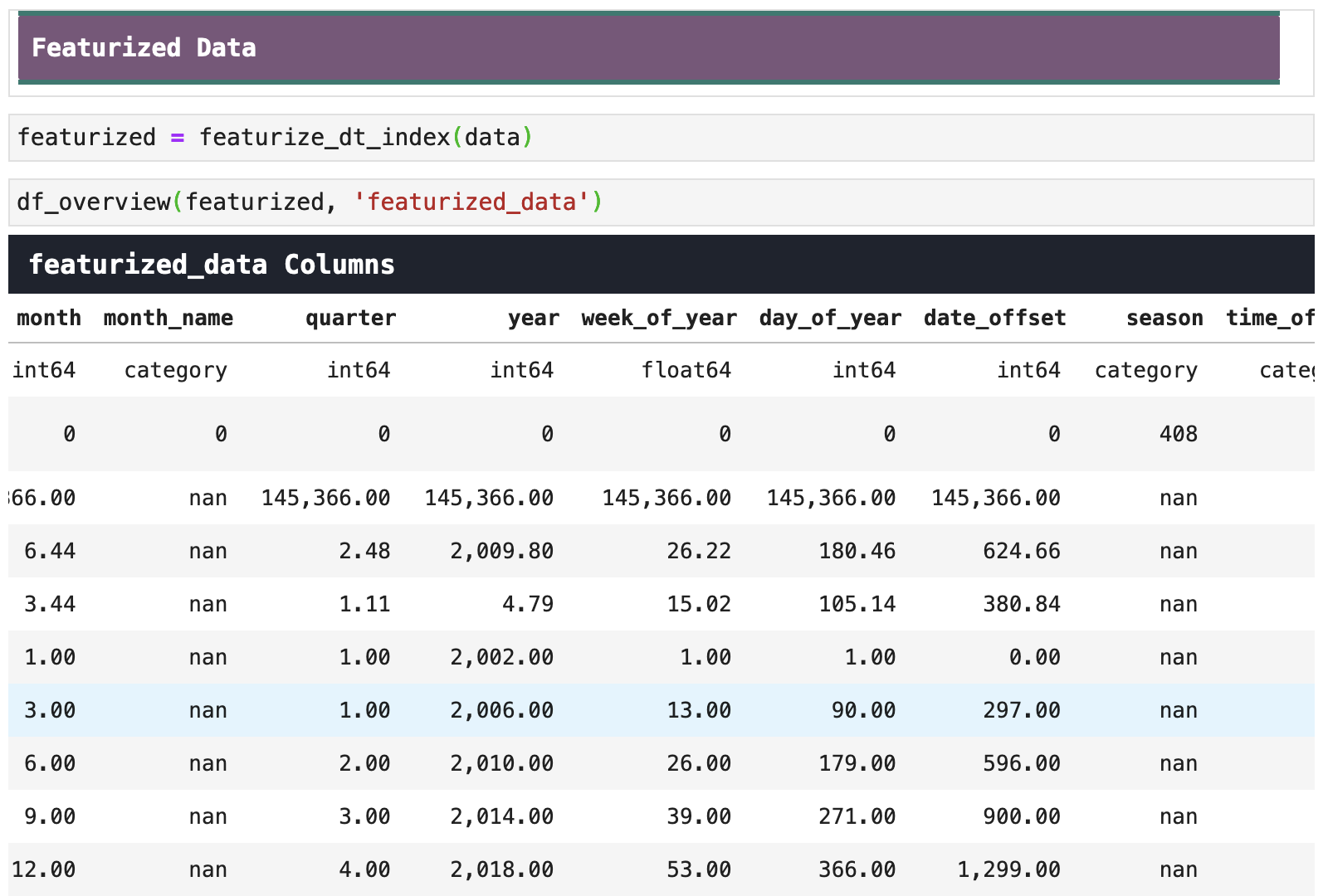
To look at these trends more closely, I will again featurize the datetime portion of our data. Below you can see the new feature columns that we will plot in the next section.
| | Top | Apple Stock Data | Initial Data Visualization | Prophet Model | Incoporating Holidays | Future Predictions | Ecommerce Data | Ecom Visualization | Ecom Prophet | Energy Consumption Data | Energy Visualization | Importance of Trends | Energy Prophet | Energy Forecasting | Energy Results | Energy Future Predictions | | ||
|---|---|---|
| ✺ Energy Consumption: Trend Importance ✺ |
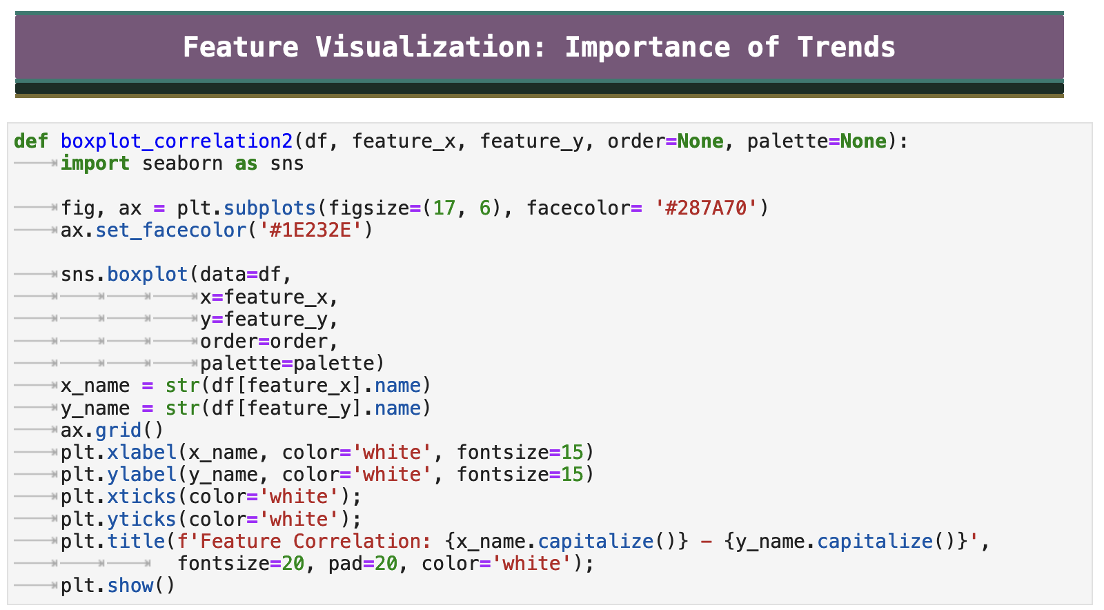
The following function will take our data and show us the correlation between the energy consumption and the features just added to the data based on the datetime portion of the time series.
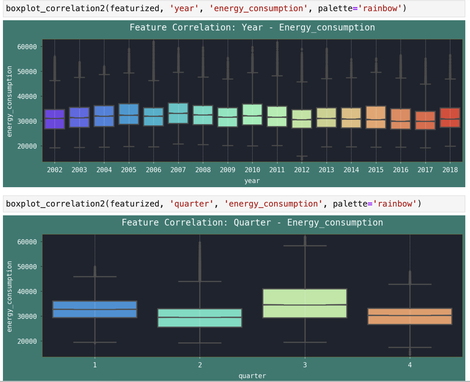
When we look at the years in the first plot below, it is clear that year after year, energy consumption is fairly stable. Perhaps the higher years were ones with more extreme temperatures in the winter or summer, increasing the demand on indoor temperature control during those times. But overall the energy consumption remains consistent each year.
In the second plot, however, we look at quarters of the year. The third quarter experiences a significant increase in energy consumption. And this makes sense, because many of the states who rely on PJM Energy for their various forms of energy are in parts of the US that experience their most extreme temperatures in July and August, which fall in the third quarter of the year.
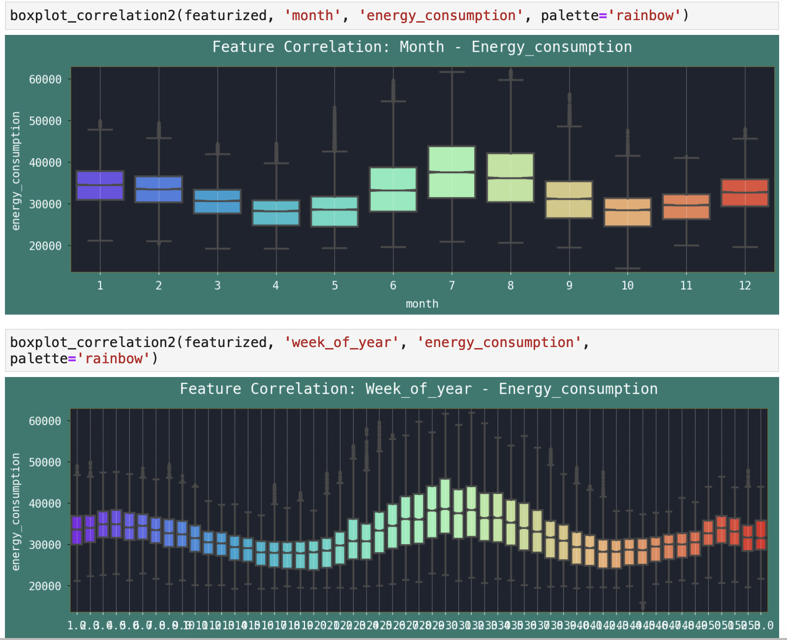
And just as mentioned above, when we look at the data by month, represented by the number of the month, it is clear that July and August are indeed the months that cause the third quarter of the year to be the highest for energy consumption. Beyond summer months, we can also see a slight increase in the coldest months of the year, when consumers require more energy for heating. The second plot below, which shows energy consumption by week of the year, further breaks down this trend and shows it in even more detail.
Days of the week tend to be pretty stable, aside from weekends, when it seems there is slightly less energy consumption. One might assume this is because people spend less time indoors and more time doing outdoor activities, thus requiring less energy. Or perhaps it is because fewer people are working on the weekends, therefore offices and other buildings where people work are not running their temperature control at the same levels.

When we look at the time of day, we can see that the most energy consumption is in the afternoons and evenings when people are home from work and school and rely more on their in-home energy. The lowest energy consumption is in the middle of the night and early mornings, when temperatures are generally more moderate in the more southern states and when office buildings would not be running their temperature control as much.
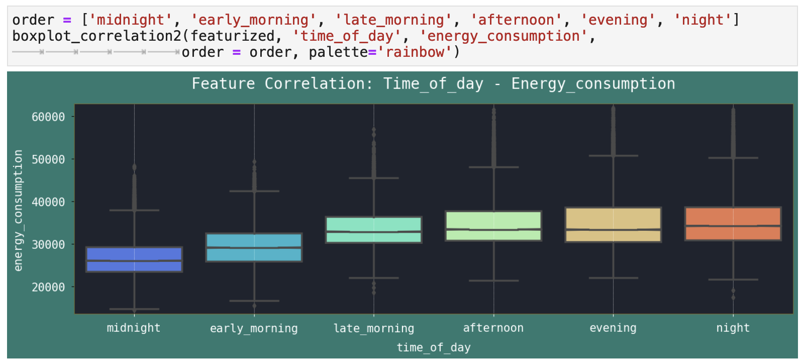
And we can zoom in for more detail on this dynamic by looking at the hours of the day. The greatest amount of energy consumption is right around dinner time in the US, when the most energy is being used for cooking, entertainment, etc.
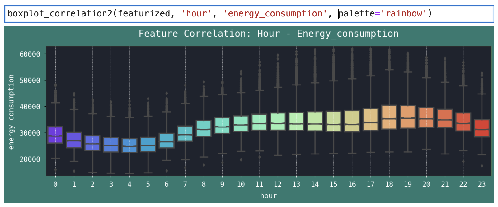
These trends are all going to be extremely helpful in leading Prophet to more accurate predictions. Just like you or I rely on observations of patterns and trends, Prophet needs similar recurring patterns in the data to be able to have a hope of knowing what will occur in the future.
| | Top | Apple Stock Data | Initial Data Visualization | Prophet Model | Incoporating Holidays | Future Predictions | Ecommerce Data | Ecom Visualization | Ecom Prophet | Energy Consumption Data | Energy Visualization | Importance of Trends | Energy Prophet | Energy Forecasting | Energy Results | Energy Future Predictions | | ||
|---|---|---|
| ✺ Energy Consumption: Prophet Model ✺ |
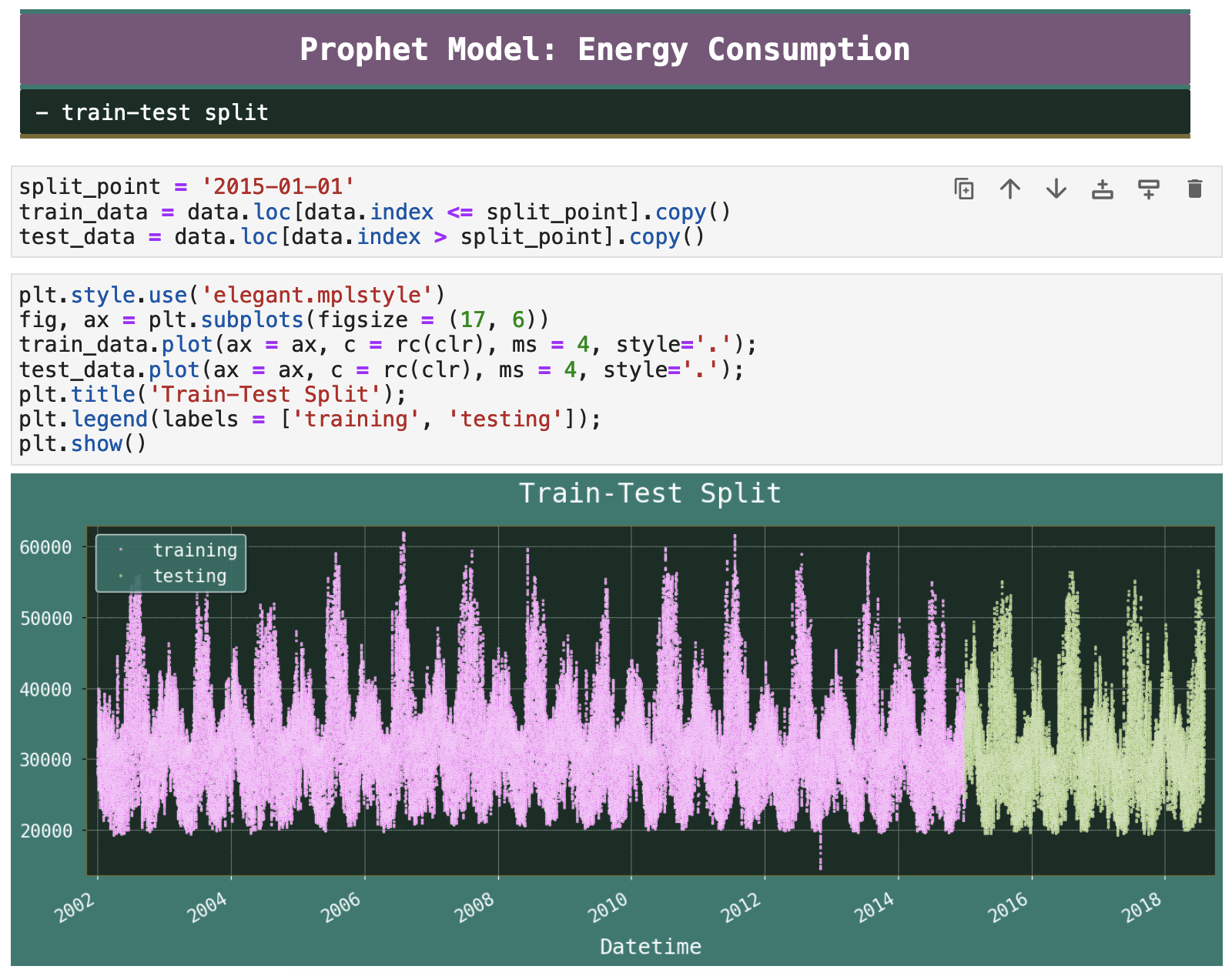
Just as we have done with our previous models, we will split the data so that 80% is used for training and 20% for testing and validation.
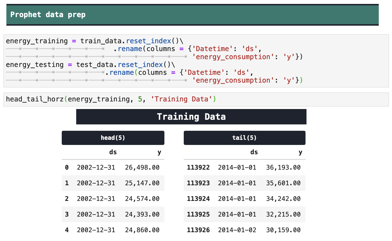
And once again, we prepare the data for Prophet's to digest:
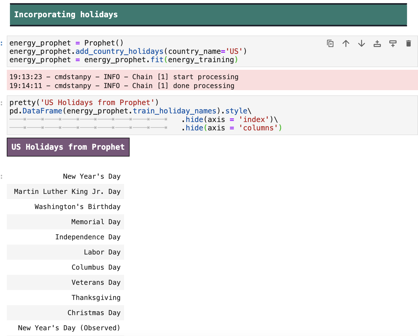
Holidays could certainly have an effect on energy consumption, so once again, we will include the US holidays for our model to hopefully find more trends and patterns.
| | Top | Apple Stock Data | Initial Data Visualization | Prophet Model | Incoporating Holidays | Future Predictions | Ecommerce Data | Ecom Visualization | Ecom Prophet | Energy Consumption Data | Energy Visualization | Importance of Trends | Energy Prophet | Energy Forecasting | Energy Results | Energy Future Predictions | | ||
|---|---|---|
| ✺ Energy Consumption: Forecasting ✺ |
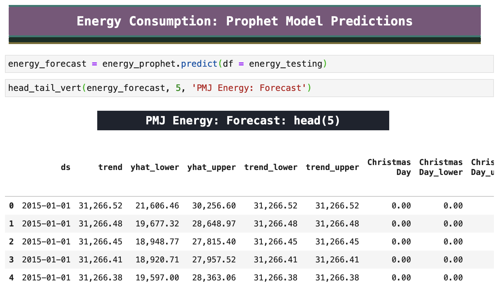
And now it is time to forecast. Below you see Prophet's forecast data based on the model training above. Below, we will get to see what level of accuracy we were able to reach!
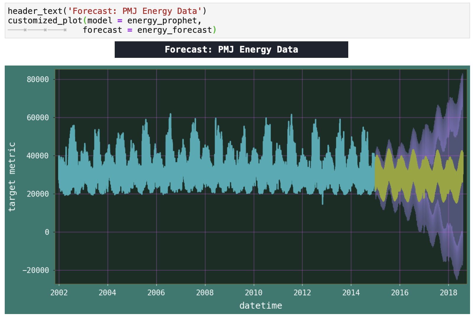
The following is a much more meaningful plot of our forecast than the ones we have seen previously. Where the others were more chaotic, this one shows a much more clear prediction and confidence interval relationship.
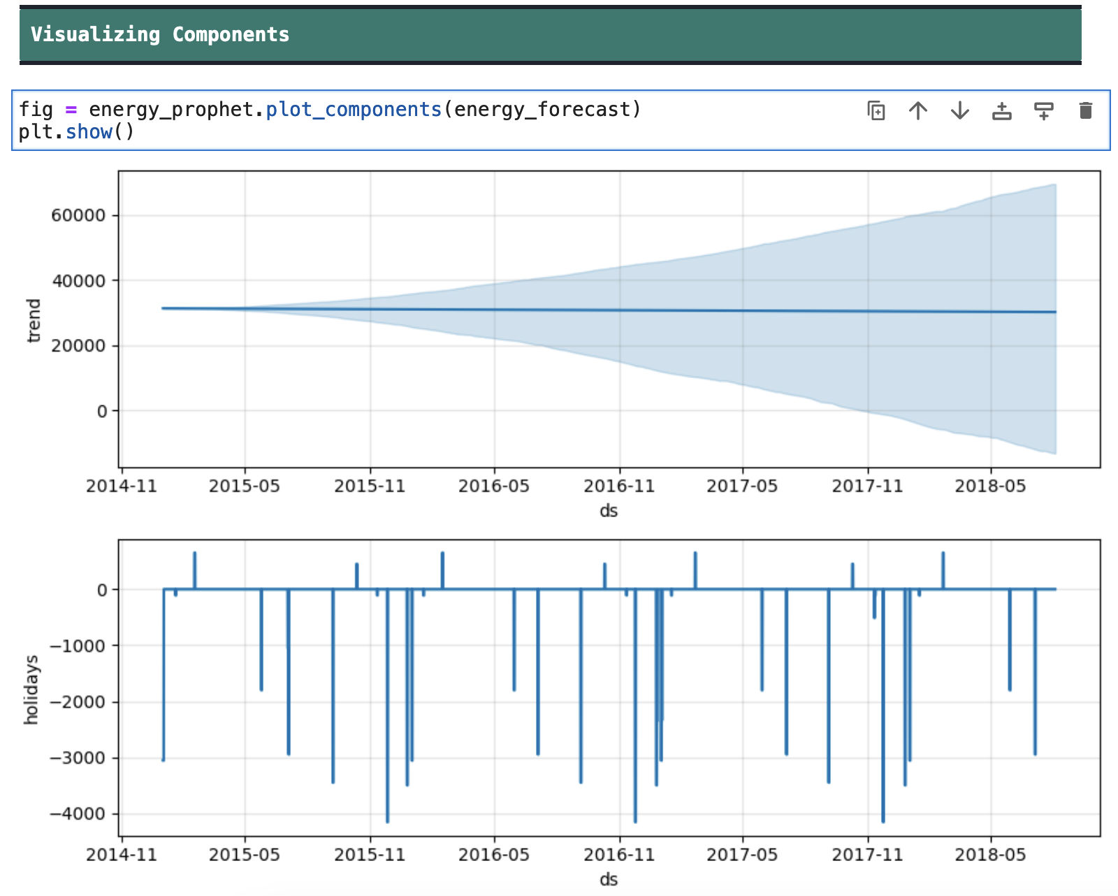
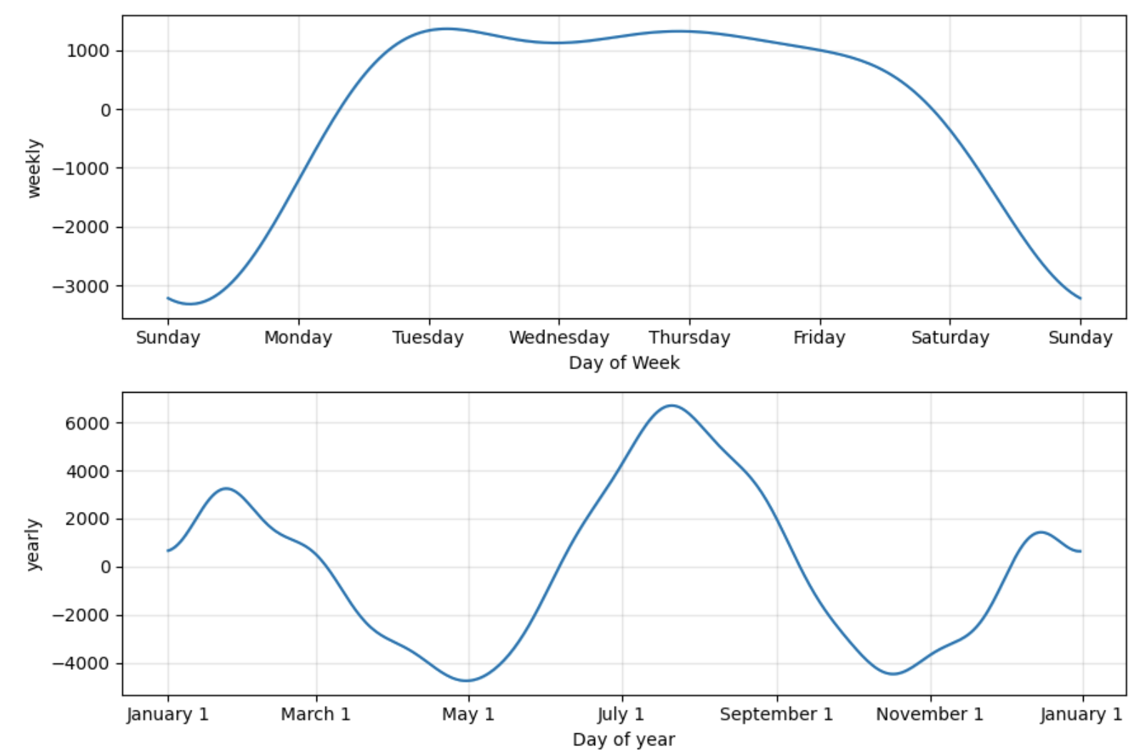
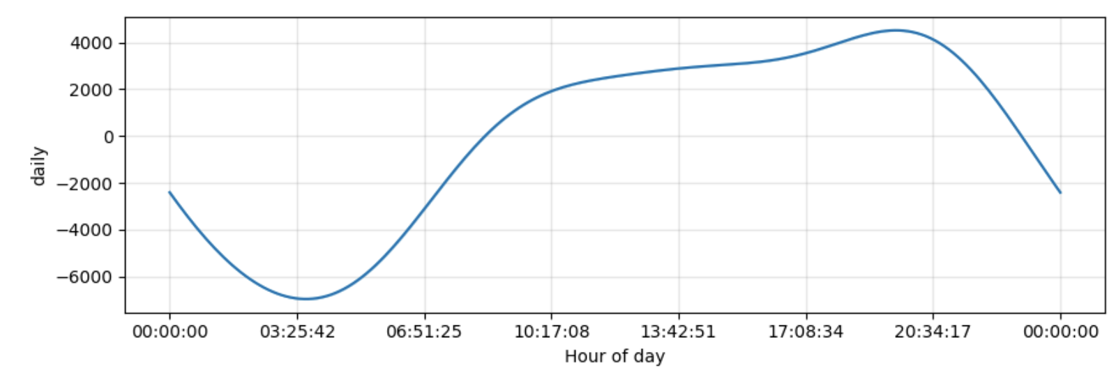
Viewing the components of our model, we can see that the holidays play into our model's predictions to a fair degree. We can also see that Prophet also picked up on our previous observations on weekday energy use. Additionally, it confirms our observations of the patterns of energy consumption over the months of the year as well as the times of the day.
| | Top | Apple Stock Data | Initial Data Visualization | Prophet Model | Incoporating Holidays | Future Predictions | Ecommerce Data | Ecom Visualization | Ecom Prophet | Energy Consumption Data | Energy Visualization | Importance of Trends | Energy Prophet | Energy Forecasting | Energy Results | Energy Future Predictions | | ||
|---|---|---|
| ✺ Energy Consumption: the Results ✺ |
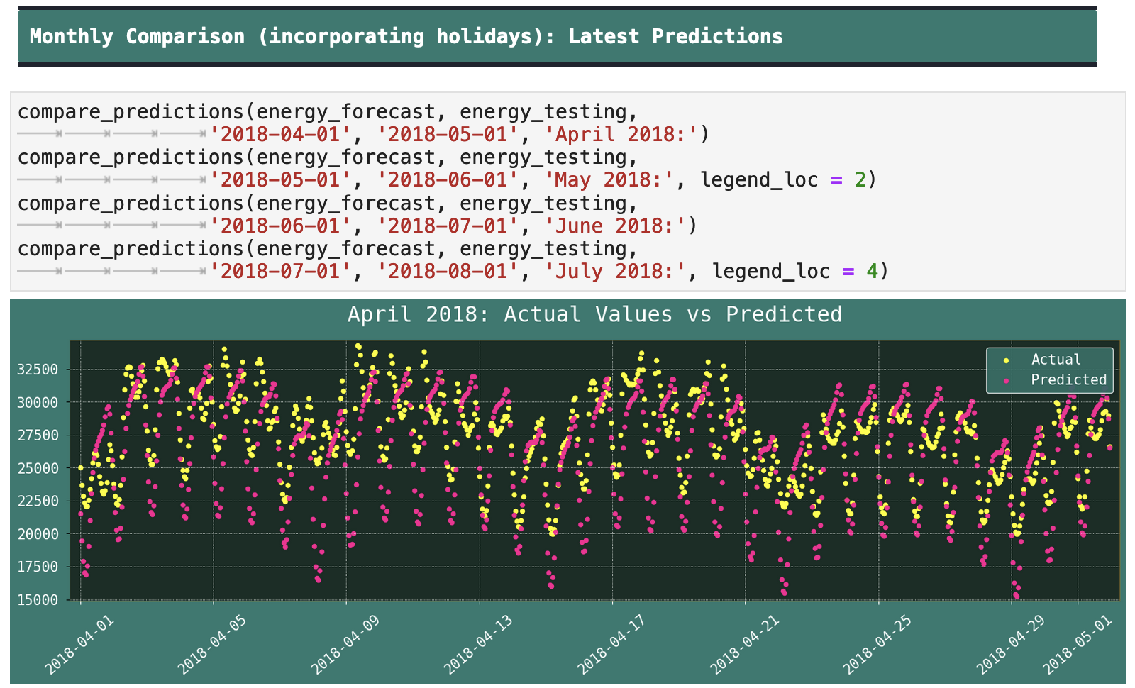
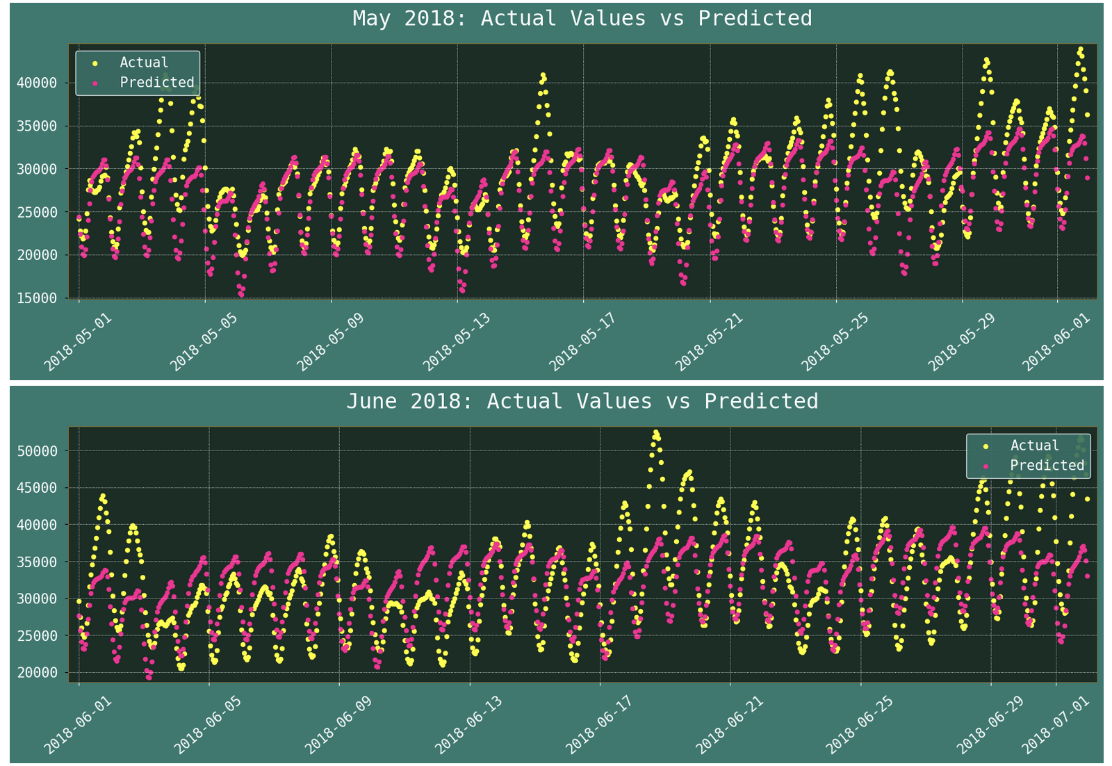
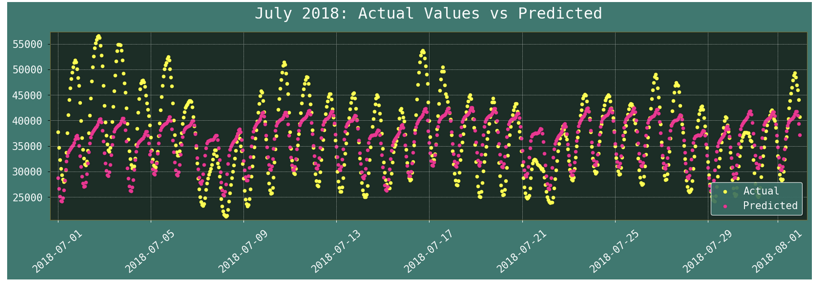
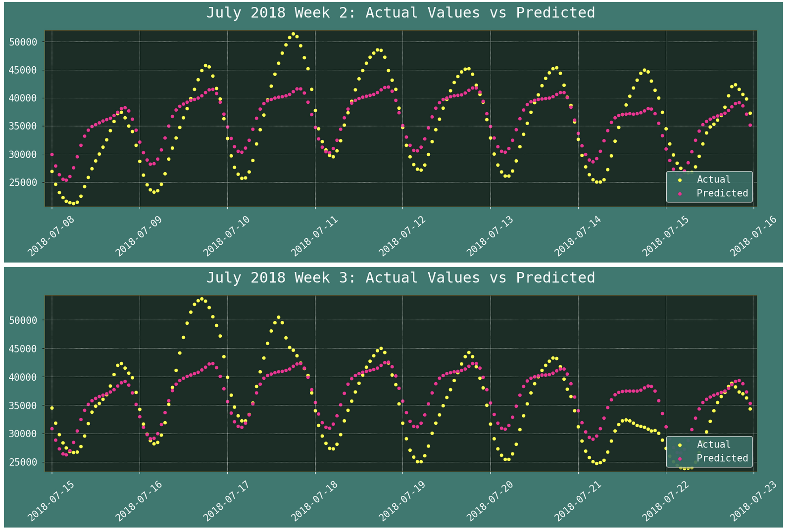
With this data, we get much more satisfying prediction to actual value comparisons. First, we will look at monthly comparisons for the validation months that are closest to the training data.
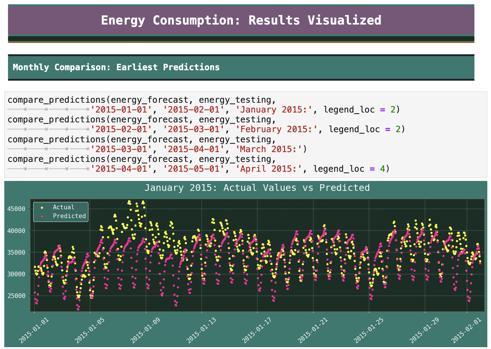
We can see that the model is much more capable of tracking the energy consumption data than it did the Apple stock prices or the sales data previously.
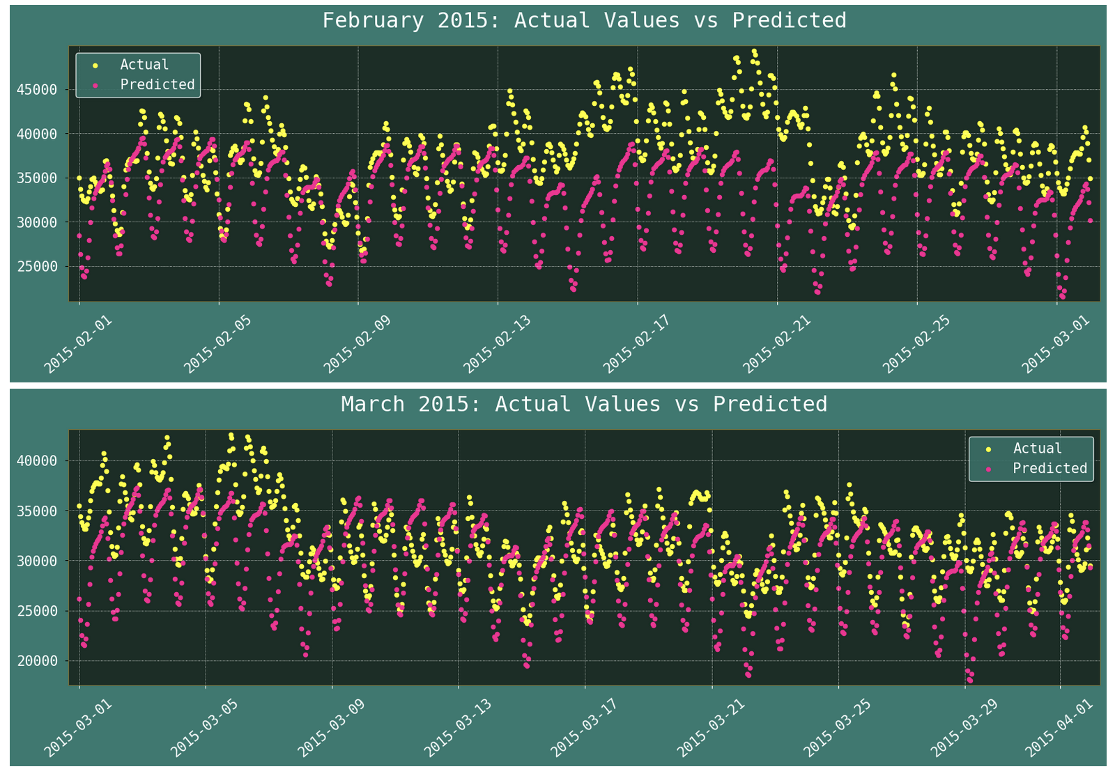
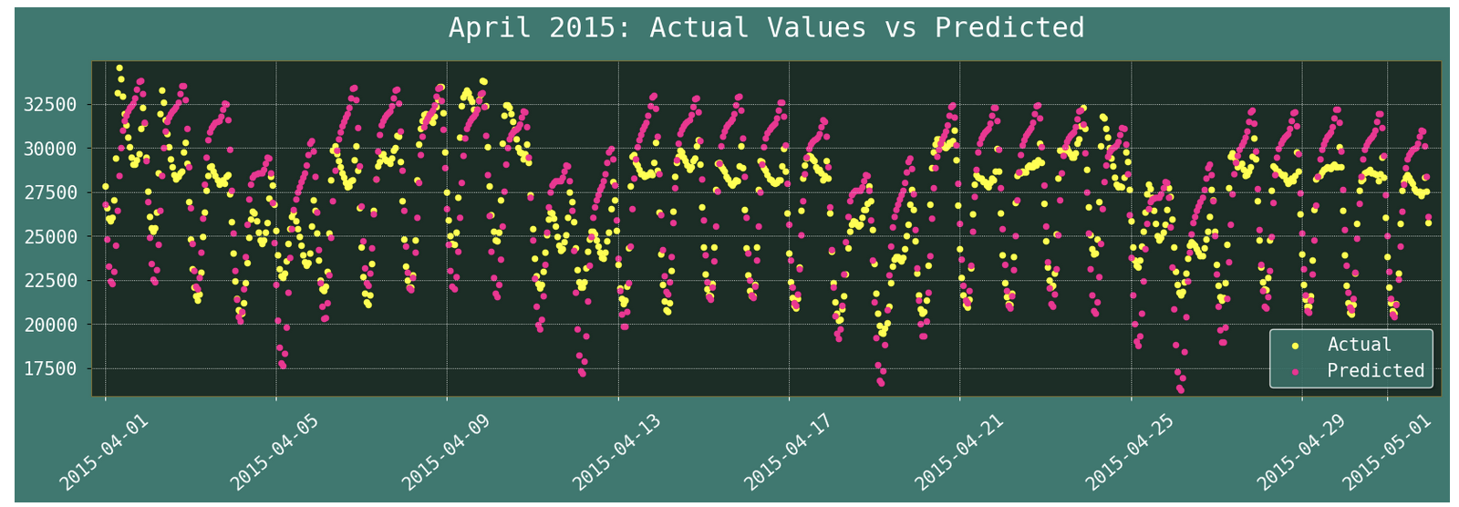
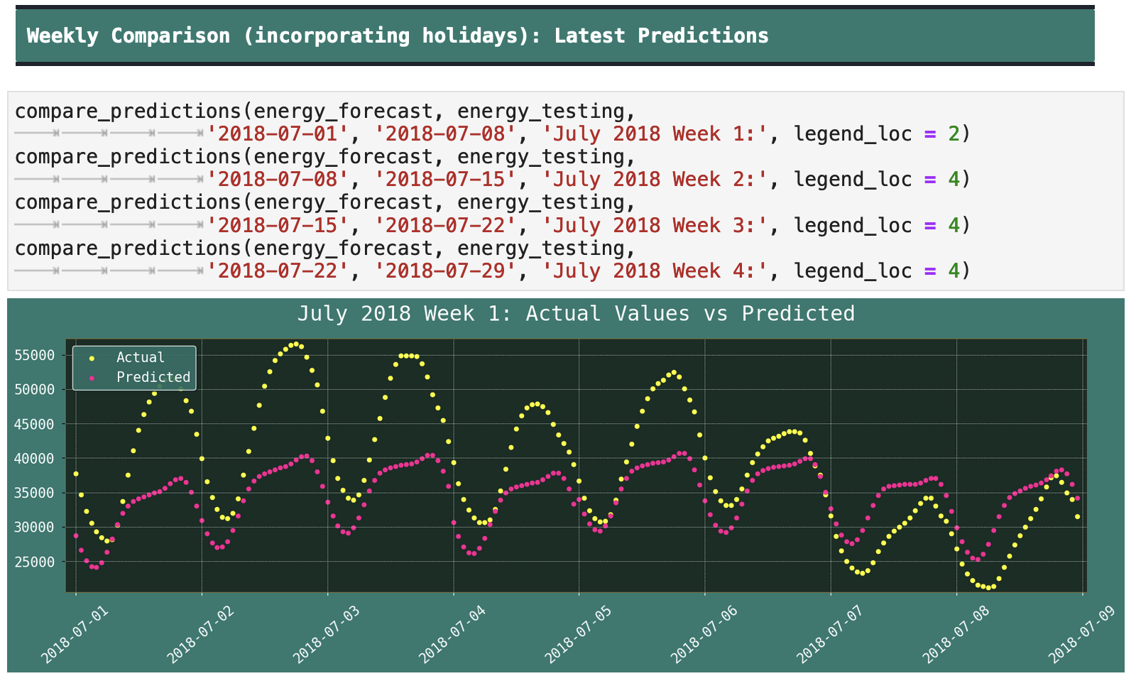
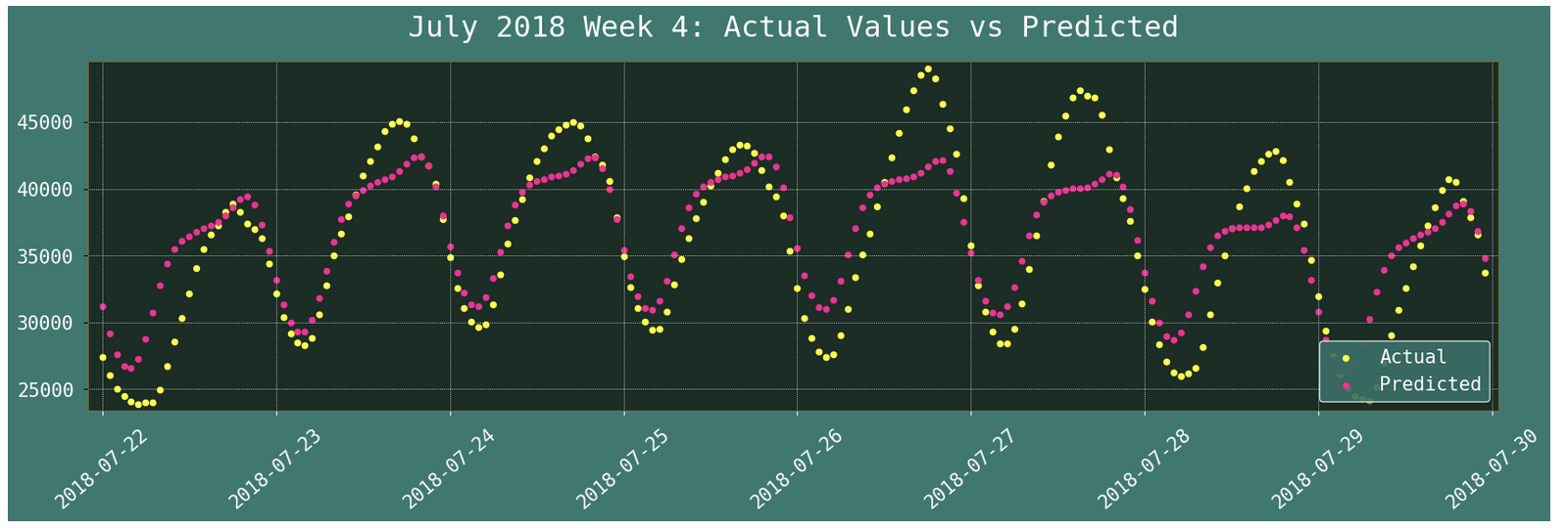
When we zoom in even further, we can see how Prophet even picked up on the daily and hourly energy consumption trends.
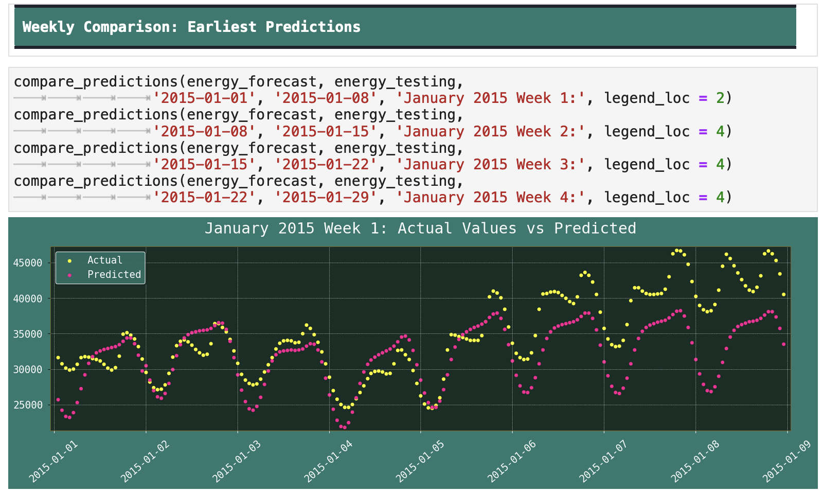
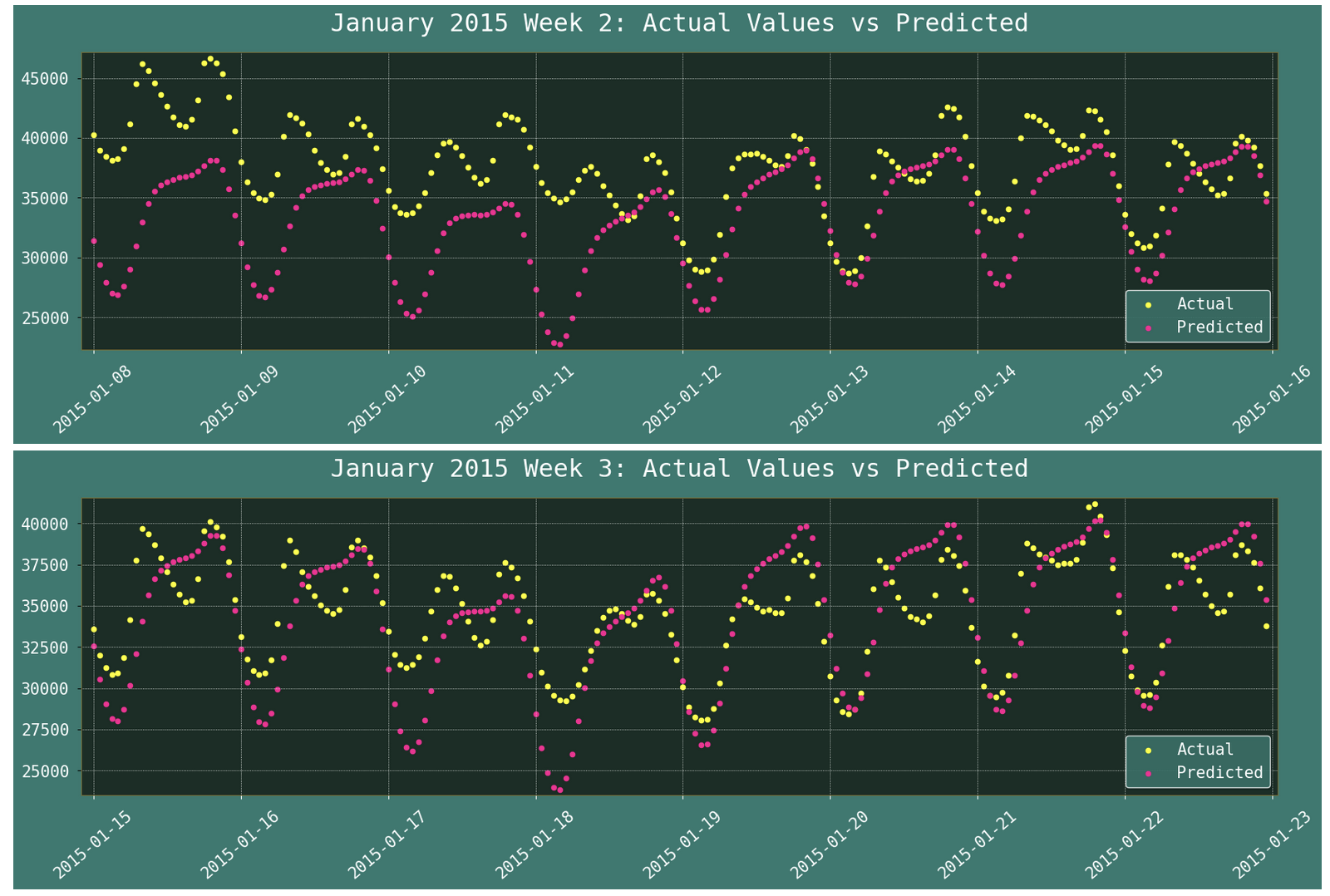
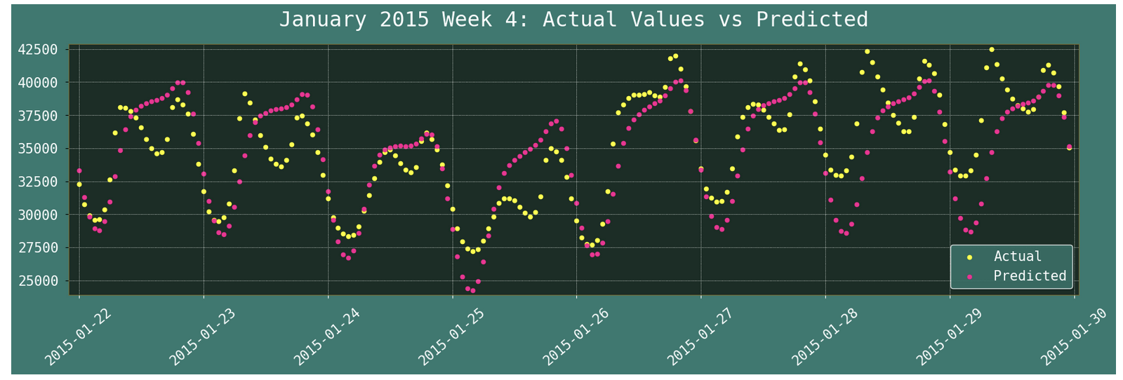
Whereas before, testing data and predictions occurring farther out from the training data presented a lower level of accuracy in predictions, with this data that contains far more trends, we can see that Prophet is even able to make good predictions out into the more distant future.
Weekly comparison also is still fairly close, but just slightly less accurate than the earlier predictions in the weeks closer to the training data.
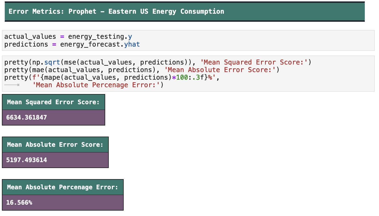
And when we look at our error metrics, our percentage error rate is around 16.6%, which leaves us at around 84% accuracy. While this is still a B grade in the minds of those of us who always strove for high As in school, in comparison to the earlier data we fed Prophet, this is a great improvement.
| | Top | Apple Stock Data | Initial Data Visualization | Prophet Model | Incoporating Holidays | Future Predictions | Ecommerce Data | Ecom Visualization | Ecom Prophet | Energy Consumption Data | Energy Visualization | Importance of Trends | Energy Prophet | Energy Forecasting | Energy Results | Energy Future Predictions | | ||
|---|---|---|
| ✺ Energy Consumption: Future Predictions ✺ |
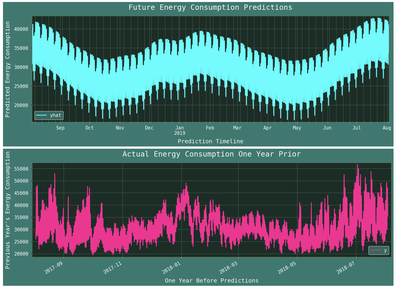
And now that we have a model that predicts with a better level of accuracy, we will train again on the entirety of the data and predict into the future.

The following code plots the future predictions as well as the same time period one year prior to predictions for comparison.
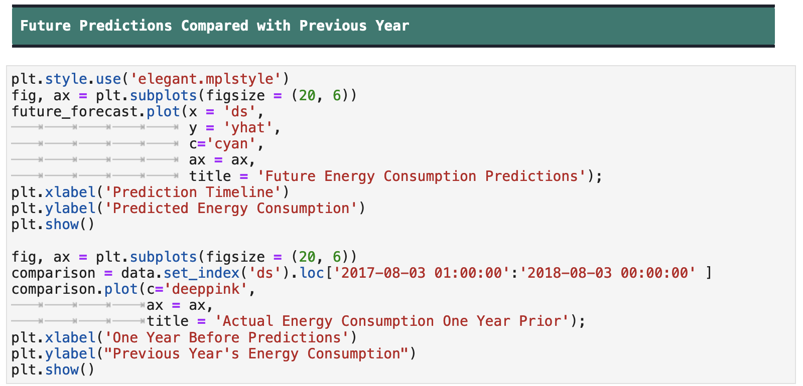
As we can see, the model is following the overall trend of the previous year. It is a much more generalized prediction, but the overarching shape is consistent.
Trends are important. That is all. Thank you.
Seriously though: trends are important. Just as you or I need prior patterns and trends upon which to base our assumptions on the world around us or of what is to come, machine learning models need the same. The fact that they can compute faster is a lovely aspect of their nature. But at the end of the day, if they are fed haphazard and chaotic data, such as the hopes and fears of humans as seen through the effects thereof on the stock market, there is little to be gained from using Prophet as a model. But if you have time series data with mega seasonal trends, Prophet is your guy! But no matter how easy, low-code, or user-friendly a model is, it cannot do the job well without a good data scientist human behind it. I don't care what ChatGPT says. 😁
Thanks for joining me on this journey! Happy data wrangling!
| Evan Marie 🌎: EvanMarie.com | EvanMarie@Proton.me | Linked In | GitHub | Hugging Face | Jovian.ai | CodeWars | TikTok | Discord ⇨ ✨ EvanMarie ✨#6114 | |
|---|
