| Jupyter Notebooks | Documentation |
This notebook is a compilation of the documentation linked above, both the docs for IPyWidgets and the sample notebooks available on the site. I do not claim ownership of any of this material, and the only parts that are my own are my experimentation with the functions and extra explanations based on my own understanding of working with this module.
Jump to: ● Top ● Widget Intro ● Widget Events ● Widget Properties ● Linking Widgets ● Numeric Widgets ● Widget Styling ● Boolean Widgets ● Widget Layout ● Selection Widgets ● Image Layout & Sizing ● String Widgets ● Image Manipulation ● Play Animation ● Image Browser ● Tag Widgets ● Layout Templates ● Date and Time ● Using Interact ● File Upload ● Interactive ● Game Controller ● Interactive Output ● Containers and Layout ● Widgets: Low-Level ● Aligning Widgets ● Asynchronous Widgets ● Output Widgets ● Embedding ● Email Widget ● Math Operations
# !pip install --upgrade ipywidgets
# !pip install --upgrade jupyterlab_widgets
# !pip install --upgrade ipywidgets
%%capture
!pip install bqplot
!pip install ipyleaflet
from urllib.request import urlretrieve
helpers="http://www.evanmarie.com/content/files/helpers/helpers.py"
urlretrieve(helpers, "helpers.py")
import helpers as h
from helpers import p, sp, d, pretty
import ipywidgets as widgets
Jump to: ● Top ● Widget Intro ● Widget Events ● Widget Properties ● Linking Widgets ● Numeric Widgets ● Widget Styling ● Boolean Widgets ● Widget Layout ● Selection Widgets ● Image Layout & Sizing ● String Widgets ● Image Manipulation ● Play Animation ● Image Browser ● Tag Widgets ● Layout Templates ● Date and Time ● Using Interact ● File Upload ● Interactive ● Game Controller ● Interactive Output ● Containers and Layout ● Widgets: Low-Level ● Aligning Widgets ● Asynchronous Widgets ● Output Widgets ● Embedding ● Email Widget ● Math Operations
Introduction to Widgets
repr
import ipywidgets as widgets
widgets.IntSlider()
display()
display(...)
.from IPython.display import display
w = widgets.IntSlider()
display(w)
Multiple display()
display(w)
Closing widgets
w.close()
Jump to: ● Top ● Widget Intro ● Widget Events ● Widget Properties ● Linking Widgets ● Numeric Widgets ● Widget Styling ● Boolean Widgets ● Widget Layout ● Selection Widgets ● Image Layout & Sizing ● String Widgets ● Image Manipulation ● Play Animation ● Image Browser ● Tag Widgets ● Layout Templates ● Date and Time ● Using Interact ● File Upload ● Interactive ● Game Controller ● Interactive Output ● Containers and Layout ● Widgets: Low-Level ● Aligning Widgets ● Asynchronous Widgets ● Output Widgets ● Embedding ● Email Widget ● Math Operations
Widget properties
import ipywidgets as widgets
w = widgets.IntSlider()
display(w)
w.value
0
Keys
In addition to value, most widgets share keys, description, and disabled. To see the entire list of synchronized, stateful properties of any specific widget, you can query the keys property.
w.keys
['_dom_classes', '_model_module', '_model_module_version', '_model_name', '_view_count', '_view_module', '_view_module_version', '_view_name', 'continuous_update', 'description', 'description_tooltip', 'disabled', 'layout', 'max', 'min', 'orientation', 'readout', 'readout_format', 'step', 'style', 'value']
Shorthand for setting the initial values of widget properties
While creating a widget, you can set some or all of the initial values of that widget by defining them as keyword arguments in the widget’s constructor (as seen below).
widgets.Text(value='My, you are looking splendid today!', disabled=True)
Linking two similar widgets
If you need to display the same value two different ways, you’ll have to use two different widgets. Instead of attempting to manually synchronize the values of the two widgets, you can use the link
or jslink
function to link two properties together (the difference between these is discussed in Widget Events). Below, the values of two widgets are linked together.
a = widgets.FloatText()
b = widgets.FloatSlider()
display(a,b)
mylink = widgets.jslink((a, 'value'), (b, 'value'))
Unlinking widgets
Unlinking the widgets is simple. All you have to do is call .unlink
on the link object. Try changing one of the widgets above after unlinking to see that they can be independently changed.
# mylink.unlink()
Jump to: ● Top ● Widget Intro ● Widget Events ● Widget Properties ● Linking Widgets ● Numeric Widgets ● Widget Styling ● Boolean Widgets ● Widget Layout ● Selection Widgets ● Image Layout & Sizing ● String Widgets ● Image Manipulation ● Play Animation ● Image Browser ● Tag Widgets ● Layout Templates ● Date and Time ● Using Interact ● File Upload ● Interactive ● Game Controller ● Interactive Output ● Containers and Layout ● Widgets: Low-Level ● Aligning Widgets ● Asynchronous Widgets ● Output Widgets ● Embedding ● Email Widget ● Math Operations
Numeric Widgets
There are many widgets distributed with ipywidgets that are designed to display numeric values. Widgets exist for displaying integers and floats, both bounded and unbounded. The integer widgets share a similar naming scheme to their floating point counterparts. By replacing Float
with Int
in the widget name, you can find the Integer equivalent.
import ipywidgets as widgets
IntSlider
value
. min
and max
, and the value can be incremented according to the step
parameter.description
parameter orientation
is either 'horizontal' (default) or 'vertical'readout
displays the current value of the slider next to it. The options are True (default) or False readout_format
specifies the format function used to represent slider value. The default is '.2f'widgets.IntSlider(
value=7,
min=0,
max=10,
step=1,
description='Test:',
disabled=False,
continuous_update=False,
orientation='horizontal',
readout=True,
readout_format='d'
)
Float Slider
horz = widgets.FloatSlider(
value=7.5,
min=0,
max=10.0,
step=0.1,
description='Test:',
disabled=False,
continuous_update=False,
orientation='horizontal',
readout=True,
readout_format='.1f',
)
vert = widgets.FloatSlider(
value=7.5,
min=0,
max=10.0,
step=0.1,
description='Test:',
disabled=False,
continuous_update=False,
orientation='vertical',
readout=True,
readout_format='.1f',
)
display(horz)
display(vert)
FloatLogSlider
The FloatLogSlider has a log scale, which makes it easy to have a slider that covers a wide range of positive magnitudes. The min and max refer to the minimum and maximum exponents of the base, and the value refers to the actual value of the slider.
widgets.FloatLogSlider(
value=10,
base=10,
min=-10, # max exponent of base
max=10, # min exponent of base
step=0.2, # exponent step
description='Log Slider'
)
IntRangeSlider
widgets.IntRangeSlider(
value=[5, 7],
min=0,
max=10,
step=1,
description='Test:',
disabled=False,
continuous_update=False,
orientation='horizontal',
readout=True,
readout_format='d',
)
FloatRangeSlider
widgets.FloatRangeSlider(
value=[5, 7.5],
min=0,
max=10.0,
step=0.1,
description='Test:',
disabled=False,
continuous_update=False,
orientation='horizontal',
readout=True,
readout_format='.1f',
)
IntProgress
widgets.IntProgress(
value=7,
min=0,
max=10,
description='Loading:',
bar_style='', # 'success', 'info', 'warning', 'danger' or ''
style={'bar_color': 'maroon'},
orientation='horizontal'
)
widgets.IntProgress(
value=7,
min=0,
max=10,
description='Here we go!',
bar_style='success', # 'success', 'info', 'warning', 'danger' or ''
style={'bar_color': 'cyan'},
orientation='vertical'
)
FloatProgress
widgets.FloatProgress(
value=7.5,
min=0,
max=10.0,
description='Loading:',
bar_style='info',
style={'bar_color': '#ffff00'},
orientation='horizontal'
)
BoundedIntText
widgets.BoundedIntText(
value=7,
min=0,
max=10,
step=1,
description='Text:',
disabled=False
)
BoundedFloatText
widgets.BoundedFloatText(
value=7.5,
min=0,
max=10.0,
step=0.1,
description='Text:',
disabled=False
)
IntText
widgets.IntText(
value=7,
description='Any:',
disabled=False
)
FloatText
widgets.FloatText(
value=7.5,
description='Any:',
disabled=False
)
Jump to: ● Top ● Widget Intro ● Widget Events ● Widget Properties ● Linking Widgets ● Numeric Widgets ● Widget Styling ● Boolean Widgets ● Widget Layout ● Selection Widgets ● Image Layout & Sizing ● String Widgets ● Image Manipulation ● Play Animation ● Image Browser ● Tag Widgets ● Layout Templates ● Date and Time ● Using Interact ● File Upload ● Interactive ● Game Controller ● Interactive Output ● Containers and Layout ● Widgets: Low-Level ● Aligning Widgets ● Asynchronous Widgets ● Output Widgets ● Embedding ● Email Widget ● Math Operations
Boolean widgets
import ipywidgets as widgets
ToggleButton
widgets.ToggleButton(
value=False,
description='Click me',
disabled=False,
button_style='', # 'success', 'info', 'warning', 'danger' or ''
tooltip='Description',
icon='check' # (FontAwesome names without the `fa-` prefix)
)
widgets.ToggleButton(
value=False,
description='You\'re Cool',
disabled=False,
button_style='', # 'success', 'info', 'warning', 'danger' or ''
tooltip='Description',
icon='gg' # (FontAwesome names without the `fa-` prefix)
)
Checkbox
value
specifies the value of the checkboxindent
parameter places an indented checkbox, aligned with other controls. Options are True (default) or False widgets.Checkbox(
value=False,
description='Check me',
disabled=False,
indent=False
)
Valid
The valid widget provides a read-only indicator.
widgets.Valid(
value=False,
description='Valid!',
)
Jump to: ● Top ● Widget Intro ● Widget Events ● Widget Properties ● Linking Widgets ● Numeric Widgets ● Widget Styling ● Boolean Widgets ● Widget Layout ● Selection Widgets ● Image Layout & Sizing ● String Widgets ● Image Manipulation ● Play Animation ● Image Browser ● Tag Widgets ● Layout Templates ● Date and Time ● Using Interact ● File Upload ● Interactive ● Game Controller ● Interactive Output ● Containers and Layout ● Widgets: Low-Level ● Aligning Widgets ● Asynchronous Widgets ● Output Widgets ● Embedding ● Email Widget ● Math Operations
Selection Widgets
There are several widgets that can be used to display single selection lists, and two that can be used to select multiple values. All inherit from the same base class. You can specify the enumeration of selectable options by passing a list (options are either (label, value) pairs, or simply values for which the labels are derived by calling str
).
import ipywidgets as widgets
Dropdown
'One', 'Two', 'Three'
as the dropdown choices but returning the values 1, 2, 3
.widgets.Dropdown(
options=['1', '2', '3'],
value='2',
description='Number:',
disabled=False,
)
Radio Buttons
widgets.RadioButtons(
options=['pepperoni', 'pineapple', 'anchovies'],
# value='pineapple', # Defaults to 'pineapple'
# layout={'width': 'max-content'}, # If the items' names are long
description='Pizza topping:',
disabled=False
)
Select
widgets.Select(
options=['Linux', 'Windows', 'macOS'],
value='macOS',
# rows=10,
description='OS:',
disabled=False
)
SelectionSlider
widgets.SelectionSlider(
options=['scrambled', 'sunny side up', 'poached', 'over easy'],
value='sunny side up',
description='I like my eggs ...',
disabled=False,
continuous_update=False,
orientation='horizontal',
readout=True
)
SelectionRangeSlider
The value, index, and label keys are 2-tuples of the min and max values selected. The options must be nonempty.
import datetime
dates = [datetime.date(2015, i, 1) for i in range(1, 13)]
options = [(i.strftime('%b'), i) for i in dates]
widgets.SelectionRangeSlider(
options=options,
index=(0, 11),
description='Months (2015)',
disabled=False
)
ToggleButtons
widgets.ToggleButtons(
options=['Slow', 'Regular', 'Fast'],
description='Speed:',
disabled=False,
button_style='', # 'success', 'info', 'warning', 'danger' or ''
tooltips=['Description of slow', 'Description of regular', 'Description of fast'],
# icons=['check'] * 3
)
SelectMultiple
Multiple values can be selected with shift and/or ctrl (or command) pressed and mouse clicks or arrow keys.
widgets.SelectMultiple(
options=['Apples', 'Oranges', 'Pears'],
value=['Oranges'],
#rows=10,
description='Fruits',
disabled=False
)
Jump to: ● Top ● Widget Intro ● Widget Events ● Widget Properties ● Linking Widgets ● Numeric Widgets ● Widget Styling ● Boolean Widgets ● Widget Layout ● Selection Widgets ● Image Layout & Sizing ● String Widgets ● Image Manipulation ● Play Animation ● Image Browser ● Tag Widgets ● Layout Templates ● Date and Time ● Using Interact ● File Upload ● Interactive ● Game Controller ● Interactive Output ● Containers and Layout ● Widgets: Low-Level ● Aligning Widgets ● Asynchronous Widgets ● Output Widgets ● Embedding ● Email Widget ● Math Operations
String Widgets
There are several widgets that can be used to display a string value. The Text
, Textarea
, and Combobox
widgets accept input. The HTML
and HTMLMath
widgets display a string as HTML (HTMLMath
also renders math). The Label
widget can be used to construct a custom control label.
import ipywidgets as widgets
Text
widgets.Text(
value='Hello World',
placeholder='Type something',
description='String:',
disabled=False
)
Textarea
widgets.Textarea(
value='Hello World',
placeholder='Type something',
description='String:',
disabled=False
)
Combobox
widgets.Combobox(
# value='John',
placeholder='Choose Someone',
options=['Paul', 'John', 'George', 'Ringo'],
description='Combobox:',
ensure_option=True,
disabled=False
)
Password
The Password
widget hides user input on the screen. This widget is not a secure way to collect sensitive information because:
Password
widget are transmitted unencrypted.Password
widget is stored as plain text.widgets.Password(
value='password',
placeholder='Enter password',
description='Password:',
disabled=False
)
Label
The Label
widget is useful if you need to build a custom description next to a control using similar styling to the built-in control descriptions.
widgets.HBox([widgets.Label(value="The $m$ in $E=mc^2$:"), widgets.FloatSlider()])
widgets.HBox([widgets.Label(value="$test$"), widgets.FloatSlider()])
HTML
widgets.HTML(
value="Hello <b>World</b>",
placeholder='Some HTML',
description='Some HTML'
)
HTMLMath
widgets.HTMLMath(
value=r"Some math and <i>HTML</i>: \(x^2\) and $$\frac{x+1}{x-1}$$",
placeholder='Some HTML',
description='Some HTML',
)
Image
url = "https://cdn.shopify.com/s/files/1/0508/4767/8644/articles/how-to-plan-an-epic-doggy-playdate_1800x.progressive.jpg?v=1637914006"
urlretrieve(url, "doggy.jpg")
file = open("doggy.jpg", "rb")
image = file.read()
widgets.Image(
value=image,
format='png',
width=300,
height=400,
)
Button
The icon
attribute can be used to define an icon; see the fontawesome page for available icons.
A callback function foo
can be registered using button.on_click(foo)
. The function foo
will be called when the button is clicked with the button instance as its single argument.
button = widgets.Button(
description='Click me',
disabled=False,
button_style='', # 'success', 'info', 'warning', 'danger' or ''
tooltip='Click me',
icon='check' # (FontAwesome names without the `fa-` prefix)
)
button
Output
Output
widget can capture and display stdout, stderr and rich output generated by IPython. For detailed documentation, see the output widget examples.Jump to: ● Top ● Widget Intro ● Widget Events ● Widget Properties ● Linking Widgets ● Numeric Widgets ● Widget Styling ● Boolean Widgets ● Widget Layout ● Selection Widgets ● Image Layout & Sizing ● String Widgets ● Image Manipulation ● Play Animation ● Image Browser ● Tag Widgets ● Layout Templates ● Date and Time ● Using Interact ● File Upload ● Interactive ● Game Controller ● Interactive Output ● Containers and Layout ● Widgets: Low-Level ● Aligning Widgets ● Asynchronous Widgets ● Output Widgets ● Embedding ● Email Widget ● Math Operations
Play (Animation) widget
The Play
widget is useful to perform animations by iterating on a sequence of integers with a certain speed. The value of the slider below is linked to the player.
play = widgets.Play(
value=50,
min=0,
max=100,
step=1,
interval=500,
description="Press play",
disabled=False
)
slider = widgets.IntSlider()
widgets.jslink((play, 'value'), (slider, 'value'))
widgets.HBox([play, slider])
Jump to: ● Top ● Widget Intro ● Widget Events ● Widget Properties ● Linking Widgets ● Numeric Widgets ● Widget Styling ● Boolean Widgets ● Widget Layout ● Selection Widgets ● Image Layout & Sizing ● String Widgets ● Image Manipulation ● Play Animation ● Image Browser ● Tag Widgets ● Layout Templates ● Date and Time ● Using Interact ● File Upload ● Interactive ● Game Controller ● Interactive Output ● Containers and Layout ● Widgets: Low-Level ● Aligning Widgets ● Asynchronous Widgets ● Output Widgets ● Embedding ● Email Widget ● Math Operations
Tag widgets
TagsInput
TagsInput
widget is useful for selecting/creating a list of tags. You can drag and drop tags to reorder them, limit them to a set of allowed values, or even prevent making duplicate tags.tags = widgets.TagsInput(
value=['pizza', 'fries'],
allowed_tags=['pizza', 'fries', 'tomatoes', 'steak'],
allow_duplicates=False
)
tags
ColorsInput
ColorsInput
widget is useful for selecting/creating a list of colors. You can drag and drop colors to reorder them, limit them to a set of allowed values, or even prevent making duplicate colors.color_tags = widgets.ColorsInput(
value=['red', '#2f6d30'],
# allowed_tags=['red', 'blue', 'green'],
# allow_duplicates=False
)
display(color_tags)
Float and Integer Input widgets
FloatInputs
and IntsInput
widgets enable creating a list of float or integer numbers.floatsinput = widgets.FloatsInput(
value=[1.3, 4.56, 78.90],
tag_style='info',
format = '.2f'
)
floatsinput
intsinput = widgets.IntsInput(
value=[1, 4, 3243],
min=0,
max=1000000,
format='$,d'
)
intsinput
Jump to: ● Top ● Widget Intro ● Widget Events ● Widget Properties ● Linking Widgets ● Numeric Widgets ● Widget Styling ● Boolean Widgets ● Widget Layout ● Selection Widgets ● Image Layout & Sizing ● String Widgets ● Image Manipulation ● Play Animation ● Image Browser ● Tag Widgets ● Layout Templates ● Date and Time ● Using Interact ● File Upload ● Interactive ● Game Controller ● Interactive Output ● Containers and Layout ● Widgets: Low-Level ● Aligning Widgets ● Asynchronous Widgets ● Output Widgets ● Embedding ● Email Widget ● Math Operations
Date and Time Pickers
DatePicker
import ipywidgets as widgets
widgets.DatePicker(
description='Pick a Date',
disabled=False
)
TimePicker
widgets.TimePicker(
description='Pick a Time',
disabled=False
)
DatetimePicker
For a list of browsers that support the datetime picker widget, see the MDN article for the HTML datetime-local input field. For the browsers that do not support the datetime-local input, we try to fall back on displaying separate date and time inputs.
Time zones
There are two points worth to note with regards to timezones for datetimes:
None
as the argument).This means that if the kernel and browser have different timezones, the default string serialization of the timezones might differ, but they will still represent the same point in time.
widgets.DatetimePicker(
description='Pick a Time',
disabled=False
)
NaiveDatetimePicker
In some cases you might want to be able to pick naive datetime objects, i.e. timezone-unaware datetimes. To quote the Python 3 docs:
Naive objects are easy to understand and to work with, at the cost of ignoring some aspects of reality.
This is useful if you need to compare the picked datetime to naive datetime objects, as Python will otherwise complain!
widgets.NaiveDatetimePicker(description='Pick a Time')
Color picker
widgets.ColorPicker(
concise=False,
description='Pick a color',
value='blue',
disabled=False
)
Jump to: ● Top ● Widget Intro ● Widget Events ● Widget Properties ● Linking Widgets ● Numeric Widgets ● Widget Styling ● Boolean Widgets ● Widget Layout ● Selection Widgets ● Image Layout & Sizing ● String Widgets ● Image Manipulation ● Play Animation ● Image Browser ● Tag Widgets ● Layout Templates ● Date and Time ● Using Interact ● File Upload ● Interactive ● Game Controller ● Interactive Output ● Containers and Layout ● Widgets: Low-Level ● Aligning Widgets ● Asynchronous Widgets ● Output Widgets ● Embedding ● Email Widget ● Math Operations
File Upload
The FileUpload
allows to upload any type of file(s) into memory in the kernel.
widgets.FileUpload(
accept='', # Accepted file extension e.g. '.txt', '.pdf', 'image/*', 'image/*,.pdf'
multiple=False # True to accept multiple files upload else False
)
The upload widget exposes a value
attribute that contains the files uploaded. The value attribute is a tuple with a dictionary for each uploaded file. For instance:
uploader = widgets.FileUpload()
display(uploader)
# upload something...
# once a file is uploaded, use the `.value` attribute to retrieve the content:
uploader.value
#=> (
#=> {
#=> 'name': 'example.txt',
#=> 'type': 'text/plain',
#=> 'size': 36,
#=> 'last_modified': datetime.datetime(2020, 1, 9, 15, 58, 43, 321000, tzinfo=datetime.timezone.utc),
#=> 'content': <memory at 0x10c1b37c8>
#=> },
#=> )
Entries in the dictionary can be accessed either as items, as one would any dictionary, or as attributes:
uploaded_file = uploader.value[0]
uploaded_file["size"]
#=> 36
uploaded_file.size
#=> 36
The contents of the file uploaded are in the value of the content
key. They are a memory view:
uploaded_file.content
#=> <memory at 0x10c1b37c8>
You can extract the content to bytes:
uploaded_file.content.tobytes()
#=> b'This is the content of example.txt.\n'
If the file is a text file, you can get the contents as a string by decoding it:
import codecs
codecs.decode(uploaded_file.content, encoding="utf-8")
#=> 'This is the content of example.txt.\n'
You can save the uploaded file to the filesystem from the kernel:
with open("./saved-output.txt", "wb") as fp:
fp.write(uploaded_file.content)
To convert the uploaded file into a Pandas dataframe, you can use a BytesIO object:
import io
import pandas as pd
pd.read_csv(io.BytesIO(uploaded_file.content))
If the uploaded file is an image, you can visualize it with an image widget:
widgets.Image(value=uploaded_file.content.tobytes())
Jump to: ● Top ● Widget Intro ● Widget Events ● Widget Properties ● Linking Widgets ● Numeric Widgets ● Widget Styling ● Boolean Widgets ● Widget Layout ● Selection Widgets ● Image Layout & Sizing ● String Widgets ● Image Manipulation ● Play Animation ● Image Browser ● Tag Widgets ● Layout Templates ● Date and Time ● Using Interact ● File Upload ● Interactive ● Game Controller ● Interactive Output ● Containers and Layout ● Widgets: Low-Level ● Aligning Widgets ● Asynchronous Widgets ● Output Widgets ● Embedding ● Email Widget ● Math Operations
Game Controller
The Controller
allows a game controller to be used as an input device.
widgets.Controller(
index=0,
)
Jump to: ● Top ● Widget Intro ● Widget Events ● Widget Properties ● Linking Widgets ● Numeric Widgets ● Widget Styling ● Boolean Widgets ● Widget Layout ● Selection Widgets ● Image Layout & Sizing ● String Widgets ● Image Manipulation ● Play Animation ● Image Browser ● Tag Widgets ● Layout Templates ● Date and Time ● Using Interact ● File Upload ● Interactive ● Game Controller ● Interactive Output ● Containers and Layout ● Widgets: Low-Level ● Aligning Widgets ● Asynchronous Widgets ● Output Widgets ● Embedding ● Email Widget ● Math Operations
Containers and Layout Widgets
These widgets are used to hold other widgets, called children. Each has a children
property that may be set either when the widget is created or later.
Box
items = [widgets.Label(str(i)) for i in range(4)]
widgets.Box(items)
HBox
items = [widgets.Label(str(i)) for i in range(4)]
widgets.HBox(items)
VBox
items = [widgets.Label(str(i)) for i in range(4)]
left_box = widgets.VBox([items[0], items[1]])
right_box = widgets.VBox([items[2], items[3]])
widgets.HBox([left_box, right_box])
GridBox
This box uses the HTML Grid specification to lay out its children in two dimensional grid. The example below lays out the 8 items inside in 3 columns and as many rows as needed to accommodate the items.
items = [widgets.Label(str(i)) for i in range(8)]
widgets.GridBox(items, layout=widgets.Layout(grid_template_columns="repeat(3, 100px)"))
Accordion
accordion = widgets.Accordion(children=[widgets.IntSlider(), widgets.Text()], titles=('Slider', 'Text'))
accordion
Tabs
In this example the children are set after the tab is created. Titles for the tabs are set in the same way they are for Accordion
.
tab_contents = ['P0', 'P1', 'P2', 'P3', 'P4']
children = [widgets.Text(description=name) for name in tab_contents]
tab = widgets.Tab()
tab.children = children
tab.titles = [str(i) for i in range(len(children))]
tab
Stack
The Stack
widget can have multiple children widgets as for Tab
and Accordion
, but only shows one at a time depending on the value of selected_index
:
button = widgets.Button(description='Click here')
slider = widgets.IntSlider()
stack = widgets.Stack([button, slider], selected_index=0)
stack # will show only the button
This can be used in combination with another selection-based widget to show different widgets depending on the selection:
dropdown = widgets.Dropdown(options=['button', 'slider'])
widgets.jslink((dropdown, 'index'), (stack, 'selected_index'))
widgets.VBox([dropdown, stack])
NOTE:
selected_index
, not value¶Unlike the rest of the widgets discussed earlier, the container widgets Accordion
and Tab
update their selected_index
attribute when the user changes which accordion or tab is selected. That means that you can both see what the user is doing and programmatically set what the user sees by setting the value of selected_index
.
Setting selected_index = None
closes all of the accordions or deselects all tabs.
In the cells below try displaying or setting the selected_index
of the tab
and/or accordion
.
tab.selected_index = 3
accordion.selected_index = None
Nesting tabs and accordions
Tabs and accordions can be nested as deeply as you want. If you have a few minutes, try nesting a few accordions or putting an accordion inside a tab or a tab inside an accordion.
The example below makes a couple of tabs with an accordion children in one of them
tab_nest = widgets.Tab()
tab_nest.children = [accordion, accordion]
tab_nest.titles = ('An accordion', 'Copy of the accordion')
tab_nest
Jump to: ● Top ● Widget Intro ● Widget Events ● Widget Properties ● Linking Widgets ● Numeric Widgets ● Widget Styling ● Boolean Widgets ● Widget Layout ● Selection Widgets ● Image Layout & Sizing ● String Widgets ● Image Manipulation ● Play Animation ● Image Browser ● Tag Widgets ● Layout Templates ● Date and Time ● Using Interact ● File Upload ● Interactive ● Game Controller ● Interactive Output ● Containers and Layout ● Widgets: Low-Level ● Aligning Widgets ● Asynchronous Widgets ● Output Widgets ● Embedding ● Email Widget ● Math Operations
Aligning Widgets
Here we show some examples that illustrate how the default styling of widgets aligns nicely.
from ipywidgets import *
1. VBox(HBox)
VBox([HBox([VBox([Dropdown(description='Choice', options=['foo', 'bar']),
ColorPicker(description='Color'),
HBox([Button(), Button()])]),
Textarea(value="Lorem ipsum dolor sit amet, consectetur adipiscing elit,"
"sed do eiusmod tempor incididunt ut labore et dolore magna aliqua. "
"Ut enim ad minim veniam, quis nostrud exercitation ullamco laboris "
"nisi ut aliquip ex ea commodo consequat. Duis aute irure dolor in "
"reprehenderit in voluptate velit esse cillum dolore eu fugiat nulla "
"pariatur. Excepteur sint occaecat cupidatat non proident, sunt in culpa "
"qui officia deserunt mollit anim id est laborum.")]),
HBox([Text(), Checkbox(description='Check box')]),
IntSlider(),
Controller()], background_color='#EEE')
2. HBox(VBox)
HBox([VBox([Button(description='Press'), Dropdown(options=['a', 'b']), Button(description='Button')]),
VBox([Button(), Checkbox(), IntText()])], background_color='#EEE')
3. VBox(HBox)
width sliders, range sliders and progress bars
VBox([HBox([Button(), FloatRangeSlider(), Text(), Button()]),
HBox([Button(), FloatText(),
FloatProgress(value=40), Checkbox(description='Check')]),
HBox([ToggleButton(), IntSlider(description='Foobar'),
Dropdown(options=['foo', 'bar']), Valid()]),
])
4. Dropdown resize
dd = Dropdown(description='Foobar', options=['foo', 'bar'])
dd
dd.layout.width = '148px'
5. Colorpicker alignment, concise and long version
cp = ColorPicker(description='foobar')
VBox([HBox([Dropdown(width='148px', options=['foo', 'bar']),
Button(description='Button')]), cp, HBox([Button(), Button()])])
cp.concise = True
cp.concise = False
cp2 = ColorPicker()
VBox([HBox([Button(), Button()]), cp2])
cp2.concise = True
cp2.concise = False
6. Vertical slider and progress bar alignment and resize
HBox([IntSlider(description='Slider', orientation='vertical', height='200px'),
FloatProgress(description='Progress', value=33, orientation='vertical', height='200px')])
HBox([IntSlider(description='Slider', orientation='vertical'),
FloatProgress(description='Progress', value=50, orientation='vertical')])
t = Tab(children=[FloatText(), IntSlider()], _titles={0: 'Text', 1: 'Slider'})
t
t.selected_index = 1
Jump to: ● Top ● Widget Intro ● Widget Events ● Widget Properties ● Linking Widgets ● Numeric Widgets ● Widget Styling ● Boolean Widgets ● Widget Layout ● Selection Widgets ● Image Layout & Sizing ● String Widgets ● Image Manipulation ● Play Animation ● Image Browser ● Tag Widgets ● Layout Templates ● Date and Time ● Using Interact ● File Upload ● Interactive ● Game Controller ● Interactive Output ● Containers and Layout ● Widgets: Low-Level ● Aligning Widgets ● Asynchronous Widgets ● Output Widgets ● Embedding ● Email Widget ● Math Operations
Output Widgets
The Output
widget can capture and display stdout, stderr and rich output generated by IPython. You can also append output directly to an output widget, or clear it programmatically.
out = widgets.Output(layout={'border': '1px solid black'})
out
After the widget is created, direct output to it using a context manager. You can print text to the output area:
with out:
for i in range(10):
print(i, 'Hello world!')
Rich output can also be directed to the output area. Anything which displays nicely in a Jupyter notebook will also display well in the Output
widget.
from IPython.display import YouTubeVideo
with out:
display(YouTubeVideo('eWzY2nGfkXk'))
We can even display complex mimetypes, such as nested widgets, in an output widget.
with out:
display(widgets.IntSlider())
We can also append outputs to the output widget directly with the convenience methods append_stdout
, append_stderr
, or append_display_data
.
out = widgets.Output(layout={'border': '1px solid black'})
out.append_stdout('Output appended with append_stdout')
out.append_display_data(YouTubeVideo('eWzY2nGfkXk'))
out
We can clear the output by either using IPython.display.clear_output
within the context manager, or we can call the widget's clear_output
method directly.
out.clear_output()
clear_output
supports the keyword argument wait
. With this set to True
, the widget contents are not cleared immediately. Instead, they are cleared the next time the widget receives something to display. This can be useful when replacing content in the output widget: it allows for smoother transitions by avoiding a jarring resize of the widget following the call to clear_output
.
Finally, we can use an output widget to capture all the output produced by a function using the capture
decorator.
@out.capture()
def function_with_captured_output():
print('This goes into the output widget')
raise Exception('As does this')
function_with_captured_output()
out.capture
supports the keyword argument clear_output
. Setting this to True
will clear the output widget every time the function is invoked, so that you only see the output of the last invocation. With clear_output
set to True
, you can also pass a wait=True
argument to only clear the output once new output is available. Of course, you can also manually clear the output any time as well.
out.clear_output()
Output widgets as the foundation for interact
The output widget forms the basis of how interact and related methods are implemented. It can also be used by itself to create rich layouts with widgets and code output. One simple way to customize how an interact UI looks is to use the interactive_output
function to hook controls up to a function whose output is captured in the returned output widget. In the next example, we stack the controls vertically and then put the output of the function to the right.
a = widgets.IntSlider(description='a')
b = widgets.IntSlider(description='b')
c = widgets.IntSlider(description='c')
def f(a, b, c):
print('{}*{}*{}={}'.format(a, b, c, a*b*c))
out = widgets.interactive_output(f, {'a': a, 'b': b, 'c': c})
widgets.HBox([widgets.VBox([a, b, c]), out])
Debugging errors in callbacks with the output widget
callbacks (for instance, functions attached to the .observe
method on widget traits, or to the .on_click
method on button widgets) are not displayed anywhere. Even on other platforms, it is unclear what cell this output should appear in. This can make debugging errors in callback functions more challenging.
An effective tool for accessing the output of widget callbacks is to decorate the callback with an output widget's capture method. You can then display the widget in a new cell to see the callback output.
debug_view = widgets.Output(layout={'border': '1px solid black'})
@debug_view.capture(clear_output=True)
def bad_callback(event):
print('This is about to explode')
return 1.0 / 0.0
button = widgets.Button(
description='click me to raise an exception',
layout={'width': '300px'}
)
button.on_click(bad_callback)
button
debug_view
Integrating output widgets with the logging module
While using the .capture
decorator works well for understanding and debugging single callbacks, it does not scale to larger applications. Typically, in larger applications, one might use the logging module to print information on the status of the program. However, in the case of widget applications, it is unclear where the logging output should go.
A useful pattern is to create a custom handler that redirects logs to an output widget. The output widget can then be displayed in a new cell to monitor the application while it runs.
import ipywidgets as widgets
import logging
class OutputWidgetHandler(logging.Handler):
""" Custom logging handler sending logs to an output widget """
def __init__(self, *args, **kwargs):
super(OutputWidgetHandler, self).__init__(*args, **kwargs)
layout = {
'width': '100%',
'height': '160px',
'border': '1px solid black'
}
self.out = widgets.Output(layout=layout)
def emit(self, record):
""" Overload of logging.Handler method """
formatted_record = self.format(record)
new_output = {
'name': 'stdout',
'output_type': 'stream',
'text': formatted_record+'\n'
}
self.out.outputs = (new_output, ) + self.out.outputs
def show_logs(self):
""" Show the logs """
display(self.out)
def clear_logs(self):
""" Clear the current logs """
self.out.clear_output()
logger = logging.getLogger(__name__)
handler = OutputWidgetHandler()
handler.setFormatter(logging.Formatter('%(asctime)s - [%(levelname)s] %(message)s'))
logger.addHandler(handler)
logger.setLevel(logging.INFO)
handler.show_logs()
handler.clear_logs()
logger.info('Starting program')
try:
logger.info('About to try something dangerous...')
1.0/0.0
except Exception as e:
logger.exception('An error occurred!')
INFO:__main__:Starting program INFO:__main__:About to try something dangerous... ERROR:__main__:An error occurred! Traceback (most recent call last): File "<ipython-input-110-43aa6f6a7e65>", line 6, in <module> 1.0/0.0 ZeroDivisionError: float division by zero
Interacting with output widgets from background threads
Jupyter's display
mechanism can be counter-intuitive when displaying output produced by background threads. A background thread's output is printed to whatever cell the main thread is currently writing to. To see this directly, create a thread that repeatedly prints to standard out:
import threading
import time
def run():
for i in itertools.count(0):
time.sleep(1)
print('output from background {}'.format(i))
t = threading.Thread(target=run)
t.start()
This always prints in the currently active cell, not the cell that started the background thread.
This can lead to surprising behavior in output widgets. During the time in which output is captured by the output widget, any output generated in the notebook, regardless of thread, will go into the output widget.
The best way to avoid surprises is to never use an output widget's context manager in a context where multiple threads generate output. Instead, we can pass an output widget to the function executing in a thread, and use append_display_data()
, append_stdout()
, or append_stderr()
methods to append displayable output to the output widget.
import threading
from IPython.display import display, HTML
import ipywidgets as widgets
import time
def thread_func(something, out):
for i in range(1, 5):
time.sleep(0.3)
out.append_stdout('{} {} {}\n'.format(i, '**'*i, something))
out.append_display_data(HTML("<em>All done!</em>"))
display('Display in main thread')
out = widgets.Output()
# Now the key: the container is displayed (while empty) in the main thread
display(out)
thread = threading.Thread(
target=thread_func,
args=("some text", out))
thread.start()
'Display in main thread'
thread.join()
from ipywidgets import Image, Video, Audio
from urllib.request import urlretrieve
url = "https://www.tvar.org/wp-content/uploads/2018/04/iStock-486330501-copy.jpg"
urlretrieve(url, "image.jpg")
('image.jpg', <http.client.HTTPMessage at 0x7f1e053bd640>)
Image.from_file("image.jpg", width=200)
url = "http://commondatastorage.googleapis.com/gtv-videos-bucket/sample/ForBiggerBlazes.mp4"
urlretrieve(url, 'video.mp4')
video1 = Video.from_file("video.mp4", width=300)
video1
video2 = Video.from_url("http://commondatastorage.googleapis.com/gtv-videos-bucket/sample/ForBiggerJoyrides.mp4",
width=300, autoplay=False)
urlvideo2
--------------------------------------------------------------------------- NameError Traceback (most recent call last) <ipython-input-117-396f31a07715> in <module> 1 video2 = Video.from_url("http://commondatastorage.googleapis.com/gtv-videos-bucket/sample/ForBiggerJoyrides.mp4", 2 width=300, autoplay=False) ----> 3 urlvideo2 NameError: name 'urlvideo2' is not defined
url = "https://download.samplelib.com/mp3/sample-3s.mp3"
urlretrieve(url, "sample.mp3")
Audio.from_file("sample.mp3", controls=True)
label
description
Text
Text
Text
Jump to: ● Top ● Widget Intro ● Widget Events ● Widget Properties ● Linking Widgets ● Numeric Widgets ● Widget Styling ● Boolean Widgets ● Widget Layout ● Selection Widgets ● Image Layout & Sizing ● String Widgets ● Image Manipulation ● Play Animation ● Image Browser ● Tag Widgets ● Layout Templates ● Date and Time ● Using Interact ● File Upload ● Interactive ● Game Controller ● Interactive Output ● Containers and Layout ● Widgets: Low-Level ● Aligning Widgets ● Asynchronous Widgets ● Output Widgets ● Embedding ● Email Widget ● Math Operations
Widget Events
Special Events
The Button
is not used to represent a data type. Instead the button widget is used to handle mouse clicks. The on_click
method of the Button
can be used to register function to be called when the button is clicked. The doc string of the on_click
can be seen below.
print(widgets.Button.on_click.__doc__)
Register a callback to execute when the button is clicked. The callback will be called with one argument, the clicked button widget instance. Parameters ---------- remove: bool (optional) Set to true to remove the callback from the list of callbacks.
Since button clicks are stateless, they are transmitted from the front-end to the back-end using custom messages. By using the on_click
method, a button that prints a message when it has been clicked is shown below. To capture print
s (or any other kind of output) and ensure it is displayed, be sure to send it to an Output
widget (or put the information you want to display into an HTML
widget).
from IPython.display import display
button = widgets.Button(description="Click Me!")
output = widgets.Output()
display(button, output)
def on_button_clicked(b):
with output:
print("Button clicked.")
button.on_click(on_button_clicked)
Traitlet Events
Widget properties are IPython traitlets, and traitlets are eventful. To handle changes, the observe
method of the widget can be used to register a callback. The doc string for observe
can be seen below.
print(widgets.Widget.observe.__doc__)
Setup a handler to be called when a trait changes. This is used to setup dynamic notifications of trait changes. Parameters ---------- handler : callable A callable that is called when a trait changes. Its signature should be ``handler(change)``, where ``change`` is a dictionary. The change dictionary at least holds a 'type' key. * ``type``: the type of notification. Other keys may be passed depending on the value of 'type'. In the case where type is 'change', we also have the following keys: * ``owner`` : the HasTraits instance * ``old`` : the old value of the modified trait attribute * ``new`` : the new value of the modified trait attribute * ``name`` : the name of the modified trait attribute. names : list, str, All If names is All, the handler will apply to all traits. If a list of str, handler will apply to all names in the list. If a str, the handler will apply just to that name. type : str, All (default: 'change') The type of notification to filter by. If equal to All, then all notifications are passed to the observe handler.
Signatures
Mentioned in the doc string, the callback registered must have the signature handler(change)
where change
is a dictionary holding the information about the change.
Using this method, an example of how to output an IntSlider
's value as it is changed can be seen below.
int_range = widgets.IntSlider()
output2 = widgets.Output()
display(int_range, output2)
def on_value_change(change):
with output2:
print(change['new'])
int_range.observe(on_value_change, names='value')
vert_range = vert
output3 = widgets.Output()
display(vert, output3)
def on_value_change(change):
with output3:
print(change['new'])
vert.observe(on_value_change, names='value')
Jump to: ● Top ● Widget Intro ● Widget Events ● Widget Properties ● Linking Widgets ● Numeric Widgets ● Widget Styling ● Boolean Widgets ● Widget Layout ● Selection Widgets ● Image Layout & Sizing ● String Widgets ● Image Manipulation ● Play Animation ● Image Browser ● Tag Widgets ● Layout Templates ● Date and Time ● Using Interact ● File Upload ● Interactive ● Game Controller ● Interactive Output ● Containers and Layout ● Widgets: Low-Level ● Aligning Widgets ● Asynchronous Widgets ● Output Widgets ● Embedding ● Email Widget ● Math Operations
Linking Widgets
Often, you may want to simply link widget attributes together. Synchronization of attributes can be done in a simpler way than by using bare traitlets events.
Linking traitlets attributes in the kernel
The first method is to use the link
and dlink
functions from the traitlets
module (these two functions are re-exported by the ipywidgets
module for convenience). This only works if we are interacting with a live kernel.
caption = widgets.Label(value='The values of slider1 and slider2 are synchronized')
sliders1, slider2 = widgets.IntSlider(description='Slider 1'),\
widgets.IntSlider(description='Slider 2')
l = widgets.link((sliders1, 'value'), (slider2, 'value'))
display(caption, sliders1, slider2)
caption = widgets.Label(value='Changes in source values are reflected in target1')
source, target1 = widgets.IntSlider(description='Source'),\
widgets.IntSlider(description='Target 1')
dl = widgets.dlink((source, 'value'), (target1, 'value'))
display(caption, source, target1)
Function traitlets.link
and traitlets.dlink
return a Link
or DLink
object. The link can be broken by calling the unlink
method.
l.unlink()
dl.unlink()
Registering callbacks to trait changes in the kernel
Since attributes of widgets on the Python side are traitlets, you can register handlers to the change events whenever the model gets updates from the front-end.
The handler passed to observe will be called with one change argument. The change object holds at least a type
key and a name
key, corresponding respectively to the type of notification and the name of the attribute that triggered the notification.
Other keys may be passed depending on the value of type
. In the case where type is change
, we also have the following keys:
owner
: the HasTraits instanceold
: the old value of the modified trait attributenew
: the new value of the modified trait attributename
: the name of the modified trait attribute.caption = widgets.Label(value='The slider value is in its initial position.')
slider = widgets.IntSlider(min=-5, max=5, value=1, description='Slider')
def handle_slider_change(change):
caption.value = 'The slider value is ' + (
'negative' if change.new < 0 else 'nonnegative'
)
slider.observe(handle_slider_change, names='value')
display(caption, slider)
value = input("Input a number: ")
result = "That is " + ("high! " if int(value) > 100 else "low! ")
print(result)
Input a number:
--------------------------------------------------------------------------- ValueError Traceback (most recent call last) <ipython-input-128-aeb87aa21164> in <module> 1 value = input("Input a number: ") 2 ----> 3 result = "That is " + ("high! " if int(value) > 100 else "low! ") 4 print(result) ValueError: invalid literal for int() with base 10: ''
this_caption = widgets.Label(value = "This is a happy slider doing its thing")
this_slider = widgets.IntSlider(min = 0, max = 200, value = 0,
description = "Happy Slider")
def judge_value(change):
this_caption.value = "Wow, that is " + ("high! " if change.new > 100 else "low! ")
this_slider.observe(judge_value, names = 'value')
display(this_caption, this_slider)
Linking widgets attributes from the client side
When synchronizing traitlets attributes, you may experience a lag because of the latency due to the roundtrip to the server side. You can also directly link widget attributes in the browser using the link widgets, in either a unidirectional or a bidirectional fashion.
Javascript links persist when embedding widgets in html web pages without a kernel.
caption = widgets.Label(value='The values of range1 and range2 are synchronized')
range1, range2 = widgets.IntSlider(description='Range 1'),\
widgets.IntSlider(description='Range 2')
l = widgets.jslink((range1, 'value'), (range2, 'value'))
display(caption, range1, range2)
caption = widgets.Label(value='Changes in source_range values are reflected in target_range1')
source_range, target_range1 = widgets.IntSlider(description='Source range'),\
widgets.IntSlider(description='Target range 1')
dl = widgets.jsdlink((source_range, 'value'), (target_range1, 'value'))
display(caption, source_range, target_range1)
Function widgets.jslink
returns a Link
widget. The link can be broken by calling the unlink
method.
# l.unlink()
# dl.unlink()
Linking in the kernel vs in the client
Linking in the kernel means linking via python. If two sliders are linked in the kernel, when one slider is changed the browser sends a message to the kernel (python in this case) updating the changed slider, the link widget in the kernel then propagates the change to the other slider object in the kernel, and then the other slider's kernel object sends a message to the browser to update the other slider's views in the browser. If the kernel is not running (as in a static web page), then the controls will not be linked.
Linking using jslink (i.e., on the browser side) means constructing the link in Javascript. When one slider is changed, Javascript running in the browser changes the value of the other slider in the browser, without needing to communicate with the kernel at all. If the sliders are attached to kernel objects, each slider will update their kernel-side objects independently.
To see the difference between the two, go to the static version of this page in the ipywidgets documentation and try out the sliders near the bottom. The ones linked in the kernel with link
and dlink
are no longer linked, but the ones linked in the browser with jslink
and jsdlink
are still linked.
Continuous Programming
Some widgets offer a choice with their continuous_update
attribute between continually updating values or only updating values when a user submits the value (for example, by pressing Enter or navigating away from the control). In the next example, we see the "Delayed" controls only transmit their value after the user finishes dragging the slider or submitting the textbox. The "Continuous" controls continually transmit their values as they are changed. Try typing a two-digit number into each of the text boxes, or dragging each of the sliders, to see the difference.
a = widgets.IntSlider(description="Delayed", continuous_update=False)
b = widgets.IntText(description="Delayed", continuous_update=False)
c = widgets.IntSlider(description="Continuous", continuous_update=True)
d = widgets.IntText(description="Continuous", continuous_update=True)
widgets.link((a, 'value'), (b, 'value'))
widgets.link((a, 'value'), (c, 'value'))
widgets.link((a, 'value'), (d, 'value'))
widgets.VBox([a,b,c,d])
Sliders, Text
, and Textarea
controls default to continuous_update=True
. IntText
and other text boxes for entering integer or float numbers default to continuous_update=False
(since often you'll want to type an entire number before submitting the value by pressing enter or navigating out of the box).
Debouncing
When trait changes trigger a callback that performs a heavy computation, you may want to not do the computation as often as the value is updated. For instance, if the trait is driven by a slider which has its continuous_update
set to True
, the user will trigger a bunch of computations in rapid succession.
Debouncing solves this problem by delaying callback execution until the value has not changed for a certain time, after which the callback is called with the latest value. The effect is that the callback is only called when the trait pauses changing for a certain amount of time.
Debouncing can be implemented using an asynchronous loop or threads. We show an asynchronous solution below, which is more suited for ipywidgets. If you would like to instead use threads to do the debouncing, replace the Timer
class with from threading import Timer
.
import asyncio
class Timer:
def __init__(self, timeout, callback):
self._timeout = timeout
self._callback = callback
async def _job(self):
await asyncio.sleep(self._timeout)
self._callback()
def start(self):
self._task = asyncio.ensure_future(self._job())
def cancel(self):
self._task.cancel()
def debounce(wait):
""" Decorator that will postpone a function's
execution until after `wait` seconds
have elapsed since the last time it was invoked. """
def decorator(fn):
timer = None
def debounced(*args, **kwargs):
nonlocal timer
def call_it():
fn(*args, **kwargs)
if timer is not None:
timer.cancel()
timer = Timer(wait, call_it)
timer.start()
return debounced
return decorator
Here is how we use the debounce
function as a decorator. Try changing the value of the slider. The text box will only update after the slider has paused for about 0.2 seconds.
slider = widgets.IntSlider()
text = widgets.IntText()
@debounce(0.2)
def value_changed(change):
text.value = change.new
slider.observe(value_changed, 'value')
widgets.VBox([slider, text])
Throttling
Throttling is another technique that can be used to limit callbacks. Whereas debouncing ignores calls to a function if a certain amount of time has not passed since the last (attempt of) call to the function, throttling will just limit the rate of calls. This ensures that the function is regularly called.
We show an synchronous solution below. Likewise, you can replace the Timer
class with from threading import Timer
if you want to use threads instead of asynchronous programming.
import asyncio
from time import time
def throttle(wait):
""" Decorator that prevents a function from being called
more than once every wait period. """
def decorator(fn):
time_of_last_call = 0
scheduled, timer = False, None
new_args, new_kwargs = None, None
def throttled(*args, **kwargs):
nonlocal new_args, new_kwargs, time_of_last_call, scheduled, timer
def call_it():
nonlocal new_args, new_kwargs, time_of_last_call, scheduled, timer
time_of_last_call = time()
fn(*new_args, **new_kwargs)
scheduled = False
time_since_last_call = time() - time_of_last_call
new_args, new_kwargs = args, kwargs
if not scheduled:
scheduled = True
new_wait = max(0, wait - time_since_last_call)
timer = Timer(new_wait, call_it)
timer.start()
return throttled
return decorator
To see how different it behaves compared to the debouncer, here is the same slider example with its throttled value displayed in the text box. Notice how much more interactive it is, while still limiting the callback rate.
slider02 = widgets.IntSlider()
text02 = widgets.IntText()
@throttle(0.2)
def value_changed(change):
text02.value = change.new
slider02.observe(value_changed, 'value')
widgets.VBox([slider02, text02])
Jump to: ● Top ● Widget Intro ● Widget Events ● Widget Properties ● Linking Widgets ● Numeric Widgets ● Widget Styling ● Boolean Widgets ● Widget Layout ● Selection Widgets ● Image Layout & Sizing ● String Widgets ● Image Manipulation ● Play Animation ● Image Browser ● Tag Widgets ● Layout Templates ● Date and Time ● Using Interact ● File Upload ● Interactive ● Game Controller ● Interactive Output ● Containers and Layout ● Widgets: Low-Level ● Aligning Widgets ● Asynchronous Widgets ● Output Widgets ● Embedding ● Email Widget ● Math Operations
Widget Styling
This covers how to style Jupyter interactive widgets to build rich and reactive widget-based applications.
Predefined styles
If you wish the styling of widgets to make use of colors and styles defined by the environment (to be consistent with e.g. a notebook theme), many widgets enable choosing in a list of pre-defined styles.
For example, the Button
widget has a button_style
attribute that may take 5 different values:
'primary'
'success'
'info'
'warning'
'danger'
besides the default empty string ''.
from ipywidgets import Button
Button(description='Danger Button', button_style='danger')
The `style` attribute
While the layout
attribute only exposes layout-related CSS properties for the top-level DOM element of widgets, the style
attribute is used to expose non-layout related styling attributes of widgets.
However, the properties of the style
attribute are specific to each widget type.
b1 = Button(description='Custom color')
b1.style.button_color = 'lightgreen'
b1
You can get a list of the style attributes for a widget with the keys
property.
b1.style.keys
['_model_module', '_model_module_version', '_model_name', '_view_count', '_view_module', '_view_module_version', '_view_name', 'button_color', 'font_weight']
Just like the layout
attribute, widget styles can be assigned to other widgets.
b2 = Button()
b2.style = b1.style
b2
Widget styling attributes are specific to each widget type.
s1 = widgets.IntSlider(description='Cyan handle')
s1.style.handle_color = 'cyan'
s1
Styles can be given when a widget is constructed, either as a specific Style instance or as a dictionary.
b3 = Button(description='Styled button', style=dict(
font_style='italic',
font_weight='bold',
font_variant="small-caps",
text_color='red',
text_decoration='underline'
))
b3
Current supported attributes
Currently, the styling attributes that are supported vary from widget to widget. Here is the list of which different Style
widgets are used by the various other widgets:
from collections import defaultdict
from IPython.display import HTML
import ipywidgets
from pprint import pprint
reverse_lut = defaultdict(set)
styles = set()
for export_name in dir(ipywidgets.widgets):
export = getattr(ipywidgets.widgets, export_name)
try:
if issubclass(export, ipywidgets.Widget) and 'style' in export.class_trait_names():
reverse_lut[export.style.klass.__name__].add(export.__name__)
styles.add(export.style.klass)
except TypeError:
pass
html = '<ul>'
for style, widgets in reverse_lut.items():
html = f"{html}\n<li><b>{style}:</b> {', '.join(sorted(widgets))}</li>"
html += "</ul>"
HTML(html)
dir(ipywidgets.widgets)[4:10]
['BoundedIntText', 'Box', 'Button', 'ButtonStyle', 'CallbackDispatcher', 'Checkbox']
getattr(ipywidgets.widgets, 'Accordion')
ipywidgets.widgets.widget_selectioncontainer.Accordion
And here are the different attributes that the different Style
widgets support:
attributes = defaultdict(set)
base_traits = set(ipywidgets.Style.class_trait_names())
for s in styles:
for t in s.class_trait_names():
if not t.startswith("_") and t not in base_traits:
attributes[s.__name__].add(t)
all_attributes = set().union(*attributes.values())
html = '<table>\n'
html = f"{html}<tr><th>Attribute</th>{ ''.join(f'<th>{s}</th>' for s in attributes.keys()) }</tr>"
for a in all_attributes:
html = f"""{html}<tr><td>{a}</td>{ ''.join(f'<td>{"✓" if a in attribs else ""}</td>' for attribs in attributes.values()) }</tr>"""
html += "</table>"
HTML(html)
Attribute | ProgressStyle | DescriptionStyle | SliderStyle | ToggleButtonsStyle | ButtonStyle |
---|---|---|---|---|---|
description_width | ✓ | ✓ | ✓ | ✓ | |
button_width | ✓ | ||||
button_color | ✓ | ||||
bar_color | ✓ | ||||
font_weight | ✓ | ✓ | |||
handle_color | ✓ |
Jump to: ● Top ● Widget Intro ● Widget Events ● Widget Properties ● Linking Widgets ● Numeric Widgets ● Widget Styling ● Boolean Widgets ● Widget Layout ● Selection Widgets ● Image Layout & Sizing ● String Widgets ● Image Manipulation ● Play Animation ● Image Browser ● Tag Widgets ● Layout Templates ● Date and Time ● Using Interact ● File Upload ● Interactive ● Game Controller ● Interactive Output ● Containers and Layout ● Widgets: Low-Level ● Aligning Widgets ● Asynchronous Widgets ● Output Widgets ● Embedding ● Email Widget ● Math Operations
Widget Layout
This section presents how to layout Jupyter interactive widgets to build rich and reactive widget-based applications.
The `layout` attribute
Jupyter interactive widgets have a layout
attribute exposing a number of CSS properties that impact how widgets are laid out.
Exposed CSS properties
Sizes
height
width
max_height
max_width
min_height
min_width
Display
visibility
display
overflow
Box model
border
margin
padding
Positioning
top
left
bottom
right
Flexbox
order
flex_flow
align_items
flex
align_self
align_content
justify_content
Grid layout
grid_auto_columns
grid_auto_flow
grid_auto_rows
grid_gap
grid_template
grid_row
grid_column
Shorthand CSS properties
You may have noticed that certain CSS properties such as margin-[top/right/bottom/left]
seem to be missing. The same holds for padding-[top/right/bottom/left]
etc.
In fact, you can atomically specify [top/right/bottom/left]
margins via the margin
attribute alone by passing the string '100px 150px 100px 80px'
for a respectively top
, right
, bottom
and left
margins of 100
, 150
, 100
and 80
pixels.
Similarly, the flex
attribute can hold values for flex-grow
, flex-shrink
and flex-basis
. The border
attribute is a shorthand property for border-width
, border-style (required)
, and border-color
.
Examples
The following example shows how to resize a Button
so that its views have a height of 80px
and a width of 50%
of the available space:
from ipywidgets import Button, Layout
b = Button(description='(50% width, 80px height) button',
layout=Layout(width='50%', height='80px'))
b
The layout
property can be shared between multiple widgets and assigned directly.
Button(description='Another button with the same layout', layout=b.layout)
Description
You may have noticed that long descriptions are truncated. This is because the description length is, by default, fixed.
from ipywidgets import IntSlider
IntSlider(description='A too long description')
You can change the length of the description to fit the description text. However, this will make the widget itself shorter. You can change both by adjusting the description width and the widget width using the widget's style.
style = {'description_width': 'initial'}
IntSlider(description='A too long description', style=style)
If you need more flexibility to lay out widgets and descriptions, you can use Label widgets directly.
from ipywidgets import HBox, Label
HBox([Label('A too long description'), IntSlider()])
Natural sizes, and arrangements using HBox and VBox
Most of the core-widgets have default heights and widths that tile well together. This allows simple layouts based on the HBox
and VBox
helper functions to align naturally:
from ipywidgets import Button, HBox, VBox
words = ['correct', 'horse', 'battery', 'staple']
items = [Button(description=w) for w in words]
left_box = VBox([items[0], items[1]])
right_box = VBox([items[2], items[3]])
HBox([left_box, right_box])
Latex
Widgets such as sliders and text inputs have a description attribute that can render Latex Equations. The Label
widget also renders Latex equations.
IntSlider(description=r'\(\int_0^t f\)')
Label(value=r'\(e=mc^2\)')
Number formatting
Sliders have a readout field which can be formatted using Python's Format Specification Mini-Language. If the space available for the readout is too narrow for the string representation of the slider value, a different styling is applied to show that not all digits are visible.
The Flexbox layout
The HBox
and VBox
classes above are special cases of the Box
widget.
The Box
widget enables the entire CSS flexbox spec as well as the Grid layout spec, enabling rich reactive layouts in the Jupyter notebook. It aims at providing an efficient way to lay out, align and distribute space among items in a container.
Again, the whole flexbox spec is exposed via the layout
attribute of the container widget (Box
) and the contained items. One may share the same layout
attribute among all the contained items.
Acknowledgement
The following flexbox tutorial on the flexbox layout follows the lines of the article A Complete Guide to Flexbox by Chris Coyier, and uses text and various images from the article with permission.
Layout Basics and terminology
Since flexbox is a whole module and not a single property, it involves a lot of things including its whole set of properties. Some of them are meant to be set on the container (parent element, known as "flex container") whereas the others are meant to be set on the children (known as "flex items").
If regular layout is based on both block and inline flow directions, the flex layout is based on "flex-flow directions". Please have a look at this figure from the specification, explaining the main idea behind the flex layout.
Basically, items will be laid out following either the main axis
(from main-start
to main-end
) or the cross axis
(from cross-start
to cross-end
).
main axis
- The main axis of a flex container is the primary axis along which flex items are laid out. Beware, it is not necessarily horizontal; it depends on the flex-direction property (see below).main-start | main-end
- The flex items are placed within the container starting from main-start and going to main-end.main size
- A flex item's width or height, whichever is in the main dimension, is the item's main size. The flex item's main size property is either the ‘width’ or ‘height’ property, whichever is in the main dimension.
cross axis - The axis perpendicular to the main axis is called the cross axis. Its direction depends on the main axis direction.cross-start | cross-end
- Flex lines are filled with items and placed into the container starting on the cross-start side of the flex container and going toward the cross-end side.cross size
- The width or height of a flex item, whichever is in the cross dimension, is the item's cross size. The cross size property is whichever of ‘width’ or ‘height’ that is in the cross dimension.Properties of the parent
display
can be flex
or inline-flex
. This defines a flex container (block or inline).
flex-flow
is a shorthand for the flex-direction
and flex-wrap
properties, which together define the flex container's main and cross axes. Default is row nowrap
.
flex-direction
(column-reverse | column | row | row-reverse )
This establishes the main-axis, thus defining the direction flex items are placed in the flex container. Flexbox is (aside from optional wrapping) a single-direction layout concept. Think of flex items as primarily laying out either in horizontal rows or vertical columns.
flex-wrap
(nowrap | wrap | wrap-reverse)
By default, flex items will all try to fit onto one line. You can change that and allow the items to wrap as needed with this property. Direction also plays a role here, determining the direction new lines are stacked in.
justify-content
can be one of flex-start
, flex-end
, center
, space-between
, space-around
. This defines the alignment along the main axis. It helps distribute extra free space left over when either all the flex items on a line are inflexible, or are flexible but have reached their maximum size. It also exerts some control over the alignment of items when they overflow the line.
align-items
can be one of flex-start
, flex-end
, center
, baseline
, stretch
. This defines the default behavior for how flex items are laid out along the cross axis on the current line. Think of it as the justify-content version for the cross-axis (perpendicular to the main-axis).
align-content
can be one of flex-start
, flex-end
, center
, baseline
, stretch
. This aligns a flex container's lines within when there is extra space in the cross-axis, similar to how justify-content aligns individual items within the main-axis.
Note: this property has no effect when there is only one line of flex items.
Properties of the items
The flexbox-related CSS properties of the items have no impact if the parent element is not a flexbox container (i.e. has a display
attribute equal to flex
or inline-flex
).
By default, flex items are laid out in the source order. However, the order
property controls the order in which they appear in the flex container.
flex
is shorthand for three properties, flex-grow
, flex-shrink
and flex-basis
combined. The second and third parameters (flex-shrink
and flex-basis
) are optional. Default is 0 1 auto
.
flex-grow
This defines the ability for a flex item to grow if necessary. It accepts a unitless value that serves as a proportion. It dictates what amount of the available space inside the flex container the item should take up.
If all items have flex-grow set to 1, the remaining space in the container will be distributed equally to all children. If one of the children a value of 2, the remaining space would take up twice as much space as the others (or it will try to, at least).
flex-shrink
This defines the ability for a flex item to shrink if necessary.
flex-basis
This defines the default size of an element before the remaining space is distributed. It can be a length (e.g. 20%
, 5rem
, etc.) or a keyword. The auto
keyword means "look at my width or height property".
align-self
allows the default alignment (or the one specified by align-items) to be overridden for individual flex items.
The VBox and HBox helpers
The VBox
and HBox
helper classes provide simple defaults to arrange child widgets in vertical and horizontal boxes. They are roughly equivalent to:
def VBox(*pargs, **kwargs):
"""Displays multiple widgets vertically using the flexible box model."""
box = Box(*pargs, **kwargs)
box.layout.display = 'flex'
box.layout.flex_flow = 'column'
box.layout.align_items = 'stretch'
return box
def HBox(*pargs, **kwargs):
"""Displays multiple widgets horizontally using the flexible box model."""
box = Box(*pargs, **kwargs)
box.layout.display = 'flex'
box.layout.align_items = 'stretch'
return box
Four buttons in a VBox. Items stretch to the maximum width, in a vertical box taking 50%
of the available space.
from ipywidgets import Layout, Button, Box
items_layout = Layout( width='auto') # override the default width of the button to 'auto' to let the button grow
box_layout = Layout(display='flex',
flex_flow='column',
align_items='stretch',
border='solid',
width='50%')
words = ['correct', 'horse', 'battery', 'staple']
items = [Button(description=word, layout=items_layout, button_style='danger') for word in words]
box = Box(children=items, layout=box_layout)
box
Three buttons in an HBox. Items flex proportionally to their weight.
from ipywidgets import Layout, Button, Box, VBox
# Items flex proportionally to the weight and the left over space around the text
items_auto = [
Button(description='weight=1; auto', layout=Layout(flex='1 1 auto', width='auto'), button_style='danger'),
Button(description='weight=3; auto', layout=Layout(flex='3 1 auto', width='auto'), button_style='danger'),
Button(description='weight=1; auto', layout=Layout(flex='1 1 auto', width='auto'), button_style='danger'),
]
# Items flex proportionally to the weight
items_0 = [
Button(description='weight=1; 0%', layout=Layout(flex='1 1 0%', width='auto'), button_style='danger'),
Button(description='weight=3; 0%', layout=Layout(flex='3 1 0%', width='auto'), button_style='danger'),
Button(description='weight=1; 0%', layout=Layout(flex='1 1 0%', width='auto'), button_style='danger'),
]
box_layout = Layout(display='flex',
flex_flow='row',
align_items='stretch',
width='70%')
box_auto = Box(children=items_auto, layout=box_layout)
box_0 = Box(children=items_0, layout=box_layout)
VBox([box_auto, box_0])
A more advanced example: a reactive form: The form is a VBox
of width '50%'. Each row in the VBox is an HBox, that justifies the content with space between..
from ipywidgets import Layout, Button, Box, FloatText, Textarea, Dropdown, Label, IntSlider
form_item_layout = Layout(
display='flex',
flex_flow='row',
justify_content='space-between'
)
form_items = [
Box([Label(value='Age of the captain'), IntSlider(min=40, max=60)], layout=form_item_layout),
Box([Label(value='Egg style'),
Dropdown(options=['Scrambled', 'Sunny side up', 'Over easy'])], layout=form_item_layout),
Box([Label(value='Ship size'),
FloatText()], layout=form_item_layout),
Box([Label(value='Information'),
Textarea()], layout=form_item_layout)
]
form = Box(form_items, layout=Layout(
display='flex',
flex_flow='column',
border='solid 2px',
align_items='stretch',
width='50%'
))
form
A more advanced example: a carousel.
from ipywidgets import Layout, Button, VBox, Label
item_layout = Layout(height='100px', min_width='40px')
items = [Button(layout=item_layout, description=str(i), button_style='warning') for i in range(40)]
box_layout = Layout(overflow='scroll hidden',
border='3px solid black',
width='500px',
height='',
flex_flow='row',
display='flex')
carousel = Box(children=items, layout=box_layout)
VBox([Label('Scroll horizontally:'), carousel])
The Grid Layout
The GridBox
class is a special case of the Box
widget.
The Box
widget enables the entire CSS flexbox spec, enabling rich reactive layouts in the Jupyter notebook. It aims at providing an efficient way to lay out, align and distribute space among items in a container.
Again, the whole grid layout spec is exposed via the layout
attribute of the container widget (Box
) and the contained items. One may share the same layout
attribute among all the contained items.
The following flexbox tutorial on the flexbox layout follows the lines of the article A Complete Guide to Grid by Chris House, and uses text and various images from the article with permission.
To get started you have to define a container element as a grid with display: grid, set the column and row sizes with grid-template-rows, grid-template-columns, and grid_template_areas, and then place its child elements into the grid with grid-column and grid-row. Similarly to flexbox, the source order of the grid items doesn't matter. Your CSS can place them in any order, which makes it super easy to rearrange your grid with media queries. Imagine defining the layout of your entire page, and then completely rearranging it to accommodate a different screen width all with only a couple lines of CSS. Grid is one of the most powerful CSS modules ever introduced.
As of March 2017, most browsers shipped native, unprefixed support for CSS Grid: Chrome (including on Android), Firefox, Safari (including on iOS), and Opera. Internet Explorer 10 and 11 on the other hand support it, but it's an old implementation with an outdated syntax. The time to build with grid is now!
Before diving into the concepts of Grid it's important to understand the terminology. Since the terms involved here are all kinda conceptually similar, it's easy to confuse them with one another if you don't first memorize their meanings defined by the Grid specification. But don't worry, there aren't many of them.
Grid Container
The element on which display: grid
is applied. It's the direct parent of all the grid items. In this example container is the grid container.
<div class="container">
<div class="item item-1"></div>
<div class="item item-2"></div>
<div class="item item-3"></div>
</div>
Grid Item
The children (e.g. direct descendants) of the grid container. Here the item elements are grid items, but sub-item isn't.
<div class="container">
<div class="item"></div>
<div class="item">
<p class="sub-item"></p>
</div>
<div class="item"></div>
</div>
Grid Line
The dividing lines that make up the structure of the grid. They can be either vertical ("column grid lines") or horizontal ("row grid lines") and reside on either side of a row or column. Here the yellow line is an example of a column grid line.
Grid Track
The space between two adjacent grid lines. You can think of them like the columns or rows of the grid. Here's the grid track between the second and third row grid lines.
Grid Cell
The space between two adjacent row and two adjacent column grid lines. It's a single "unit" of the grid. Here's the grid cell between row grid lines 1 and 2, and column grid lines 2 and 3.
Grid Area
The total space surrounded by four grid lines. A grid area may be comprised of any number of grid cells. Here's the grid area between row grid lines 1 and 3, and column grid lines 1 and 3.
grid-template-rows, grid-template-colums
Defines the columns and rows of the grid with a space-separated list of values. The values represent the track size, and the space between them represents the grid line.
Values:
<track-size>
- can be a length, a percentage, or a fraction of the free space in the grid (using the fr
unit)<line-name>
- an arbitrary name of your choosinggrid-template-areas
Defines a grid template by referencing the names of the grid areas which are specified with the grid-area property. Repeating the name of a grid area causes the content to span those cells. A period signifies an empty cell. The syntax itself provides a visualization of the structure of the grid.
Values:
<grid-area-name>
- the name of a grid area specified with grid-area
.
- a period signifies an empty grid cellnone
- no grid areas are definedgrid-gap
A shorthand for grid-row-gap
and grid-column-gap
Values:
<grid-row-gap>
, <grid-column-gap>
- length valueswhere grid-row-gap
and grid-column-gap
specify the sizes of the grid lines. You can think of it like setting the width of the gutters between the columns / rows.
<line-size>
- a length valueNote: The grid-
prefix will be removed and grid-gap
renamed to gap
. The unprefixed property is already supported in Chrome 68+, Safari 11.2 Release 50+ and Opera 54+.
align-items
Aligns grid items along the block (column) axis (as opposed to justify-items which aligns along the inline (row) axis). This value applies to all grid items inside the container.
Values:
start
- aligns items to be flush with the start edge of their cellend
- aligns items to be flush with the end edge of their cellcenter
- aligns items in the center of their cellstretch
- fills the whole height of the cell (this is the default)justify-items
Aligns grid items along the inline (row) axis (as opposed to align-items
which aligns along the block (column) axis). This value applies to all grid items inside the container.
Values:
start
- aligns items to be flush with the start edge of their cellend
- aligns items to be flush with the end edge of their cellcenter
- aligns items in the center of their cellstretch
- fills the whole width of the cell (this is the default)align-content
Sometimes the total size of your grid might be less than the size of its grid container. This could happen if all of your grid items are sized with non-flexible units like px
. In this case you can set the alignment of the grid within the grid container. This property aligns the grid along the block (column) axis (as opposed to justify-content which aligns the grid along the inline (row) axis).
Values:
start
- aligns the grid to be flush with the start edge of the grid containerend
- aligns the grid to be flush with the end edge of the grid containercenter
- aligns the grid in the center of the grid containerstretch
- resizes the grid items to allow the grid to fill the full height of the grid containerspace-around
- places an even amount of space between each grid item, with half-sized spaces on the far endsspace-between
- places an even amount of space between each grid item, with no space at the far endsspace-evenly
- places an even amount of space between each grid item, including the far endsjustify-content
Sometimes the total size of your grid might be less than the size of its grid container. This could happen if all of your grid items are sized with non-flexible units like px
. In this case you can set the alignment of the grid within the grid container. This property aligns the grid along the inline (row) axis (as opposed to align-content which aligns the grid along the block (column) axis).
Values:
start
- aligns the grid to be flush with the start edge of the grid containerend
- aligns the grid to be flush with the end edge of the grid containercenter
- aligns the grid in the center of the grid containerstretch
- resizes the grid items to allow the grid to fill the full width of the grid containerspace-around
- places an even amount of space between each grid item, with half-sized spaces on the far endsspace-between
- places an even amount of space between each grid item, with no space at the far endsspace-evenly
- places an even amount of space between each grid item, including the far endsgrid-auto-columns, grid-auto-rows
Specifies the size of any auto-generated grid tracks (aka implicit grid tracks). Implicit tracks get created when there are more grid items than cells in the grid or when a grid item is placed outside of the explicit grid. (see The Difference Between Explicit and Implicit Grids)
Values:
<track-size>
- can be a length, a percentage, or a fraction of the free space in the grid (using the fr
unit)Note: float
, display: inline-block
, display: table-cell
, vertical-align
and column-??
properties have no effect on a grid item.
grid-column, grid-row
Determines a grid item's location within the grid by referring to specific grid lines. grid-column-start
/grid-row-start
is the line where the item begins, and grid-column-end
/grid-row-end
is the line where the item ends.
Values:
<line>
- can be a number to refer to a numbered grid line, or a name to refer to a named grid linespan <number>
- the item will span across the provided number of grid tracksspan <name>
- the item will span across until it hits the next line with the provided nameauto
- indicates auto-placement, an automatic span, or a default span of one.item {
grid-column: <number> | <name> | span <number> | span <name> | auto /
<number> | <name> | span <number> | span <name> | auto
grid-row: <number> | <name> | span <number> | span <name> | auto /
<number> | <name> | span <number> | span <name> | auto
}
Examples:
.item-a {
grid-column: 2 / five;
grid-row: row1-start / 3;
}
.item-b {
grid-column: 1 / span col4-start;
grid-row: 2 / span 2;
}
If no grid-column
/ grid-row
is declared, the item will span 1 track by default.
Items can overlap each other. You can use z-index
to control their stacking order.
grid-area
Gives an item a name so that it can be referenced by a template created with the grid-template-areas
property. Alternatively, this property can be used as an even shorter shorthand for grid-row-start
+ grid-column-start
+ grid-row-end
+ grid-column-end
.
Values:
<name>
- a name of your choosing<row-start> / <column-start> / <row-end> / <column-end>
- can be numbers or named lines.item {
grid-area: <name> | <row-start> / <column-start> / <row-end> / <column-end>;
}
Examples:
As a way to assign a name to the item:
.item-d {
grid-area: header
}
As the short-shorthand for grid-row-start
+ grid-column-start
+ grid-row-end
+ grid-column-end
:
.item-d {
grid-area: 1 / col4-start / last-line / 6
}
justify-self
Aligns a grid item inside a cell along the inline (row) axis (as opposed to align-self
which aligns along the block (column) axis). This value applies to a grid item inside a single cell.
Values:
start
- aligns the grid item to be flush with the start edge of the cellend
- aligns the grid item to be flush with the end edge of the cellcenter
- aligns the grid item in the center of the cellstretch
- fills the whole width of the cell (this is the default).item {
justify-self: start | end | center | stretch;
}
Examples:
.item-a {
justify-self: start;
}
.item-a {
justify-self: end;
}
.item-a {
justify-self: center;
}
.item-a {
justify-self: stretch;
}
To set alignment for all the items in a grid, this behavior can also be set on the grid container via the justify-items
property.
from ipywidgets import Button, GridBox, Layout, ButtonStyle
Placing items by name:
header = Button(description='Header',
layout=Layout(width='auto', grid_area='header'),
style=ButtonStyle(button_color='lightblue'))
main = Button(description='Main',
layout=Layout(width='auto', grid_area='main'),
style=ButtonStyle(button_color='moccasin'))
sidebar = Button(description='Sidebar',
layout=Layout(width='auto', grid_area='sidebar'),
style=ButtonStyle(button_color='salmon'))
footer = Button(description='Footer',
layout=Layout(width='auto', grid_area='footer'),
style=ButtonStyle(button_color='olive'))
GridBox(children=[header, main, sidebar, footer],
layout=Layout(
width='50%',
grid_template_rows='auto auto auto',
grid_template_columns='25% 25% 25% 25%',
grid_template_areas='''
"header header header header"
"main main . sidebar "
"footer footer footer footer"
''')
)
Setting up row and column template and gap
GridBox(children=[Button(layout=Layout(width='auto', height='auto'),
style=ButtonStyle(button_color='darkseagreen')) for i in range(9)
],
layout=Layout(
width='50%',
grid_template_columns='100px 50px 100px',
grid_template_rows='80px auto 80px',
grid_gap='5px 10px')
)
Jump to: ● Top ● Widget Intro ● Widget Events ● Widget Properties ● Linking Widgets ● Numeric Widgets ● Widget Styling ● Boolean Widgets ● Widget Layout ● Selection Widgets ● Image Layout & Sizing ● String Widgets ● Image Manipulation ● Play Animation ● Image Browser ● Tag Widgets ● Layout Templates ● Date and Time ● Using Interact ● File Upload ● Interactive ● Game Controller ● Interactive Output ● Containers and Layout ● Widgets: Low-Level ● Aligning Widgets ● Asynchronous Widgets ● Output Widgets ● Embedding ● Email Widget ● Math Operations
`Image` layout and sizing
The layout and sizing of images is a little different than for other elements for a combination of historical reasons (the HTML tag img
existed before CSS) and practical reasons (an image has an intrinsic size).
Sizing of images is particularly confusing because there are two plausible ways to specify the size of an image. The Image
widget has attributes width
and height
that correspond to attributes of the same name on the HTML img
tag. In addition, the Image
widget, like every other widget, has a layout
, which also has a width
and height
.
In addition, some CSS styling is applied to images that is not applied to other widgets: max_width
is set to 100%
and height
is set to auto
.
You should not rely on Image.width
or Image.height
to determine the display width and height of the image widget. Any CSS styling, whether via Image.layout
or some other source, will override Image.width
and Image.height
.
When displaying an Image
widget by itself, setting Image.layout.width
to the desired width will display the Image
widget with the same aspect ratio as the original image.
When placing an Image
inside a Box
(or HBox
or VBox
) the result depends on whether a width has been set on the Box
. If it has, then the image will be stretched (or compressed) to fit within the box because Image.layout.max_width
is 100%
so the image fills the container. This will usually not preserve the aspect ratio of image.
Controlling the display of an `Image` inside a container
Use Image.layout.object_fit
to control how an image is scaled inside a container like a box. The possible values are:
'contain'
: Fit the image in its content box while preserving the aspect ratio. If any of the container is not covered by the image, the background of the container is displayed. The content box is the size of the container if the container is smaller than the image, or the size of the image if the container is larger.'cover'
: Fill the content box completely while preserving the aspect ratio of the image, cropping the image if necessary.'fill'
: Completely fill the content box, stretching/compressing the image as necessary. 'none'
: Do no resizing; image will be clipped by the container.'scale-down'
: Do the same thing as either contain
or none
, using whichever results in the smaller dispayed image.None
(the Python value): Remove object_fit
from the layout; effect is same as 'fill'
.Use Image.layout.object_position
to control how where an image is positioned within a container like a box. The default value ensures that the image is centered in the box. The effect of Image.layout.object_position
depends, in some cases, on the value of Image.layout.object_fit
.
There are several ways to specify the value for object_position
, described below.
Examples of `object_fit`
In the example below an image is displayed inside a green box to demonstrate each of the values for object_fit
.
To keep the example uniform, define common code here.
from ipywidgets import Layout, Box, VBox, HBox, HTML, Image
fit_options = ['contain', 'cover', 'fill', 'scale-down', 'none', None]
hbox_layout = Layout()
hbox_layout.width = '100%'
hbox_layout.justify_content = 'space-around'
green_box_layout = Layout()
green_box_layout.width = '100px'
green_box_layout.height = '100px'
green_box_layout.border = '2px solid green'
def make_box_for_grid(image_widget, fit):
"""
Make a VBox to hold caption/image for demonstrating
option_fit values.
"""
# Make the caption
if fit is not None:
fit_str = "'{}'".format(fit)
else:
fit_str = str(fit)
h = HTML(value='' + str(fit_str) + '')
# Make the green box with the image widget inside it
boxb = Box()
boxb.layout = green_box_layout
boxb.children = [image_widget]
# Compose into a vertical box
vb = VBox()
vb.layout.align_items = 'center'
vb.children = [h, boxb]
return vb
# Use this margin to eliminate space between the image and the box
image_margin = '0 0 0 0'
# Set size of captions in figures below
caption_size = 'h4'
`object_fit` in a `Box` smaller than the original image
The effect of each can be seen in the image below. In each case, the image is in a box with a green border. The original image is 600x300 and the grid boxes in the image are squares. Since the image is wider than the box width, the content box is the size of the container.
url = 'http://www.evanmarie.com/content/files/notebook_images/gaussian_with_grid.png'
urlretrieve(url, "image.png")
with open("image.png", 'rb') as f:
im_600_300 = f.read()
boxes = []
for fit in fit_options:
ib = Image(value=im_600_300)
ib.layout.object_fit = fit
ib.layout.margin = image_margin
boxes.append(make_box_for_grid(ib, fit))
vb = VBox()
h = HTML(value='<{size}>Examples of <code>object_fit</code> with large image</{size}>'.format(size=caption_size))
vb.layout.align_items = 'center'
hb = HBox()
hb.layout = hbox_layout
hb.children = boxes
vb.children = [h, hb]
vb
`object_fit` in a `Box` larger than the original image
The effect of each can be seen in the image below. In each case, the image is in a box with a green border. The original image is 50x25 and the grid boxes in the image are squares.
url = 'http://www.evanmarie.com/content/files/notebook_images/gaussian_with_grid.png'
urlretrieve(url, "image.png")
with open('image.png', 'rb') as f:
im_50_25 = f.read()
boxes = []
for fit in fit_options:
ib = Image(value=im_50_25)
ib.layout.object_fit = fit
ib.layout.margin = image_margin
boxes.append(make_box_for_grid(ib, fit))
vb = VBox()
h = HTML(value='<{size}>Examples of <code>object_fit</code> with small image</{size}>'.format(size=caption_size))
vb.layout.align_items = 'center'
hb = HBox()
hb.layout = hbox_layout
hb.children = boxes
vb.children = [h, hb]
vb
It may be surprising, given the description of the values for option_fit
, that in none of the cases does the image actually fill the box. The reason is that the underlying image is only 50 pixels wide, half the width of the box, so fill
and cover
mean "fill/cover the content box determined by the size of the image".
`object_fit` in a `Box` larger than the original image:
100%
to fill container
If the width of the image's layout is set to 100%
it will fill the box in which it is placed. This example also illustrates the difference between 'contain'
and 'scale-down'
. The effect of 'scale-down'
is either the same as 'contain'
or 'none'
, whichever leads to the smaller displayed image. In this case, the smaller image comes from doing no fitting, so that is what is displayed.
boxes = []
for fit in fit_options:
ib = Image(value=im_50_25)
ib.layout.object_fit = fit
ib.layout.margin = image_margin
# NOTE WIDTH IS SET TO 100%
ib.layout.width = '100%'
boxes.append(make_box_for_grid(ib, fit))
vb = VBox()
h = HTML(value='<{size}>Examples of <code>object_fit</code> with image '
'smaller than container</{size}>'.format(size=caption_size))
vb.layout.align_items = 'center'
hb = HBox()
hb.layout = hbox_layout
hb.children = boxes
vb.children = [h, hb]
vb
Examples of `object_position`
There are several ways to set object position:
top
and left
to describe how the image should be placed in the container.Image scaling as determined by object_fit
will take precedence over the positioning in some cases. For example, if object_fit
is fill
, so that the image is supposed to fill the container without preserving the aspect ratio, then object_position
will have no effect because there is effectively no positioning to do.
Another way to think about it is this: object_position
specifies how the white space around an image should be distributed in a container if there is white space in a particular direction.
Specifying `object_position` with keywords
This form of object_position
takes two keywords, one for horizontal position of the image in the container and one for the vertical position, in that order.
'left'
: the left side of the image should be aligned with the left side of the container'center'
: the image should be centered horizontally in the container.'right'
: the right side of the image should be aligned with the right side of the container.'top'
: the top of the image should be aligned with the top of the container.center
': the image should be centered vertically in the container. 'bottom'
: the bottom of the image should be aligned with the bottom of the container.The effect of each is display below, once for an image smaller than the container and once for an image larger than the container.
In the examples below the object_fit
is set to 'none'
so that the image is not scaled.
object_fit = 'none'
image_value = [im_600_300, im_50_25]
horz_keywords = ['left', 'center', 'right']
vert_keywords = ['top', 'center', 'bottom']
rows = []
for image, caption in zip(image_value, ['600 x 300 image', '50 x 25 image']):
cols = []
for horz in horz_keywords:
for vert in vert_keywords:
ib = Image(value=image)
ib.layout.object_position = '{horz} {vert}'.format(horz=horz, vert=vert)
ib.layout.margin = image_margin
ib.layout.object_fit = object_fit
# ib.layout.height = 'inherit'
ib.layout.width = '100%'
cols.append(make_box_for_grid(ib, ib.layout.object_position))
hb = HBox()
hb.layout = hbox_layout
hb.children = cols
rows.append(hb)
vb = VBox()
h1 = HTML(value='<{size}><code> object_position </code> by '
'keyword with large image</{size}>'.format(size=caption_size))
h2 = HTML(value='<{size}><code> object_position </code> by '
'keyword with small image</{size}>'.format(size=caption_size))
vb.children = [h1, rows[0], h2, rows[1]]
vb.layout.height = '400px'
vb.layout.justify_content = 'space-around'
vb.layout.align_items = 'center'
vb
laSpecifying `object_position` with offsets in pixelsbel
One can specify the offset of the top, left corner of the image from the top, left corner of the container in pixels. The first of the two offsets is horizontal, the second is vertical and either may be negative. Using a large enough offset that the image is outside the container will result in the image being hidden.
The image is scaled first using the value of object_fit
(which defaults to fill
if nothing is specified) then the offset is applied.
Offsets can be specified from the bottom and/or right side by combining keywords and pixel offsets. For example, right 10px bottom 20px
offsets the right side of the image 10px from the right edge of the container and the image bottom 20px from the bottom of the container.
object_fit = ['none', 'contain', 'fill', 'cover']
offset = '20px 10px'
image_value = [im_600_300]
boxes = []
for image, caption in zip(image_value, ['600 x 300 image', ]):
for fit in object_fit:
ib = Image(value=image)
ib.layout.object_position = offset
ib.layout.margin = image_margin
ib.layout.object_fit = fit
# ib.layout.height = 'inherit'
ib.layout.width = '100%'
title = 'object_fit: {}'.format(ib.layout.object_fit)
boxes.append(make_box_for_grid(ib, title))
vb = VBox()
h = HTML(value='<{size}><code>object_position</code> by '
'offset {offset} with several '
'<code>object_fit</code>s with large image</{size}>'.format(size=caption_size,
offset=offset))
vb.layout.align_items = 'center'
hb = HBox()
hb.layout = hbox_layout
hb.children = boxes
vb.children = [h, hb]
vb
Specifying `object_position` with offsets as a percentage
One can specify the offset of the top, left corner of the image from the top, left corner of the container as a percent.The first of the two offsets is horizontal, the second is vertical and either may be negative. Using a large enough offset that the image is outside the container will result in the image being hidden.
The important thing to understand is that this is a percent of the white space in each direction if the image is smaller than the container, so that 50% 50%
centers the image.
If the image is larger than the container after scaling using the object_fit
, then the offset is a percentage of the overflow of the image outside the container. That means that 50% 50%
also centers an image larger than the container. A value of 10% 90%
would put 10% of the out-of-container part of the image left of the left edge and 90% of the out-of-container part vertically above the top edge.
As with specifying the object_position
by keywords, the object_fit
can prevent any offset from being applied to the image.
Jump to: ● Top ● Widget Intro ● Widget Events ● Widget Properties ● Linking Widgets ● Numeric Widgets ● Widget Styling ● Boolean Widgets ● Widget Layout ● Selection Widgets ● Image Layout & Sizing ● String Widgets ● Image Manipulation ● Play Animation ● Image Browser ● Tag Widgets ● Layout Templates ● Date and Time ● Using Interact ● File Upload ● Interactive ● Game Controller ● Interactive Output ● Containers and Layout ● Widgets: Low-Level ● Aligning Widgets ● Asynchronous Widgets ● Output Widgets ● Embedding ● Email Widget ● Math Operations
Image Manipulation with skimage
This example builds a simple UI for performing basic image manipulation with scikit-image.
# Stdlib imports
from io import BytesIO
# Third-party libraries
from IPython.display import Image
from ipywidgets import interact, interactive, fixed
import matplotlib as mpl
from skimage import data, filters, io, img_as_float
import numpy as np
Let's load an image from scikit-image's collection, stored in the data
module. These come back as regular numpy arrays:
i = img_as_float(data.coffee())
i.shape
(400, 600, 3)
Let's make a little utility function for displaying Numpy arrays with the IPython display protocol:
def arr2img(arr):
"""Display a 2- or 3-d numpy array as an image."""
if arr.ndim == 2:
format, cmap = 'png', mpl.cm.gray
elif arr.ndim == 3:
format, cmap = 'jpg', None
else:
raise ValueError("Only 2- or 3-d arrays can be displayed as images.")
# Don't let matplotlib autoscale the color range so we can control overall luminosity
vmax = 255 if arr.dtype == 'uint8' else 1.0
with BytesIO() as buffer:
mpl.image.imsave(buffer, arr, format=format, cmap=cmap, vmin=0, vmax=vmax)
out = buffer.getvalue()
return Image(out)
arr2img(i)
Now, let's create a simple "image editor" function, that allows us to blur the image or change its color balance:
def edit_image(image, sigma=0.1, R=1.0, G=1.0, B=1.0):
new_image = filters.gaussian(image, sigma=sigma, multichannel=False)
new_image[:,:,0] = R*new_image[:,:,0]
new_image[:,:,1] = G*new_image[:,:,1]
new_image[:,:,2] = B*new_image[:,:,2]
return arr2img(new_image)
We can call this function manually and get a new image. For example, let's do a little blurring and remove all the red from the image:
edit_image(i, sigma=5, R=0.1)
But it's a lot easier to explore what this function does by controlling each parameter interactively and getting immediate visual feedback. IPython's ipywidgets
package lets us do that with a minimal amount of code:
lims = (0.0,1.0,0.01)
interact(edit_image, image=fixed(i), sigma=(0.0,10.0,0.1), R=lims, G=lims, B=lims);
Browsing SciKit-Image Gallery: Editing
The coffee cup isn't the only image that ships with scikit-image, the data
module has others. Let's make a quick interactive explorer for this:
def choose_img(name):
# Let's store the result in the global `img` that we can then use in our image editor below
global img
img = getattr(data, name)()
return arr2img(img)
# Skip 'load' and 'lena', two functions that don't actually return images
interact(choose_img, name=sorted(set(data.__all__)-{'lena', 'load'}));
And now, let's update our editor to cope correctly with grayscale and color images, since some images in the scikit-image collection are grayscale. For these, we ignore the red (R) and blue (B) channels, and treat 'G' as 'Grayscale':
lims = (0.0, 1.0, 0.01)
def edit_image(image, sigma, R, G, B):
new_image = filters.gaussian(image, sigma=sigma, multichannel=True)
if new_image.ndim == 3:
new_image[:,:,0] = R*new_image[:,:,0]
new_image[:,:,1] = G*new_image[:,:,1]
new_image[:,:,2] = B*new_image[:,:,2]
else:
new_image = G*new_image
return arr2img(new_image)
interact(edit_image, image=fixed(img), sigma=(0.0, 10.0, 0.1),
R=lims, G=lims, B=lims);
Jump to: ● Top ● Widget Intro ● Widget Events ● Widget Properties ● Linking Widgets ● Numeric Widgets ● Widget Styling ● Boolean Widgets ● Widget Layout ● Selection Widgets ● Image Layout & Sizing ● String Widgets ● Image Manipulation ● Play Animation ● Image Browser ● Tag Widgets ● Layout Templates ● Date and Time ● Using Interact ● File Upload ● Interactive ● Game Controller ● Interactive Output ● Containers and Layout ● Widgets: Low-Level ● Aligning Widgets ● Asynchronous Widgets ● Output Widgets ● Embedding ● Email Widget ● Math Operations
Image Browser
This example shows how to browse through a set of images with a slider.
%matplotlib inline
import matplotlib.pyplot as plt
from ipywidgets import interact
from sklearn import datasets
We will use the digits dataset from scikit-learn.
digits = datasets.load_digits()
def browse_images(digits):
n = len(digits.images)
def view_image(i):
plt.imshow(digits.images[i], cmap=plt.cm.gray_r, interpolation='nearest')
plt.title('Training: %s' % digits.target[i])
plt.show()
interact(view_image, i=(0,n-1))
browse_images(digits)
Jump to: ● Top ● Widget Intro ● Widget Events ● Widget Properties ● Linking Widgets ● Numeric Widgets ● Widget Styling ● Boolean Widgets ● Widget Layout ● Selection Widgets ● Image Layout & Sizing ● String Widgets ● Image Manipulation ● Play Animation ● Image Browser ● Tag Widgets ● Layout Templates ● Date and Time ● Using Interact ● File Upload ● Interactive ● Game Controller ● Interactive Output ● Containers and Layout ● Widgets: Low-Level ● Aligning Widgets ● Asynchronous Widgets ● Output Widgets ● Embedding ● Email Widget ● Math Operations
Using Layout Templates
As we showed in Layout of Jupyter widgets, multiple widgets can be arranged together using the flexible GridBox specification. However, use of the specification involves some understanding of CSS properties and may impose sharp learning curve. Here, we will describe layout templates built on top of GridBox
that simplify creation of common widget layouts.
Layout Sections: Main | 2x2 Grid | AppLayout | GridLayout | Scatterplots | Style Attributes | Weather Map |
# Utils widgets
from ipywidgets import Button, Layout, jslink, IntText, IntSlider
def create_expanded_button(description, button_style):
return Button(description=description, button_style=button_style, layout=Layout(height='auto', width='auto'))
top_left_button = create_expanded_button("Top left", 'info')
top_right_button = create_expanded_button("Top right", 'success')
bottom_left_button = create_expanded_button("Bottom left", 'danger')
bottom_right_button = create_expanded_button("Bottom right", 'warning')
top_left_text = IntText(description='Top left', layout=Layout(width='auto', height='auto'))
top_right_text = IntText(description='Top right', layout=Layout(width='auto', height='auto'))
bottom_left_slider = IntSlider(description='Bottom left', layout=Layout(width='auto', height='auto'))
bottom_right_slider = IntSlider(description='Bottom right', layout=Layout(width='auto', height='auto'))
Layout Sections: Main | 2x2 Grid | AppLayout | GridLayout | Scatterplots | Style Attributes | Weather Map |
2x2 Grid
You can easily create a layout with 4 widgets arranged on 2x2 matrix using the TwoByTwoLayout
widget:
from ipywidgets import TwoByTwoLayout
TwoByTwoLayout(top_left=top_left_button,
top_right=top_right_button,
bottom_left=bottom_left_button,
bottom_right=bottom_right_button)
If you don't define a widget for some of the slots, the layout will automatically re-configure itself by merging neighbouring cells
TwoByTwoLayout(top_left=top_left_button,
bottom_left=bottom_left_button,
bottom_right=bottom_right_button)
You can pass merge=False
in the argument of the TwoByTwoLayout
constructor if you don't want this behavior
TwoByTwoLayout(top_left=top_left_button,
bottom_left=bottom_left_button,
bottom_right=bottom_right_button,
merge=False)
You can add a missing widget even after the layout initialization:
layout_2x2 = TwoByTwoLayout(top_left=top_left_button,
bottom_left=bottom_left_button,
bottom_right=bottom_right_button)
layout_2x2
layout_2x2.top_right = top_right_button
You can also use the linking feature of widgets to update some property of a widget based on another widget:
app = TwoByTwoLayout(top_left=top_left_text, top_right=top_right_text,
bottom_left=bottom_left_slider, bottom_right=bottom_right_slider)
link_left = jslink((app.top_left, 'value'), (app.bottom_left, 'value'))
link_right = jslink((app.top_right, 'value'), (app.bottom_right, 'value'))
app.bottom_right.value = 30
app.top_left.value = 25
app
You can easily create more complex layouts with custom widgets. For example, you can use bqplot Figure widget to add plots:
import bqplot as bq
import numpy as np
size = 100
np.random.seed(0)
x_data = range(size)
y_data = np.random.randn(size)
y_data_2 = np.random.randn(size)
y_data_3 = np.cumsum(np.random.randn(size) * 100.)
x_ord = bq.OrdinalScale()
y_sc = bq.LinearScale()
bar = bq.Bars(x=np.arange(10), y=np.random.rand(10), scales={'x': x_ord, 'y': y_sc})
ax_x = bq.Axis(scale=x_ord)
ax_y = bq.Axis(scale=y_sc, tick_format='0.2f', orientation='vertical')
fig = bq.Figure(marks=[bar], axes=[ax_x, ax_y], padding_x=0.025, padding_y=0.025,
layout=Layout(width='auto', height='90%'))
from ipywidgets import FloatSlider
max_slider = FloatSlider(min=0, max=10, default_value=2, description="Max: ",
layout=Layout(width='auto', height='auto'))
min_slider = FloatSlider(min=-1, max=10, description="Min: ",
layout=Layout(width='auto', height='auto'))
app = TwoByTwoLayout(top_left=min_slider,
bottom_left=max_slider,
bottom_right=fig,
align_items="center",
height='700px')
jslink((y_sc, 'max'), (max_slider, 'value'))
jslink((y_sc, 'min'), (min_slider, 'value'))
jslink((min_slider, 'max'), (max_slider, 'value'))
jslink((max_slider, 'min'), (min_slider, 'value'))
max_slider.value = 1.5
app
Layout Sections: Main | 2x2 Grid | AppLayout | GridLayout | Scatterplots | Style Attributes | Weather Map |
AppLayout
AppLayout
is a widget layout template that allows you to create an application-like widget arrangements. It consist of a header, a footer, two sidebars and a central pane:
from ipywidgets import AppLayout, Button, Layout
header_button = create_expanded_button('Header', 'success')
left_button = create_expanded_button('Left', 'info')
center_button = create_expanded_button('Center', 'warning')
right_button = create_expanded_button('Right', 'info')
footer_button = create_expanded_button('Footer', 'success')
AppLayout(header=header_button,
left_sidebar=left_button,
center=center_button,
right_sidebar=right_button,
footer=footer_button)
However with the automatic merging feature, it's possible to achieve many other layouts:
AppLayout(header=None,
left_sidebar=None,
center=center_button,
right_sidebar=None,
footer=None)
AppLayout(header=header_button,
left_sidebar=left_button,
center=center_button,
right_sidebar=right_button,
footer=None)
AppLayout(header=None,
left_sidebar=left_button,
center=center_button,
right_sidebar=right_button,
footer=None)
AppLayout(header=header_button,
left_sidebar=left_button,
center=center_button,
right_sidebar=None,
footer=footer_button)
from google.colab import output
output.enable_custom_widget_manager()
from google.colab import output
output.disable_custom_widget_manager()
AppLayout(header=header_button,
left_sidebar=None,
center=center_button,
right_sidebar=right_button,
footer=footer_button)
AppLayout(header=header_button,
left_sidebar=None,
center=center_button,
right_sidebar=None,
footer=footer_button)
AppLayout(header=header_button,
left_sidebar=left_button,
center=None,
right_sidebar=right_button,
footer=footer_button)
You can also modify the relative and absolute widths and heights of the panes using pane_widths
and pane_heights
arguments. Both accept a sequence of three elements, each of which is either an integer (equivalent to the weight given to the row/column) or a string in the format '1fr'
(same as integer) or '100px'
(absolute size).
AppLayout(header=header_button,
left_sidebar=left_button,
center=center_button,
right_sidebar=right_button,
footer=footer_button,
pane_widths=[3, 3, 1],
pane_heights=[1, 5, '60px'])
Layout Sections: Main | 2x2 Grid | AppLayout | GridLayout | Scatterplots | Style Attributes | Weather Map |
Grid Layout
GridspecLayout
is a N-by-M grid layout allowing for flexible layout definitions using an API similar to matplotlib's GridSpec.
You can use GridspecLayout
to define a simple regularly-spaced grid. For example, to create a 4x3 layout:
from ipywidgets import GridspecLayout
grid = GridspecLayout(4, 3)
for i in range(4):
for j in range(3):
grid[i, j] = create_expanded_button('Button {} - {}'.format(i, j), 'warning')
grid
To make a widget span several columns and/or rows, you can use slice notation:
grid = GridspecLayout(4, 3, height='300px')
grid[:3, 1:] = create_expanded_button('One', 'success')
grid[:, 0] = create_expanded_button('Two', 'info')
grid[3, 1] = create_expanded_button('Three', 'warning')
grid[3, 2] = create_expanded_button('Four', 'danger')
grid
You can still change properties of the widgets stored in the grid, using the same indexing notation.
grid = GridspecLayout(4, 3, height='300px')
grid[:3, 1:] = create_expanded_button('One', 'success')
grid[:, 0] = create_expanded_button('Two', 'info')
grid[3, 1] = create_expanded_button('Three', 'warning')
grid[3, 2] = create_expanded_button('Four', 'danger')
grid
grid[0, 0].description = "I am the blue one"
Note: It's enough to pass an index of one of the grid cells occupied by the widget of interest. Slices are not supported in this context.
If there is already a widget that conflicts with the position of the widget being added, it will be removed from the grid:
grid = GridspecLayout(4, 3, height='300px')
grid[:3, 1:] = create_expanded_button('One', 'info')
grid[:, 0] = create_expanded_button('Two', 'info')
grid[3, 1] = create_expanded_button('Three', 'info')
grid[3, 2] = create_expanded_button('Four', 'info')
grid
grid[3, 1] = create_expanded_button('New button!!', 'danger')
Note: Slices are supported in this context.
grid[:3, 1:] = create_expanded_button('I am new too!!!!!', 'warning')
Layout Sections: Main | 2x2 Grid | AppLayout | GridLayout | Scatterplots | Style Attributes | Weather Map |
Creating scatter plots using GridspecLayout
In these examples, we will demonstrate how to use GridspecLayout
and bqplot
widget to create a multipanel scatter plot. To run this example you will need to install the bqplot package.
For example, you can use the following snippet to obtain a scatter plot across multiple dimensions:
import bqplot as bq
import numpy as np
from ipywidgets import GridspecLayout, Button, Layout
n_features = 5
data = np.random.randn(100, n_features)
data[:50, 2] += 4 * data[:50, 0] **2
data[50:, :] += 4
A = np.random.randn(n_features, n_features)/5
data = np.dot(data,A)
scales_x = [bq.LinearScale() for i in range(n_features)]
scales_y = [bq.LinearScale() for i in range(n_features)]
gs = GridspecLayout(n_features, n_features)
for i in range(n_features):
for j in range(n_features):
if i != j:
sc_x = scales_x[j]
sc_y = scales_y[i]
scatt = bq.Scatter(x=data[:, j], y=data[:, i], scales={'x': sc_x, 'y': sc_y}, default_size=1)
gs[i, j] = bq.Figure(marks=[scatt], layout=Layout(width='auto', height='auto'),
fig_margin=dict(top=0, bottom=0, left=0, right=0))
else:
sc_x = scales_x[j]
sc_y = bq.LinearScale()
hist = bq.Hist(sample=data[:,i], scales={'sample': sc_x, 'count': sc_y})
gs[i, j] = bq.Figure(marks=[hist], layout=Layout(width='auto', height='auto'),
fig_margin=dict(top=0, bottom=0, left=0, right=0))
gs
Layout Sections: Main | 2x2 Grid | AppLayout | GridLayout | Scatterplots | Style Attributes | Weather Map |
Style Attributes
You can specify extra style properties to modify the layout. For example, you can change the size of the whole layout using the height
and width
arguments.
AppLayout(header=None,
left_sidebar=left_button,
center=center_button,
right_sidebar=right_button,
footer=None,
height="200px", width="50%")
The gap between the panes can be increase or decreased with grid_gap
argument:
AppLayout(header=None,
left_sidebar=left_button,
center=center_button,
right_sidebar=right_button,
footer=None,
height="200px", width="50%",
grid_gap="10px")
Additionally, you can control the alignment of widgets within the layout using justify_content
and align_items
attributes:
from ipywidgets import Text, HTML
TwoByTwoLayout(top_left=top_left_button, top_right=top_right_button,
bottom_right=bottom_right_button,
justify_items='center',
width="50%",
align_items='center')
For other alignment options it's possible to use common names (top
and bottom
) or their CSS equivalents (flex-start
and flex-end
):
TwoByTwoLayout(top_left=top_left_button, top_right=top_right_button,
bottom_right=bottom_right_button,
justify_items='center',
width="50%",
align_items='top')
Layout Sections: Main | 2x2 Grid | AppLayout | GridLayout | Scatterplots | Style Attributes | Weather Map |
Weather map
This notebook shows an example of use of the AppLayout
template, which is documented in Layout Templates notebook. You can check that notebook for further explanation.
This notebook depends on extra packages:
If you also would like to see a color weather map, you will need to obtain an API key from OpenWeatherMap.
from ipyleaflet import Map, basemaps, basemap_to_tiles, Heatmap, TileLayer
from ipywidgets import AppLayout
from ipywidgets import HTML, Layout, Dropdown, Output, Textarea, VBox, Label
import bqplot as bq
import numpy as np
from pandas import date_range
from datetime import datetime
import random
To see map overlays obtain your API key free of charge from OpenWeatherMap and paste it below.
OWM_API_KEY = "4921a1f8cd741da5ba2e9c5962ae3096" #openweathermap API key
m = Map(center=(52, 10), zoom=5, basemap=basemaps.OpenStreetMap.Mapnik)
maps = {'Mapnik' : basemaps.OpenStreetMap.Mapnik,
'Esri' : basemaps.Esri.DeLorme}
header = HTML("<h1>Fictional World Weather</h1>", layout=Layout(height='auto'))
header.style.text_align='center'
basemap_selector = Dropdown( options = list(maps.keys()),
layout=Layout(width='auto'))
heatmap_selector = Dropdown(options=('Temperature', 'Precipitation'),
layout=Layout(width='auto'))
basemap_selector.value = 'Mapnik'
m.layout.height='600px'
security_1 = np.cumsum(np.random.randn(150)) + 100.
dates = date_range(start='01-01-2007', periods=150)
dt_x = bq.DateScale()
sc_y = bq.LinearScale()
time_series = bq.Lines(x=dates, y=security_1, scales={'x': dt_x, 'y': sc_y})
ax_x = bq.Axis(scale=dt_x)
ax_y = bq.Axis(scale=sc_y, orientation='vertical')
fig = bq.Figure(marks=[time_series], axes=[ax_x, ax_y],
fig_margin=dict(top=0, bottom=80, left=30, right=20))
m.layout.width='auto'
m.layout.height='auto'
fig.layout.width='auto'
fig.layout.height='auto'
out = HTML(
value='',
layout=Layout(width='auto', height='auto')
)
AppLayout(center=m,
header=header,
left_sidebar=VBox([Label("Basemap:"),
basemap_selector,
Label("Overlay:"),
heatmap_selector]),
right_sidebar=fig,
footer=out,
pane_widths=['80px', 1, 1],
pane_heights=['80px', 4, 1],
height='600px',
grid_gap="30px")
rows = []
X, Y = np.mgrid[-90:90:10j, -180:180:20j]
X = X.flatten()
Y = Y.flatten()
temps = np.random.randn(200, 150)*0.5
def add_log(msg):
max_rows = 3
rows.append(msg)
if len(rows) > max_rows:
rows.pop(0)
return '<h4>Activity log</h4><ul>{}</ul>'.format('<li>'.join([''] + rows))
def generate_temp_series(x, y):
if heatmap_selector.value == 'Precipitation':
temp = np.cumsum(np.random.randn(150)) + 100.
elif heatmap_selector.value == 'Temperature':
dist = np.sqrt((X - x)**2 + (Y-y)**2) / 100
dist = dist.max() - dist
dist[dist > np.percentile(dist, 5)] = 0
temp = np.cumsum(np.dot(dist, temps)+0.05) + 20 - np.abs(x) / 2
time_series.y = temp
def handle_interaction(**kwargs):
if kwargs['type'] == 'click':
generate_temp_series(*kwargs['coordinates'])
msg = '%s Selected coordinates: %s, Temp: %d C Precipitation: %d mm\n' % (
datetime.now(), kwargs['coordinates'], random.randint(-20, 20), random.randint(0, 100))
out.value = add_log(msg)
m.on_interaction(handle_interaction)
def on_map_selected(change):
m.layers = [basemap_to_tiles(maps[basemap_selector.value]), weather_maps[heatmap_selector.value]]
basemap_selector.observe(on_map_selected, names='value')
heatmap_selector.observe(on_map_selected, names='value')
temp = TileLayer(min_zoom=1, max_zoom=18, url='https://tile.openweathermap.org/map/temp_new/{z}/{x}/{y}.png?appid='+OWM_API_KEY, name='owm', attribute='me')
precipitation = TileLayer(min_zoom=1, max_zoom=18, url='https://tile.openweathermap.org/map/precipitation_new/{z}/{x}/{y}.png?appid='+OWM_API_KEY, name='owm', attribute='me')
weather_maps = {'Temperature' : temp,
'Precipitation' : precipitation}
m.add_layer(weather_maps[heatmap_selector.value])
Jump to: ● Top ● Widget Intro ● Widget Events ● Widget Properties ● Linking Widgets ● Numeric Widgets ● Widget Styling ● Boolean Widgets ● Widget Layout ● Selection Widgets ● Image Layout & Sizing ● String Widgets ● Image Manipulation ● Play Animation ● Image Browser ● Tag Widgets ● Layout Templates ● Date and Time ● Using Interact ● File Upload ● Interactive ● Game Controller ● Interactive Output ● Containers and Layout ● Widgets: Low-Level ● Aligning Widgets ● Asynchronous Widgets ● Output Widgets ● Embedding ● Email Widget ● Math Operations
Using Interact
The interact
function (ipywidgets.interact
) automatically creates user interface (UI) controls for exploring code and data interactively. It is the easiest way to get started using IPython's widgets.
from ipywidgets import interact, interactive, fixed, interact_manual
import ipywidgets as widgets
Basic `interact`
At the most basic level, interact
autogenerates UI controls for function arguments, and then calls the function with those arguments when you manipulate the controls interactively. To use interact
, you need to define a function that you want to explore. Here is a function that returns its only argument x
.
def f(x):
return x
When you pass this function as the first argument to interact
along with an integer keyword argument (x=10
), a slider is generated and bound to the function parameter.
When you move the slider, the function is called, and its return value is printed.
interact(f, x=10);
If you pass True
or False
, interact
will generate a checkbox:
interact(f, x=True);
If you pass a string, interact
will generate a text box.
interact(f, x='Hi there!');
interact
can also be used as a decorator. This allows you to define a function and interact with it in a single shot. As this example shows, interact
also works with functions that have multiple arguments.
@interact(x=True, y=1.0)
def g(x, y):
return (x, y)
Fixing arguments using `fixed`
There are times when you may want to explore a function using interact
, but fix one or more of its arguments to specific values. This can be accomplished by wrapping values with the fixed
function.
def h(p, q):
return (p, q)
When we call interact
, we pass fixed(20)
for q to hold it fixed at a value of 20
.
Notice that a slider is only produced for p
as the value of q
is fixed.
interact(h, p=5, q=fixed(20));
Widget Abbreviations
When you pass an integer-valued keyword argument of 10
(x=10
) to interact
, it generates an integer-valued slider control with a range of [-10,+3*10]
. In this case, 10
is an abbreviation for an actual slider widget:
IntSlider(min=-10, max=30, step=1, value=10)
In fact, we can get the same result if we pass this IntSlider
as the keyword argument for x
:
interact(f, x=widgets.IntSlider(min=-10, max=30, step=1, value=10));
The following table gives an overview of different argument types, and how they map to interactive controls:
Keyword argument | Widget |
`True` or `False` | Checkbox |
`'Hi there'` | Text |
`value` or `(min,max)` or `(min,max,step)` if integers are passed | IntSlider |
`value` or `(min,max)` or `(min,max,step)` if floats are passed | FloatSlider |
`['orange','apple']` or `[('one', 1), ('two', 2)] | Dropdown |
Note that a dropdown is used if a list or a list of tuples is given (signifying discrete choices), and a slider is used if a tuple is given (signifying a range).
You have seen how the checkbox and text widgets work above. Here, more details about the different abbreviations for sliders and dropdowns are given.
If a 2-tuple of integers is passed (min, max)
, an integer-valued slider is produced with those minimum and maximum values (inclusively). In this case, the default step size of 1
is used.
interact(f, x=(0,4));
If a 3-tuple of integers is passed (min,max,step)
, the step size can also be set.
interact(f, x=(0,8,2));
A float-valued slider is produced if any of the elements of the tuples are floats. Here the minimum is 0.0
, the maximum is 10.0
and step size is 0.1
(the default).
interact(f, x=(0.0,10.0));
The step size can be changed by passing a third element in the tuple.
interact(f, x=(0.0,10.0,0.01));
For both integer and float-valued sliders, you can pick the initial value of the widget by passing a default keyword argument to the underlying Python function. Here we set the initial value of a float slider to 5.5
.
@interact(x=(0.0,20.0,0.5))
def h(x=5.5):
return x
Dropdown menus are constructed by passing a list of strings. In this case, the strings are both used as the names in the dropdown menu UI and passed to the underlying Python function.
interact(f, x=['apples','oranges']);
If you want a dropdown menu that passes non-string values to the Python function, you can pass a list of ('label', value)
pairs. The first items are the names in the dropdown menu UI and the second items are values that are the arguments passed to the underlying Python function.
interact(f, x=[('one', 10), ('two', 20)]);
Finally, if you need more granular control than that afforded by the abbreviation, you can pass a ValueWidget
instance as the argument. A ValueWidget
is a widget that aims to control a single value. Most of the widgets bundled with ipywidgets inherit from ValueWidget
. For more information, see this section on widget types.
interact(f, x=widgets.Combobox(options=["Chicago", "New York", "Washington"], value="Chicago"));
Jump to: ● Top ● Widget Intro ● Widget Events ● Widget Properties ● Linking Widgets ● Numeric Widgets ● Widget Styling ● Boolean Widgets ● Widget Layout ● Selection Widgets ● Image Layout & Sizing ● String Widgets ● Image Manipulation ● Play Animation ● Image Browser ● Tag Widgets ● Layout Templates ● Date and Time ● Using Interact ● File Upload ● Interactive ● Game Controller ● Interactive Output ● Containers and Layout ● Widgets: Low-Level ● Aligning Widgets ● Asynchronous Widgets ● Output Widgets ● Embedding ● Email Widget ● Math Operations
Interactive
In addition to interact
, IPython provides another function, interactive
, that is useful when you want to reuse the widgets that are produced or access the data that is bound to the UI controls.
Note that unlike interact
, the return value of the function will not be displayed automatically, but you can display a value inside the function with IPython.display.display
.
Here is a function that displays the sum of its two arguments and returns the sum. The display
line may be omitted if you don't want to show the result of the function.
from IPython.display import display
def f(a, b):
display(a + b)
return a+b
Unlike interact
, interactive
returns a Widget
instance rather than immediately displaying the widget.
The widget is an interactive
, a subclass of VBox
, which is a container for other widgets.
w = interactive(f, a=10, b=20)
type(w)
ipywidgets.widgets.interaction.interactive
The children of the interactive
are two integer-valued sliders and an output widget, produced by the widget abbreviations above.
To actually display the widgets, you can use IPython's display
function.
w.children
(IntSlider(value=10, description='a', max=30, min=-10), IntSlider(value=20, description='b', max=60, min=-20), Output())
display(w)
At this point, the UI controls work just like they would if interact
had been used. You can manipulate them interactively and the function will be called. However, the widget instance returned by interactive
also gives you access to the current keyword arguments and return value of the underlying Python function.
Here are the current keyword arguments. If you rerun this cell after manipulating the sliders, the values will have changed.
w.kwargs
{'a': 10, 'b': 20}
Here is the current return value of the function.
w.result
30
Disabling continuous updates
When interacting with long running functions, realtime feedback is a burden instead of being helpful. See the following example:
def slow_function(i):
print(int(i),list(x for x in range(int(i)) if
str(x)==str(x)[::-1] and
str(x**2)==str(x**2)[::-1]))
return
%time
slow_function(1e6)
CPU times: user 5 µs, sys: 0 ns, total: 5 µs Wall time: 9.78 µs 1000000 [0, 1, 2, 3, 11, 22, 101, 111, 121, 202, 212, 1001, 1111, 2002, 10001, 10101, 10201, 11011, 11111, 11211, 20002, 20102, 100001, 101101, 110011, 111111, 200002]
Notice that the output is updated even while dragging the mouse on the slider. This is not useful for long running functions due to lagging:
from ipywidgets import FloatSlider
interact(slow_function,i=FloatSlider(min=1e5, max=1e7, step=1e5));
There are two ways to mitigate this. You can either only execute on demand, or restrict execution to mouse release events.
interact_manual
The interact_manual
function provides a variant of interaction that allows you to restrict execution so it is only done on demand. A button is added to the interact controls that allows you to trigger an execute event.
interact_manual(slow_function,i=FloatSlider(min=1e5, max=1e7, step=1e5));
You can do the same thing with interactive
by using a dict
as the second argument, as shown below.
slow = interactive(slow_function, {'manual': True}, i=widgets.FloatSlider(min=1e4, max=1e6, step=1e4))
slow
continuous_update
If you are using slider widgets, you can set the continuous_update
kwarg to False
. continuous_update
is a kwarg of slider widgets that restricts executions to mouse release events.
interact(slow_function,i=FloatSlider(min=1e5, max=1e7, step=1e5, continuous_update=False));
Jump to: ● Top ● Widget Intro ● Widget Events ● Widget Properties ● Linking Widgets ● Numeric Widgets ● Widget Styling ● Boolean Widgets ● Widget Layout ● Selection Widgets ● Image Layout & Sizing ● String Widgets ● Image Manipulation ● Play Animation ● Image Browser ● Tag Widgets ● Layout Templates ● Date and Time ● Using Interact ● File Upload ● Interactive ● Game Controller ● Interactive Output ● Containers and Layout ● Widgets: Low-Level ● Aligning Widgets ● Asynchronous Widgets ● Output Widgets ● Embedding ● Email Widget ● Math Operations
Interactive Output
interactive_output
provides additional flexibility: you can control how the UI elements are laid out.
Unlike interact
, interactive
, and interact_manual
, interactive_output
does not generate a user interface for the widgets. This is powerful, because it means you can create a widget, put it in a box, and then pass the widget to interactive_output
, and have control over the widget and its layout.
from ipywidgets import interact, interactive, fixed, interact_manual, FloatSlider
import ipywidgets as widgets
from IPython.display import display
a = widgets.IntSlider()
b = widgets.IntSlider()
c = widgets.IntSlider()
ui = widgets.HBox([a, b, c])
def f(a, b, c):
print((a, b, c))
out = widgets.interactive_output(f, {'a': a, 'b': b, 'c': c})
display(ui, out)
Arguments that are dependent on each other
Arguments that are dependent on each other can be expressed manually using observe
. See the following example, where one variable is used to describe the bounds of another. For more information, please see the widget events example notebook.
x_widget = FloatSlider(min=0.0, max=10.0, step=0.05)
y_widget = FloatSlider(min=0.5, max=10.0, step=0.05, value=5.0)
def update_x_range(*args):
x_widget.max = 2.0 * y_widget.value
y_widget.observe(update_x_range, 'value')
def printer(x, y):
print(x, y)
interact(printer,x=x_widget, y=y_widget);
Flickering and jumping output
On occasion, you may notice interact output flickering and jumping, causing the notebook scroll position to change as the output is updated. The interactive control has a layout, so we can set its height to an appropriate value (currently chosen manually) so that it will not change size as it is updated.
%matplotlib inline
from ipywidgets import interactive
import matplotlib.pyplot as plt
import numpy as np
def f(m, b):
plt.figure(2)
x = np.linspace(-10, 10, num=1000)
plt.plot(x, m * x + b)
plt.ylim(-5, 5)
plt.show()
interactive_plot = interactive(f, m=(-2.0, 2.0), b=(-3, 3, 0.5))
output = interactive_plot.children[-1]
output.layout.height = '350px'
interactive_plot
Interact with multiple functions
You may want to have a single widget interact with multiple functions. This is possible by simply linking the widget to both functions using the interactive_output() function. The order of execution of the functions will be the order they were linked to the widget.
import ipywidgets as widgets
from IPython.display import display
a = widgets.IntSlider(value=5, min=0, max=10)
def f1(a):
display(a)
def f2(a):
display(a * 2)
out1 = widgets.interactive_output(f1, {'a': a})
out2 = widgets.interactive_output(f2, {'a': a})
display(a)
display(out1)
display(out2)
Jump to: ● Top ● Widget Intro ● Widget Events ● Widget Properties ● Linking Widgets ● Numeric Widgets ● Widget Styling ● Boolean Widgets ● Widget Layout ● Selection Widgets ● Image Layout & Sizing ● String Widgets ● Image Manipulation ● Play Animation ● Image Browser ● Tag Widgets ● Layout Templates ● Date and Time ● Using Interact ● File Upload ● Interactive ● Game Controller ● Interactive Output ● Containers and Layout ● Widgets: Low-Level ● Aligning Widgets ● Asynchronous Widgets ● Output Widgets ● Embedding ● Email Widget ● Math Operations
Widgets: Low-Level Explanation
One of the goals of the Jupyter Notebook is to minimize the “distance” the user is from their data. This means allowing the user to quickly view and manipulate the data.
Before the widgets, this was just the segmentation of code and results from executing those segments. | Widgets further decrease the distance between the user and their data by allowing UI interactions to directly manipulate data in the kernel. |
Jupyter interactive widgets are interactive elements, think sliders, text boxes, buttons, that have representations both in the kernel (place where code is executed) and the front-end (the Notebook web interface). To do this, a clean, well-abstracted communication layer must exist.
This is where Jupyter notebook “comms” come into play. The comm API is a symmetric, asynchronous, fire and forget style messaging API. It allows the programmer to send JSON-able blobs between the front-end and the back-end. The comm API hides the complexity of the webserver, ZMQ, and websockets.
Sections: Main | Synchronized State | Models & Views | Code Execution | Model Construction | Displaying a View | Widget Skeleton | Serialization | Installation | Static Assets | Distribution |
Synchronized State
Using comms, the widget base layer is designed to keep state in sync. In the kernel, a Widget instance exists. This Widget instance has a corresponding WidgetModel instance in the front-end. The Widget and WidgetModel store the same state. The widget framework ensures both models are kept in sync with each other. If the WidgetModel is changed in the front-end, the Widget receives the same change in the kernel. Vice versa, if the Widget in the kernel is changed, the WidgetModel in the front-end receives the same change. There is no single source of truth, both models have the same precedence. Although a notebook has the notion of cells, neither Widget or WidgetModel are bound to any single cell.
Sections: Main | Synchronized State | Models & Views | Code Execution | Model Construction | Displaying a View | Widget Skeleton | Serialization | Installation | Static Assets | Distribution |
Models and Views
In order for the user to interact with widgets on a cell by cell basis, the WidgetModels are represented by WidgetViews. Any single WidgetView is bound to a single cell. Multiple WidgetViews can be linked to a single WidgetModel. This is how you can redisplay the same Widget multiple times and it still works. To accomplish this, the widget framework uses Backbone.js. In a traditional MVC framework, the WidgetModel is the (M)odel, and the WidgetView is both the (V)iew and (C)ontroller. Meaning that, the views both display the state of the model and manipulate it. Think about a slider control, it both displays the value and allows the user to change the value by dragging the slide handle.
from ipywidgets import *
from IPython.display import display
w = IntSlider()
display(w, w)
display(w)
Sections: Main | Synchronized State | Models & Views | Code Execution | Model Construction | Displaying a View | Widget Skeleton | Serialization | Installation | Static Assets | Distribution |
Code Execution
The user code required to display a simple FloatSlider widget is:
from ipywidgets import FloatSlider
slider = FloatSlider()
display(slider)
In order to understand how a widget is displayed, one must understand how code is executed in the Notebook. Execution begins in the code cell. A user event triggers the code cell to send an evaluate code message to the kernel, containing all of the code in the code cell. This message is given a GUID, which the front-end associates to the code cell, and remembers it (important).
Once that message is received by the kernel, the kernel immediately sends the front-end an “I’m busy” status message. The kernel then proceeds to execute the code.
Sections: Main | Synchronized State | Models & Views | Code Execution | Model Construction | Displaying a View | Widget Skeleton | Serialization | Installation | Static Assets | Distribution |
Model Construction
When a Widget is constructed in the kernel, the first thing that happens is that a comm is constructed and associated with the widget. When the comm is constructed, it is given a GUID (globally unique identifier). A comm-open message is sent to the front-end, with metadata stating that the comm is a widget comm and what the corresponding WidgetModel class is.
The WidgetModel class is specified by module and name. Require.js is then used to asynchronously load the WidgetModel class. The message triggers a comm to be created in the front-end with the same GUID as the back-end. Then, the new comm gets passed into the WidgetManager in the front-end, which creates an instance of the WidgetModel class, linked to the comm. Both the Widget and WidgetModel repurpose the comm GUID as their own.
Asynchronously, the kernel sends an initial state push, containing the initial state of the Widget, to the front-end, immediately after the comm-open message. This state message may or may not be received by the time the WidgetModel is constructed. Regardless, the message is cached and gets processed once the WidgetModel has been constructed. The initial state push is what causes the WidgetModel in the front-end to become in sync with the Widget in the kernel.
Sections: MainSynchronized State | Models & Views | Code Execution | Model Construction | Displaying a View | Widget Skeleton | Serialization | Installation | Static Assets | Distribution |
Displaying a View
After the Widget has been constructed, it can be displayed. Calling display(widgetinstance)
causes a specially named repr method in the widget to run. This method sends a message to the front-end that tells the front-end to construct and display a widget view. The message is in response to the original code execution message, and the original message’s GUID is stored in the new message’s header. When the front-end receives the message, it uses the original message’s GUID to determine what cell the new view should belong to. Then, the view is created, using the WidgetView class specified in the WidgetModel’s state. The same require.js method is used to load the view class. Once the class is loaded, an instance of it is constructed, displayed in the right cell, and registers listeners for changes of the model.
Sections: Main | Synchronized State | Models & Views | Code Execution | Model Construction | Displaying a View | Widget Skeleton | Serialization | Installation | Static Assets | Distribution |
Widget Skeleton
%%javascript
this.model.get('count');
this.model.set('count', 999);
this.touch();
/////////////////////////////////
this.colorpicker = document.createElement('input');
this.colorpicker.setAttribute('type', 'color');
this.el.appendChild(this.colorpicker);
Since widgets exist in both the front-end and kernel, they consist of both Python (if the kernel is IPython) and Javascript code. A boilerplate widget can be seen below:
Python:
from ipywidgets import DOMWidget
from traitlets import Unicode, Int
class MyWidget(DOMWidget):
_view_module = Unicode('mywidget').tag(sync=True)
_view_module_version = Unicode('0.1.0').tag(sync=True)
_view_name = Unicode('MyWidgetView').tag(sync=True)
count = Int().tag(sync=True)
JavaScript:
define('mywidget', ['@jupyter-widgets/base'], function(widgets) {
var MyWidgetView = widgets.DOMWidgetView.extend({
render: function() {
MyWidgetView.__super__.render.apply(this, arguments);
this._count_changed();
this.listenTo(this.model, 'change:count', this._count_changed, this);
},
_count_changed: function() {
var old_value = this.model.previous('count');
var new_value = this.model.get('count');
this.el.textContent = String(old_value) + ' -> ' + String(new_value);
}
});
return {
MyWidgetView: MyWidgetView
}
});
Describing the Python:
The base widget classes are DOMWidget
and Widget
. The DOMWidget
class represents a widget that is represented in the page as an HTML DOM element. The Widget
class is more general and can be used for objects that may not live on the page as a DOM element (for example, a widget inheriting from Widget
may represent a Javascript object).
_view_module
, _view_module_version
, and _view_name
are how the front-end knows what view class to construct for the model.
sync=True
is what makes the traitlets behave like state.
A similarly named _model_module
, _model_module_version
, and _model_name
can be used to specify the corresponding WidgetModel.
count
is an example of a custom piece of state.
Describing the JavaScript:
The define
call asynchronously loads the specified dependencies, and then passes them in as arguments into the callback. Here, the only dependency that is loaded is the base widget module.
Custom views inherit from either DOMWidgetView
or WidgetView
. The DOMWidgetView
class is for widgets that render themselves into a DOM element, and the WidgetView
class does not make this assumption.
Custom models inherit from WidgetModel
.
The render
method is what is called to render the view’s contents. If the view is a DOMWidgetView
, the .el
attribute contains the DOM element that will be displayed on the page.
.listenTo
allows the view to listen to properties of the model for changes.
_count_changed
is an example of a method that could be used to handle model changes.
this.model
is how the corresponding model can be accessed.
this.model.previous
will get the previous value of the trait.
this.model.get
will get the current value of the trait.
this.model.set
followed by this.model.save_changes();
changes the model.
Use the view method touch
instead of model.save_changes
to associate the changes with the current view, thus associating any response messages with the view’s cell.
The dictionary returned is the public members of the module.
Sections: MainSynchronized State | Models & Views | Code Execution | Model Construction | Displaying a View | Widget Skeleton | Serialization | Installation | Static Assets | Distribution |
Serialization of widget attributes
Widget trait attributes tagged with sync=True
are synchronized with the JavaScript model instance on the JavaScript side. For this reason, they need to be serialized into json
.
By default, basic Python types such as int
, float
, list
and dict
are simply be mapped to Number
, Array
and Object
. For more complex types, serializers and de-serializers must be specified on both the Python side and the JavaScript side.
Custom serialization and de-serialization on the Python side
In many cases, a custom serialization must be specified for trait attributes. For example,
Custom serialization can be specified for a given trait attribute through the to_json
and from_json
metadata. These must be functions that take two arguments
In most cases, the second argument is not used in the implementation of the serializer.
Example
For example, in the case of the value
attribute of the DatePicker
widget, the declaration is
value = Datetime(None, allow_none=True).tag(sync=True, to_json=datetime_to_json, from_json=datetime_from_json)
where datetime_to_json(value, widget)
and datetime_from_json(value, widget)
return or handle json data-structures that are amenable to the front-end.
The case of parent-child relationships between widget models
When a widget model holds other widget models, you must use the serializers and deserializers provided in ipywidgets packed into the widget_serialization
dictionary.
For example, the HBox
widget declares its children
attribute in the following fashion:
from .widget import widget_serialization
[...]
children = Tuple().tag(sync=True, **widget_serialization)
The actual result of the serialization of a widget model is a string holding the widget id prefixed with "IPY_MODEL_"
.
Custom serialization and de-serialization on the JavaScript side
In order to mirror the custom serializer and deserializer of the Python side, symmetric methods must be provided on the JavaScript side.
On the JavaScript side, serializers are specified through the serializers
class-level attribute of the widget model.
They are generally specified in the following fashion, extending the dictionary of serializers and serializers of the base class. In the following example, which comes from the DatePicker
, the deserializer for the value
attribute is specified.
static serializers = _.extend({
value: {
serialize: serialize_datetime,
deserialize: deserialize_datetime
}
}, BaseModel.serializers)
Custom serializers are functions taking two arguments: the value of the object to [de]serialize, and the widget manager. In most cases, the widget manager is actually not used.
Sections: MainSynchronized State | Models & Views | Code Execution | Model Construction | Displaying a View | Widget Skeleton | Serialization | Installation | Static Assets | Distribution |
Installation
Because the API of any given widget must exist in the kernel, the kernel is the natural place for widgets to be installed. However, kernels, as of now, don’t host static assets. Instead, static assets are hosted by the webserver, which is the entity that sits between the kernel and the front-end. This is a problem because it means widgets have components that need to be installed both in the webserver and the kernel. The kernel components are easy to install, because you can rely on the language’s built-in tools. The static assets for the webserver complicate things, because an extra step is required to let the webserver know where the assets are.
Sections: MainSynchronized State | Models & Views | Code Execution | Model Construction | Displaying a View | Widget Skeleton | Serialization | Installation | Static Assets | Distribution |
Static Assets
In the case of the classic Jupyter notebook, static assets are made available to the Jupyter notebook in the form of a Jupyter extension. JavaScript bundles are copied in a directory accessible through the nbextensions/
handler. Nbextensions also have a mechanism for running your code on page load. This can be set using the install-nbextension command.
Sections: MainSynchronized State | Models & Views | Code Execution | Model Construction | Displaying a View | Widget Skeleton | Serialization | Installation | Static Assets | Distribution |
Distribution
Two template projects are available in the form of cookiecutters:
These cookiecutters are meant to help custom widget authors get started with the packaging and the distribution of Jupyter interactive widgets.
They produce a project for a widget library following the current best practices for using interactive widgets. An implementation for a placeholder "Hello World" widget is provided.
Jump to: ● Top ● Widget Intro ● Widget Events ● Widget Properties ● Linking Widgets ● Numeric Widgets ● Widget Styling ● Boolean Widgets ● Widget Layout ● Selection Widgets ● Image Layout & Sizing ● String Widgets ● Image Manipulation ● Play Animation ● Image Browser ● Tag Widgets ● Layout Templates ● Date and Time ● Using Interact ● File Upload ● Interactive ● Game Controller ● Interactive Output ● Containers and Layout ● Widgets: Low-Level ● Aligning Widgets ● Asynchronous Widgets ● Output Widgets ● Embedding ● Email Widget ● Math Operations
Asynchronous Widgets
This notebook covers two scenarios where we'd like widget-related code to run without blocking the kernel from acting on other execution requests:
Waiting for user interaction
You may want to pause your Python code to wait for some user interaction with a widget from the frontend. Typically this would be hard to do since running Python code blocks any widget messages from the frontend until the Python code is done.
We'll do this in two approaches: using the event loop integration, and using plain generator functions.
Event loop integration
If we take advantage of the event loop integration IPython offers, we can have a nice solution using the async/await syntax in Python 3.
First we invoke our asyncio event loop. This requires ipykernel 4.7 or later.
%gui asyncio
We define a new function that returns a future for when a widget attribute changes.
import asyncio
def wait_for_change(widget, value):
future = asyncio.Future()
def getvalue(change):
# make the new value available
future.set_result(change.new)
widget.unobserve(getvalue, value)
widget.observe(getvalue, value)
return future
And we finally get to our function where we will wait for widget changes. We'll do 10 units of work, and pause after each one until we observe a change in the widget. Notice that the widget's value is available to us, since it is what the wait_for_change
future has as a result.
Run this function, and change the slider 10 times.
from ipywidgets import IntSlider, Output
slider = IntSlider()
out = Output()
async def f():
for i in range(10):
out.append_stdout('did work ' + str(i) + '\n')
x = await wait_for_change(slider, 'value')
out.append_stdout('async function continued with value ' + str(x) + '\n')
asyncio.ensure_future(f())
slider
out
Generator Approach
If you can't take advantage of the async/await syntax, or you don't want to modify the event loop, you can also do this with generator functions.
First, we define a decorator which hooks a generator function up to widget change events.
from functools import wraps
def yield_for_change(widget, attribute):
"""Pause a generator to wait for a widget change event.
This is a decorator for a generator function which pauses the generator on yield
until the given widget attribute changes. The new value of the attribute is
sent to the generator and is the value of the yield.
"""
def f(iterator):
@wraps(iterator)
def inner():
i = iterator()
def next_i(change):
try:
i.send(change.new)
except StopIteration as e:
widget.unobserve(next_i, attribute)
widget.observe(next_i, attribute)
# start the generator
next(i)
return inner
return f
Then we set up our generator.
from ipywidgets import IntSlider, VBox, HTML
slider2=IntSlider()
@yield_for_change(slider2, 'value')
def f():
for i in range(10):
print('did work %s'%i)
x = yield
print('generator function continued with value %s'%x)
f()
slider2
did work 0
Modifications
The above two approaches both waited on widget change events, but can be modified to wait for other things, such as button event messages (as in a "Continue" button), etc.
Updating a widget in the background
Sometimes you'd like to update a widget in the background, allowing the kernel to also process other execute requests. We can do this with threads. In the example below, the progress bar will update in the background and will allow the main kernel to do other computations.
import threading
from IPython.display import display
import ipywidgets as widgets
import time
progress = widgets.FloatProgress(value=0.0, min=0.0, max=1.0)
def work(progress):
total = 100
for i in range(total):
time.sleep(0.2)
progress.value = float(i+1)/total
thread = threading.Thread(target=work, args=(progress,))
display(progress)
thread.start()
Jump to: ● Top ● Widget Intro ● Widget Events ● Widget Properties ● Linking Widgets ● Numeric Widgets ● Widget Styling ● Boolean Widgets ● Widget Layout ● Selection Widgets ● Image Layout & Sizing ● String Widgets ● Image Manipulation ● Play Animation ● Image Browser ● Tag Widgets ● Layout Templates ● Date and Time ● Using Interact ● File Upload ● Interactive ● Game Controller ● Interactive Output ● Containers and Layout ● Widgets: Low-Level ● Aligning Widgets ● Asynchronous Widgets ● Output Widgets ● Embedding ● Email Widget ● Math Operations
Embedding Widgets
Jupyter interactive widgets can be serialized and embedded into
Here, we discuss embedding widgets using the custom widget manager in the @jupyter-widgets/html-manager
npm package. Two embedders are provided:
Embedding Widgets in HTML Web Pages
The classic notebook interface provides a Widgets
menu for generating an HTML snippet
that can be embedded into any static web page:
The menu provides three sets of actions
Save Notebook Widget State
A notebook file may be saved with the current widget state as metadata. This allows the notebook file to be rendered with rendered widgets (see the section about Sphinx below, for example). To save a notebook with the current widget state, use the Save Notebook Widget State
menu item.
In order to delete old saved state and save new state to the notebook, do the following in order:
Clear Notebook Widget State
menu and save the notebook. This clears the metadata from the notebook file.Save Notebook Widget State
and save the notebook. This saves the new widget state to the notebook file. Embeddable HTML Snippet
The Embed widgets
menu item provides a dialog containing an HTML page
which embeds the current widgets. In order to support custom widgets, it uses the RequireJS embedder.
This HTML snippet is composed of multiple <script>
tags embedded into an HTML document:
The second script tag loads the RequireJS widget embedder. This defines appropriate modules and then sets up a function to render all of the widget views included on the page. If you are only embedding standard widgets and do not want to use RequireJS, you can replace these first two script tags with a script tag loading the standard embedder.
The next script tag is a script tag with mime type
application/vnd.jupyter.widget-state+json
that contains the state of all
the widget models currently in use. The JSON schema for the content of this
script tag is found in the @jupyter-widgets/schema
npm package.
Then there are a number of script tags, each with mime type
application/vnd.jupyter.widget-view+json
, corresponding to the views which
you want to display on the web page. These script tags must be in the body of
the page, and are replaced with the rendered widgets. The JSON schema for the
content of these script tags is found in the @jupyter-widgets/schema
npm
package.
The Embed Widgets action currently creates one of these script tags for each view displayed in the notebook. If you'd like to lay out the views, or include only some of them, you can delete or include these script tags as you wish.
In order to clear widget state from the frontend so that it does not show up in the embedding, restart the kernel and then refresh the page, in that order.
Widget State JSON
The Download Widget State
option triggers the downloading of a JSON filecontaining the serialized state of all the widget models currently in use, using the application/vnd.jupyter.widget-state+json
format specified in the @jupyter-widgets/schema
npm package.
Python interface
Embeddable code for the widgets can also be produced from Python. The
ipywidgets.embed
module provides several functions for embedding widgets
into HTML documents programmatically.
Use embed_minimal_html
to create a simple, stand-alone HTML page:
from ipywidgets import IntSlider
from ipywidgets.embed import embed_minimal_html
slider = IntSlider(value=40)
embed_minimal_html('export.html', views=[slider], title='Widgets export')
This creates the stand-alone file export.html
. To view the file, either
start an HTTP server, such as the HTTP
server
in the Python standard library, or just open it in your web browser (by
double-clicking on the file, or by writing file:///path/to/file
in your
browser search bar).
You will sometimes want greater granularity than that afforded by
embed_minimal_html
. Often, you want to control the structure of the HTML
document in which the widgets are embedded. For this, use embed_data
to get
JSON exports of specific parts of the widget state. You can embed these in an
HTML template:
import json
from ipywidgets import IntSlider
from ipywidgets.embed import embed_data
s1 = IntSlider(max=200, value=100)
s2 = IntSlider(value=40)
data = embed_data(views=[s1, s2])
html_template = """
<html>
<head>
<title>Widget export</title>
<!-- Load RequireJS, used by the IPywidgets for dependency management -->
<script
src="https://cdnjs.cloudflare.com/ajax/libs/require.js/2.3.4/require.min.js"
integrity="sha256-Ae2Vz/4ePdIu6ZyI/5ZGsYnb+m0JlOmKPjt6XZ9JJkA="
crossorigin="anonymous">
</script>
<!-- Load IPywidgets bundle for embedding. -->
<script
data-jupyter-widgets-cdn="https://unpkg.com/"
data-jupyter-widgets-cdn-only
src="https://cdn.jsdelivr.net/npm/@jupyter-widgets/html-manager@*/dist/embed-amd.js"
crossorigin="anonymous">
</script>
<!-- The state of all the widget models on the page -->
<script type="application/vnd.jupyter.widget-state+json">
{manager_state}
</script>
</head>
<body>
<h1>Widget export</h1>
<div id="first-slider-widget">
<!-- This script tag will be replaced by the view's DOM tree -->
<script type="application/vnd.jupyter.widget-view+json">
{widget_views[0]}
</script>
</div>
<hrule />
<div id="second-slider-widget">
<!-- This script tag will be replaced by the view's DOM tree -->
<script type="application/vnd.jupyter.widget-view+json">
{widget_views[1]}
</script>
</div>
</body>
</html>"""
manager_state = json.dumps(data['manager_state'])
widget_views = [json.dumps(view) for view in data['view_specs']]
rendered_template = html_template.format(manager_state=manager_state, widget_views=widget_views)
with open('export.html', 'w') as fp:
fp.write(rendered_template)
The web page needs to load RequireJS and the Jupyter widgets HTML manager.
You then need to include the manager state in a <script>
tag of type
application/vnd.jupyter.widget-state+json
, which can go in the head of the
document. For each widget view, place a <script>
tag of type
application/vnd.jupyter.widget-view+json
in the DOM element that should
contain the view. The widget manager will replace each <script>
tag with
the DOM tree corresponding to the widget.
In this example, we used a Python string for the template, and used the
format
method to interpolate the state. For embedding in more complex
documents, you may want to use a templating engine like
Jinja2.
We also change the CDN from its default of jsdelivr to use unpkg by setting the
data-jupyter-widgets-cdn
attribute.
What's more, we only load modules from the CDN by setting the
data-jupyter-widgets-cdn-only
attribute.
In all embedding functions in ipywidgets.embed
, the state of all widgets
known to the widget manager is included by default. You can alternatively
pass a reduced state to use instead. This can be particularly relevant if you
have many independent widgets with a large state, but only want to include
the relevant ones in your export. To include only the state of specific views
and their dependencies, use the function dependency_state
:
from ipywidgets.embed import embed_minimal_html, dependency_state
s1 = IntSlider(max=200, value=100)
s2 = IntSlider(value=40)
embed_minimal_html('export.html', views=[s1, s2], state=dependency_state([s1, s2]))
Embedding Widgets in the Sphinx HTML Documentation
As of ipywidgets 6.0, Jupyter interactive widgets can be rendered in Sphinx html documentation. Two means of achieving this are provided:
Using the Jupyter Sphinx Extension
The jupyter_sphinx extension
enables jupyter-specific features in sphinx. It can be installed with pip
and
conda
.
In the conf.py
sphinx configuration file, add jupyter_sphinx
to the list of enabled extensions.
Then use the jupyter-execute
directive to embed the output of code execution
in your documentation
.. jupyter-execute::
from ipywidgets import VBox, jsdlink, IntSlider, Button
s1, s2 = IntSlider(max=200, value=100), IntSlider(value=40)
b = Button(icon='legal')
jsdlink((s1, 'value'), (s2, 'max'))
VBox([s1, s2, b])
Using the nbsphinx
Project
The nbsphinx Sphinx extension
provides a source parser for *.ipynb
files. Custom Sphinx directives are used
to show Jupyter Notebook code cells (and of course their results) in both HTML
and LaTeX output.
In the case of the HTML output, Jupyter Interactive Widgets are also supported.
For notebooks that are executed by nbsphinx
the widget state is automatically
generated.
For others, it is a requirement that the notebook was correctly saved with the
special "Save Notebook Widget State" action in the widgets menu.
The necessary JavaScript code is automatically embedded in the generated HTML
files.
A custom URL or a local JavaScript file can be specified with the
nbsphinx_widgets_path
configuration option.
For more configuration options, have a look at the
documentation.
Rendering Interactive Widgets on nbviewer
If your notebook was saved with the special "Save Notebook Widget State" action in the Widgets menu, interactive widgets displayed in your notebook should also be rendered on nbviewer.
See e.g. the Widget List example from the documentation.
The Case of Custom Widget Libraries
Custom widgets can also be rendered on nbviewer, static HTML and RTD documentation. An illustration of this is the http://jupyter.org/widgets gallery.
The widget embedder attempts to fetch the model and view implementation of the
custom widget from the npm CDN https://cdn.jsdelivr.net/npm by default. The URL that is requested
for, e.g. the bqplot
module name, with the semver range ^2.0.0
is
https://cdn.jsdelivr.net/npm/bqplot@^2.0.0/dist/index.js
which holds the webpack bundle for the bqplot library.
While the default CDN is using https://cdn.jsdelivr.net/npm it can be configured by
setting the optional data-jupyter-widgets-cdn
attribute for script tag which loads embed-amd.js
,
as shown in the example above.
While the default strategy is loading modules from the same site, and then falling back to CDN. This can be configured by setting the optional
data-jupyter-widgets-cdn-only
attribute for script tag which loads embed-amd.js
as shown in the example above too.
The widget-cookiecutter template project contains a template project for a custom widget library following the best practices for authoring widgets, which ensure that your custom widget library can render on nbviewer.
Using jupyter-widgets-controls
in web contexts
The core jupyter-widgets-controls
library, the JavaScript package of ipywidgets, is
agnostic to the context in which it is used (Notebook, JupyterLab, static web
page). For each context, we specialize the base widget manager implemented in
@jupyter-widgets/base
to provide the logic for
Specifically:
widgetsnbextension
Python package provides the implementation of a specialized widget
manager for the classic Jupyter notebook, and the packaging logic as a notebook
extension.@jupyter-widgets/jupyterlab-manager
npm package provides the implementation of a specialized widget
manager for the context of JupyterLab
, and the packaging logic as a lab
extension.@jupyter-widgets/html-manager
npm package is a specialization of
the base widget manager used for the static embedding of widgets used by
the Sphinx
extension, nbviewer
, and the "Embed Widgets" command
discussed above.We provide additional examples of specializations of the base widget manager
implementing other usages of Jupyter widgets in web contexts.
1. The web1
example is a simplistic example showcasing the use of
Jupyter widgets in a web context.
2. The web2
example is a simple example making use of the
application/vnd.jupyter.widget-state+json
mime type.
3. The web3
example showcases how communication with a Jupyter kernel can
happen in a web context outside of the notebook or jupyterlab contexts.
4. The web4
example shows how to embed widgets in an HTML document
using the HTML widget manager.
Jump to: ● Top ● Widget Intro ● Widget Events ● Widget Properties ● Linking Widgets ● Numeric Widgets ● Widget Styling ● Boolean Widgets ● Widget Layout ● Selection Widgets ● Image Layout & Sizing ● String Widgets ● Image Manipulation ● Play Animation ● Image Browser ● Tag Widgets ● Layout Templates ● Date and Time ● Using Interact ● File Upload ● Interactive ● Game Controller ● Interactive Output ● Containers and Layout ● Widgets: Low-Level ● Aligning Widgets ● Asynchronous Widgets ● Output Widgets ● Embedding ● Email Widget ● Math Operations
Email Widget
This tutorial shows how to build a simple email widget using the TypeScript widget cookiecutter: https://github.com/jupyter-widgets/widget-ts-cookiecutter
We recommend installing conda
using miniconda
.
Instructions are available on the conda installation documentation.
Next create a conda environment that includes:
To create the environment, execute the following command:
conda create -n ipyemail -c conda-forge jupyterlab jupyter-packaging cookiecutter nodejs yarn python
Then activate the environment with:
conda activate ipyemail
It is usually recommended to bootstrap the widget with cookiecutter
.
Two cookiecutter projects are currently available:
In this tutorial, we are going to use the TypeScript cookiecutter, as many of the existing widgets are written in TypeScript.
To generate the project, run the following command:
cookiecutter https://github.com/jupyter-widgets/widget-ts-cookiecutter
When prompted, enter the desired values as follows:
author_name []: Your Name
author_email []: your@name.net
github_project_name []: ipyemail
github_organization_name []:
python_package_name [ipyemail]:
npm_package_name [ipyemail]: jupyter-email
npm_package_version [0.1.0]:
project_short_description [A Custom Jupyter Widget Library]: A Custom Email Widget
Change to the directory the cookiecutter created and list the files:
cd ipyemail
ls
You should see a list like the following:
appveyor.yml css examples ipyemail.json MANIFEST.in pytest.ini readthedocs.yml setup.cfg src tsconfig.json
codecov.yml docs ipyemail LICENSE.txt package.json README.md setupbase.py setup.py tests webpack.config.js
The generated project should already contain a README.md
file with the instructions to develop the widget locally.
Since the widget contains a Python part, you need to install the package in editable mode:
python -m pip install -e .
You also need to enable the widget frontend extension.
If you are using JupyterLab 3.x:
# link your development version of the extension with JupyterLab
jupyter labextension develop . --overwrite
# rebuild extension Typescript source after making changes
yarn run build
It is also possible to rebuild the widget automatically when there is a new change, using the watch
script:
# watch the source directory in one terminal, automatically rebuilding when needed
yarn run watch
If you are using JupyterLab 2.x, you will need to install the @jupyter-widgets/jupyterlab-manager
extension manually:
# install the widget manager to display the widgets in JupyterLab
jupyter labextension install @jupyter-widgets/jupyterlab-manager --no-build
# install the local extension
jupyter labextension install .
If you are using the Classic Notebook:
jupyter nbextension install --sys-prefix --symlink --overwrite --py ipyemail
jupyter nbextension enable --sys-prefix --py ipyemail
At this point, you should be able to open a notebook and create a new ExampleWidget
.
To test it, execute the following in a terminal:
# if you are using the classic notebook
jupyter notebook
# if you are using JupyterLab
jupyter lab
And open examples/introduction.ipynb
.
By default, the widget displays the string Hello World
with a colored background:
The next steps will walk you through how to modify the existing code to transform the widget into an email widget.
The widget framework is built on top of the Comm framework (short for communication). The Comm framework is a framework that allows the kernel to send/receive JSON messages to/from the front end (as seen below).
To learn more about how the underlying Widget protocol works, check out the Low Level Widget documentation.
To create a custom widget, you need to define the widget both in the browser and in the Python kernel.
To define a widget, you must inherit from the DOMWidget
, ValueWidget
, or Widget
base class. If you intend for your widget to be displayed, you'll want to inherit from DOMWidget
. If you intend for your widget to be used as an input for interact, you'll want to inherit from ValueWidget
. Your widget should inherit from ValueWidget
if it has a single obvious output (for example, the output of an IntSlider
is clearly the current value of the slider).
Both the DOMWidget
and ValueWidget
classes inherit from the Widget
class. The Widget
class is useful for cases in which the widget is not meant to be displayed directly in the notebook, but instead as a child of another rendering environment. Here are some examples:
DOMWidget
and any 3D objects or lights meant to be rendered in that window as Widget
interact
(like IntSlider
), you should multiple inherit from both DOMWidget
and ValueWidget
. interact
but does not need to be displayed, you should inherit from only ValueWidget
Inheriting from the DOMWidget does not tell the widget framework what front end widget to associate with your back end widget.
Instead, you must tell it yourself by defining specially named trait attributes, _view_name
, _view_module
, and _view_module_version
(as seen below) and optionally _model_name
and _model_module
.
First let's rename ipyemail/example.py
to ipyemail/widget.py
.
In ipyemail/widget.py
, replace the example code with the following:
from ipywidgets import DOMWidget, ValueWidget, register
from traitlets import Unicode, Bool, validate, TraitError
from ._frontend import module_name, module_version
@register
class Email(DOMWidget, ValueWidget):
_model_name = Unicode('EmailModel').tag(sync=True)
_model_module = Unicode(module_name).tag(sync=True)
_model_module_version = Unicode(module_version).tag(sync=True)
_view_name = Unicode('EmailView').tag(sync=True)
_view_module = Unicode(module_name).tag(sync=True)
_view_module_version = Unicode(module_version).tag(sync=True)
value = Unicode('example@example.com').tag(sync=True)
In ipyemail/__init__.py
, change the import from:
from .example import ExampleWidget
To:
from .widget import Email
Traitlets is an IPython library for defining type-safe properties on configurable objects. For this tutorial you do not need to worry about the configurable piece of the traitlets machinery. The sync=True
keyword argument tells the widget framework to handle synchronizing that value to the browser. Without sync=True
, attributes of the widget won't be synchronized with the front-end.
Unicode, used for _view_name
, is not the only Traitlet type, there are many more some of which are listed below:
Not all of these traitlets can be synchronized across the network, only the JSON-able traits and Widget instances will be synchronized.
The IPython widget framework front end relies heavily on Backbone.js. Backbone.js is an MVC (model view controller) framework. Widgets defined in the back end are automatically synchronized with Backbone.js Model
in the front end. Each front end Model
handles the widget data and state, and can have any number of associate View
s. In the context of a widget the Views
are what render objects for the user to interact with, and the Model handles communication with the Python objects.
On the first state push from python the synced traitlets are added automatically. The _view_name
trait that you defined earlier is used by the widget framework to create the corresponding Backbone.js view and link that view to the model.
The TypeScript cookiecutter generates a file src/widget.ts
. Open the file and rename ExampleModel
to EmailModel
and ExampleView
to EmailView
:
export class EmailModel extends DOMWidgetModel {
defaults() {
return {...super.defaults(),
_model_name: EmailModel.model_name,
_model_module: EmailModel.model_module,
_model_module_version: EmailModel.model_module_version,
_view_name: EmailModel.view_name,
_view_module: EmailModel.view_module,
_view_module_version: EmailModel.view_module_version,
value : 'Hello World'
};
}
static serializers: ISerializers = {
...DOMWidgetModel.serializers,
// Add any extra serializers here
}
static model_name = 'EmailModel';
static model_module = MODULE_NAME;
static model_module_version = MODULE_VERSION;
static view_name = 'EmailView';
static view_module = MODULE_NAME;
static view_module_version = MODULE_VERSION;
}
export class EmailView extends DOMWidgetView {
render() {
this.el.classList.add('custom-widget');
this.value_changed();
this.model.on('change:value', this.value_changed, this);
}
value_changed() {
this.el.textContent = this.model.get('value');
}
}
Now, override the base render
method of the view to define custom rendering logic.
A handle to the widget's default DOM element can be acquired via this.el
. The el
property is the DOM element associated with the view.
In src/widget.ts
, define the _emailInput
attribute:
export class EmailView extends DOMWidgetView {
private _emailInput: HTMLInputElement;
render() {
// .....
}
// .....
}
Then, add the following logic for the render
method:
render() {
this._emailInput = document.createElement('input');
this._emailInput.type = 'email';
this._emailInput.value = 'example@example.com';
this._emailInput.disabled = true;
this.el.appendChild(this._emailInput);
this.el.classList.add('custom-widget');
this.value_changed();
this.model.on('change:value', this.value_changed, this);
},
First, run the following command to recreate the frontend bundle:
npm run build
If you use JupyterLab, you might want to use jlpm
as the npm client. jlpm
uses yarn
under the hood as the package manager. The main difference compared to npm
is that jlpm
will generate a yarn.lock
file for the dependencies, instead of package-lock.json
. With jlpm
the command is:
jlpm run build
After reloading the page, you should be able to display your widget just like any other widget now:
from ipyemail import Email
Email()
There is not much that you can do with the above example that you can't do with the IPython display framework. To change this, you will make the widget stateful. Instead of displaying a static "example@example.com" email address, it will display an address set by the back end. First you need to add a traitlet in the back end. Use the name of value
to stay consistent with the rest of the widget framework and to allow your widget to be used with interact.
We want to be able to avoid the user to write an invalid email address, so we need a validator using traitlets.
from ipywidgets import DOMWidget, ValueWidget, register
from traitlets import Unicode, Bool, validate, TraitError
from ._frontend import module_name, module_version
@register
class Email(DOMWidget, ValueWidget):
_model_name = Unicode('EmailModel').tag(sync=True)
_model_module = Unicode(module_name).tag(sync=True)
_model_module_version = Unicode(module_version).tag(sync=True)
_view_name = Unicode('EmailView').tag(sync=True)
_view_module = Unicode(module_name).tag(sync=True)
_view_module_version = Unicode(module_version).tag(sync=True)
value = Unicode('example@example.com').tag(sync=True)
disabled = Bool(False, help="Enable or disable user changes.").tag(sync=True)
# Basic validator for the email value
@validate('value')
def _valid_value(self, proposal):
if proposal['value'].count("@") != 1:
raise TraitError('Invalid email value: it must contain an "@" character')
if proposal['value'].count(".") == 0:
raise TraitError('Invalid email value: it must contain at least one "." character')
return proposal['value']
To access the model associated with a view instance, use the model
property of the view. get
and set
methods are used to interact with the Backbone model. get
is trivial, however you have to be careful when using set
. After calling the model set
you need call the view's touch
method. This associates the set
operation with a particular view so output will be routed to the correct cell. The model also has an on
method, which allows you to listen to events triggered by the model (like value changes).
By replacing the string literal with a call to model.get
, the view will now display the value of the back end upon display. However, it will not update itself to a new value when the value changes.
export class EmailView extends DOMWidgetView {
render() {
this._emailInput = document.createElement('input');
this._emailInput.type = 'email';
this._emailInput.value = this.model.get('value');
this._emailInput.disabled = this.model.get('disabled');
this.el.appendChild(this._emailInput);
}
private _emailInput: HTMLInputElement;
}
To get the view to update itself dynamically, register a function to update the view's value when the model's value
property changes. This can be done using the model.on
method. The on
method takes three parameters, an event name, callback handle, and callback context. The Backbone event named change
will fire whenever the model changes. By appending :value
to it, you tell Backbone to only listen to the change event of the value
property (as seen below).
export class EmailView extends DOMWidgetView {
render() {
this._emailInput = document.createElement('input');
this._emailInput.type = 'email';
this._emailInput.value = this.model.get('value');
this._emailInput.disabled = this.model.get('disabled');
this.el.appendChild(this._emailInput);
// Python -> JavaScript update
this.model.on('change:value', this._onValueChanged, this);
this.model.on('change:disabled', this._onDisabledChanged, this);
}
private _onValueChanged() {
this._emailInput.value = this.model.get('value');
}
private _onDisabledChanged() {
this._emailInput.disabled = this.model.get('disabled');
}
private _emailInput: HTMLInputElement;
}
This allows us to update the value from the Python kernel to the views. Now to get the value updated from the front-end to the Python kernel (when the input is not disabled) we set the value on the frontend model using model.set
and then sync the frontend model with the Python object using model.save_changes
.
export class EmailView extends DOMWidgetView {
render() {
this._emailInput = document.createElement('input');
this._emailInput.type = 'email';
this._emailInput.value = this.model.get('value');
this._emailInput.disabled = this.model.get('disabled');
this.el.appendChild(this._emailInput);
// Python -> JavaScript update
this.model.on('change:value', this._onValueChanged, this);
this.model.on('change:disabled', this._onDisabledChanged, this);
// JavaScript -> Python update
this._emailInput.onchange = this._onInputChanged.bind(this);
}
private _onValueChanged() {
this._emailInput.value = this.model.get('value');
}
private _onDisabledChanged() {
this._emailInput.disabled = this.model.get('disabled');
}
private _onInputChanged() {
this.model.set('value', this._emailInput.value);
this.model.save_changes();
}
private _emailInput: HTMLInputElement;
}
To instantiate a new widget:
email = Email(value='john.doe@domain.com', disabled=False)
email
To get the value of the widget:
email.value
To set the value of the widget:
email.value = 'jane.doe@domain.com'
The end result should look like the following:
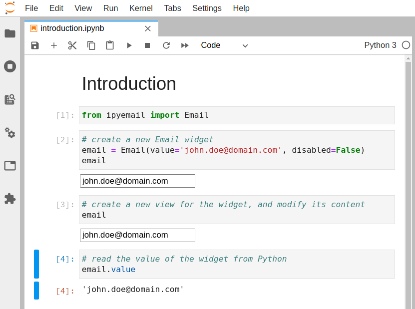
In the example above we have seen how to pass simple unicode strings to a HTML input element. However,
certain HTML elements, like e.g. <img/>
, <iframe/>
or <script/>
require URLs as input. Consider
a widget embedding an <iframe/>
. The widget has a src
property that is connected to the src
attribute of the <iframe/>
. It is the ipywidget version of the built-in IPython.display.IFrame(...)
.
Like the built-in we'd like to support two forms:
from ipyiframe import IFrame
remote_url = IFrame(src='https://jupyter.org') # full HTTP URL
local_file = IFrame(src='./local_file.html') # local file
Note, that the second form is a path relative to the notebook file. Using this string as the src
attribute of the <iframe/>
is not going to work, because the browser will interpret it as a relative
URL, relative to the browsers address bar. To transform the relative path into a valid file URL we use
the utility funtion resolveUrl(...)
in our javascript view class:
export class IFrameView extends DOMWidgetView {
render() {
this.$iframe = document.createElement('iframe');
this.el.appendChild(this.$iframe);
this.src_changed();
this.model.on('change:src', this.src_changed, this);
}
src_changed() {
const url = this.model.get('src');
this.model.widget_manager.resolveUrl(url).then(resolvedUrl => {
this.$iframe.src = resolvedUrl;
});
}
}
Invoking this.model.widget_manager.resolveUrl(...)
returns a promise that resolves to the correct URL.
As we have seen in this tutorial, starting from a cookiecutter project is really useful to quickly prototype a custom widget.
Two cookiecutter projects are currently available:
If you want to learn more about building custom widgets, you can also check out the rich ecosystem of third-party widgets:
Jump to: ● Top ● Widget Intro ● Widget Events ● Widget Properties ● Linking Widgets ● Numeric Widgets ● Widget Styling ● Boolean Widgets ● Widget Layout ● Selection Widgets ● Image Layout & Sizing ● String Widgets ● Image Manipulation ● Play Animation ● Image Browser ● Tag Widgets ● Layout Templates ● Date and Time ● Using Interact ● File Upload ● Interactive ● Game Controller ● Interactive Output ● Containers and Layout ● Widgets: Low-Level ● Aligning Widgets ● Asynchronous Widgets ● Output Widgets ● Embedding ● Email Widget ● Math Operations
Math Operations
from ipywidgets import interact
from sympy import Symbol, Eq, factor
x = Symbol('x')
def factorit(n):
return Eq(x**n-1, factor(x**n-1))
factorit(12)
interact(factorit, n=(2,40));
Lorenz System of Differential Equations
In this Notebook we explore the Lorenz system of differential equations:
$$ \begin{aligned} \dot{x} & = \sigma(y-x) \\ \dot{y} & = \rho x - y - xz \\ \dot{z} & = -\beta z + xy \end{aligned} $$This is one of the classic systems in non-linear differential equations. It exhibits a range of different behaviors as the parameters ($\sigma$, $\beta$, $\rho$) are varied.
%matplotlib inline
from ipywidgets import interact, interactive
from IPython.display import clear_output, display, HTML
import numpy as np
from scipy import integrate
from matplotlib import pyplot as plt
from mpl_toolkits.mplot3d import Axes3D
from matplotlib.colors import cnames
from matplotlib import animation
Computing the trajectories and plotting the result
We define a function that can integrate the differential equations numerically and then plot the solutions. This function has arguments that control the parameters of the differential equation ($\sigma$, $\beta$, $\rho$), the numerical integration (N
, max_time
) and the visualization (angle
).
def solve_lorenz(N=10, angle=0.0, max_time=4.0, sigma=10.0, beta=8./3, rho=28.0):
fig = plt.figure()
ax = fig.add_axes([0, 0, 1, 1], projection='3d')
ax.axis('off')
# prepare the axes limits
ax.set_xlim((-25, 25))
ax.set_ylim((-35, 35))
ax.set_zlim((5, 55))
def lorenz_deriv(x_y_z, t0, sigma=sigma, beta=beta, rho=rho):
"""Compute the time-derivative of a Lorenz system."""
x, y, z = x_y_z
return [sigma * (y - x), x * (rho - z) - y, x * y - beta * z]
# Choose random starting points, uniformly distributed from -15 to 15
np.random.seed(1)
x0 = -15 + 30 * np.random.random((N, 3))
# Solve for the trajectories
t = np.linspace(0, max_time, int(250*max_time))
x_t = np.asarray([integrate.odeint(lorenz_deriv, x0i, t)
for x0i in x0])
# choose a different color for each trajectory
colors = plt.cm.viridis(np.linspace(0, 1, N))
for i in range(N):
x, y, z = x_t[i,:,:].T
lines = ax.plot(x, y, z, '-', c=colors[i])
plt.setp(lines, linewidth=2)
ax.view_init(30, angle)
plt.show()
return t, x_t
Let's call the function once to view the solutions. For this set of parameters, we see the trajectories swirling around two points, called attractors.
t, x_t = solve_lorenz(angle=0, N=10)
Using IPython's interactive
function, we can explore how the trajectories behave as we change the various parameters.
w = interactive(solve_lorenz, angle=(0.,360.), max_time=(0.1, 4.0),
N=(0,50), sigma=(0.0,50.0), rho=(0.0,50.0))
display(w)
The object returned by interactive
is a Widget
object and it has attributes that contain the current result and arguments:
t, x_t = w.result
w.kwargs
{'N': 10, 'angle': 0.0, 'max_time': 4.0, 'sigma': 10.0, 'beta': 2.6333333333333333, 'rho': 28.0}
After interacting with the system, we can take the result and perform further computations. In this case, we compute the average positions in $x$, $y$ and $z$.
xyz_avg = x_t.mean(axis=1)
xyz_avg.shape
(10, 3)
Creating histograms of the average positions (across different trajectories) show that on average the trajectories swirl about the attractors.
plt.hist(xyz_avg[:,0])
plt.title('Average $x(t)$');
plt.hist(xyz_avg[:,1])
plt.title('Average $y(t)$');
Jump to: ● Top ● Widget Intro ● Widget Events ● Widget Properties ● Linking Widgets ● Numeric Widgets ● Widget Styling ● Boolean Widgets ● Widget Layout ● Selection Widgets ● Image Layout & Sizing ● String Widgets ● Image Manipulation ● Play Animation ● Image Browser ● Tag Widgets ● Layout Templates ● Date and Time ● Using Interact ● File Upload ● Interactive ● Game Controller ● Interactive Output ● Containers and Layout ● Widgets: Low-Level ● Aligning Widgets ● Asynchronous Widgets ● Output Widgets ● Embedding ● Email Widget ● Math Operations